Product Description - What is PalatePal ?
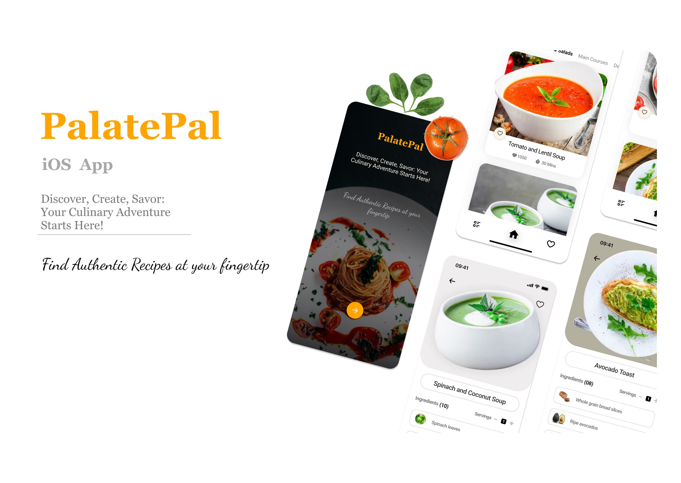
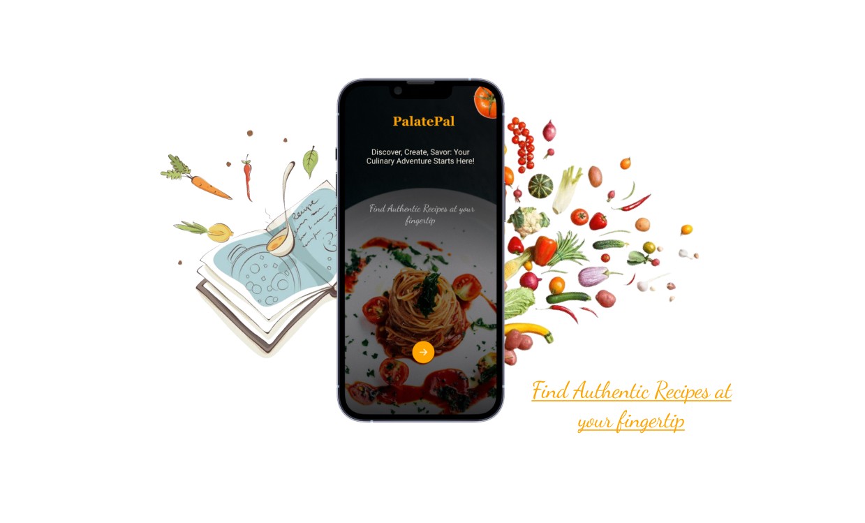
PalatePal, a mobile recipe application for iOS, is crafted to meet unique tastes, presenting fresh recipes each day. It adheres to a minimalist design, emphasizing its principal aim to grant users an extensive range of meal recipes.
The Design Process
Thought Process behind choosing Color schemes
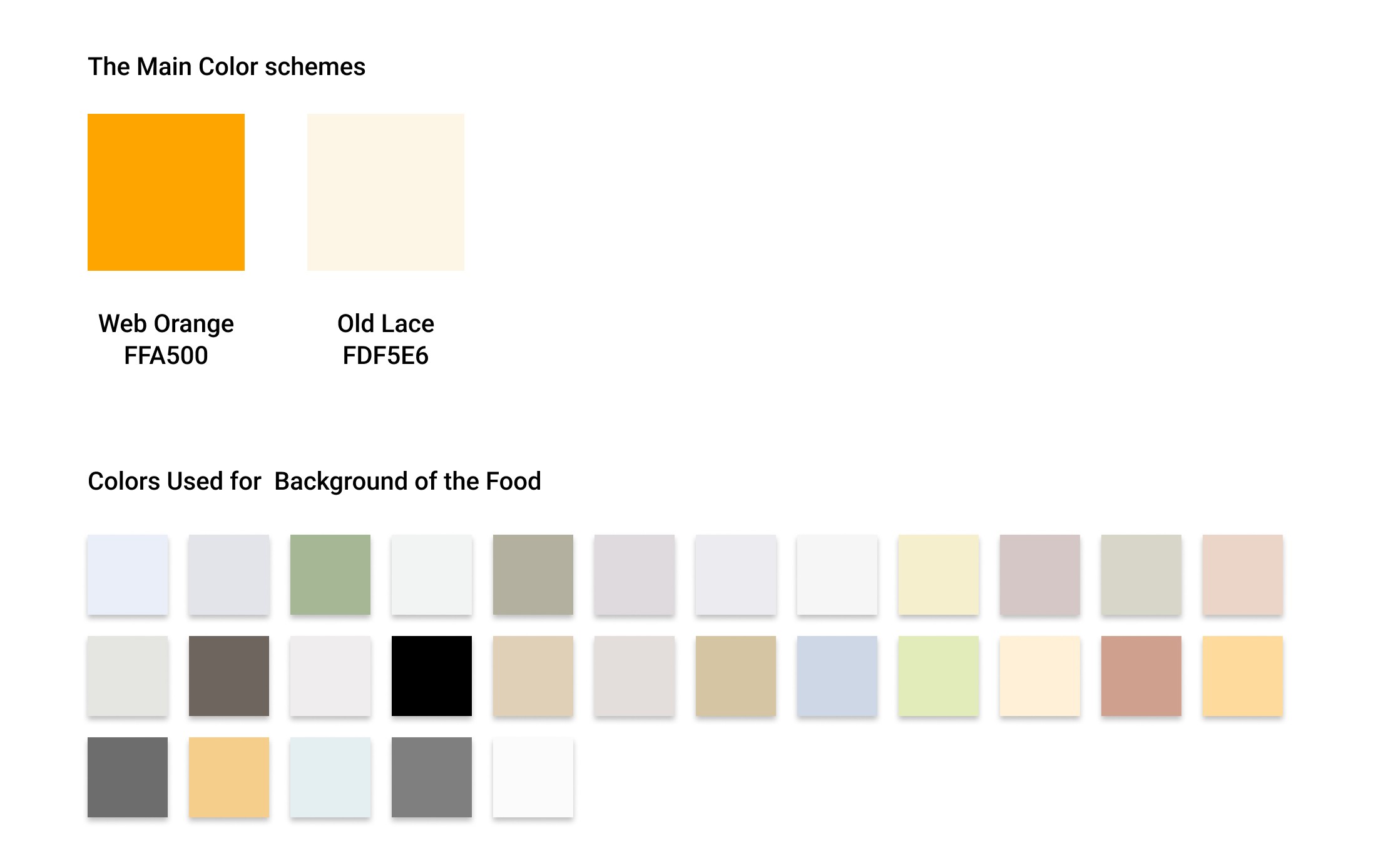
Primary Color: Warm orange shades #FFA500 create a vibrant and appetizing atmosphere. It was used for mainly Brand Name and main highlighting objects.
Accent Color: Creamy off-white #FDF5E6 add warmth and complement the orange tones, creating a cozy and inviting ambiance.
Research
I started by exploring the related existing applications on the App Store. Many of them lacked a user-centric design, with some missing a clear main design focus. Others offered an excessive number of options that weren't particularly useful for a recipe application, in my opinion. Therefore, I focused on making it more user-friendly. I aimed to create a sleek, good-looking, and easy-to-use interface.
Initial Low Fidelity Sketches
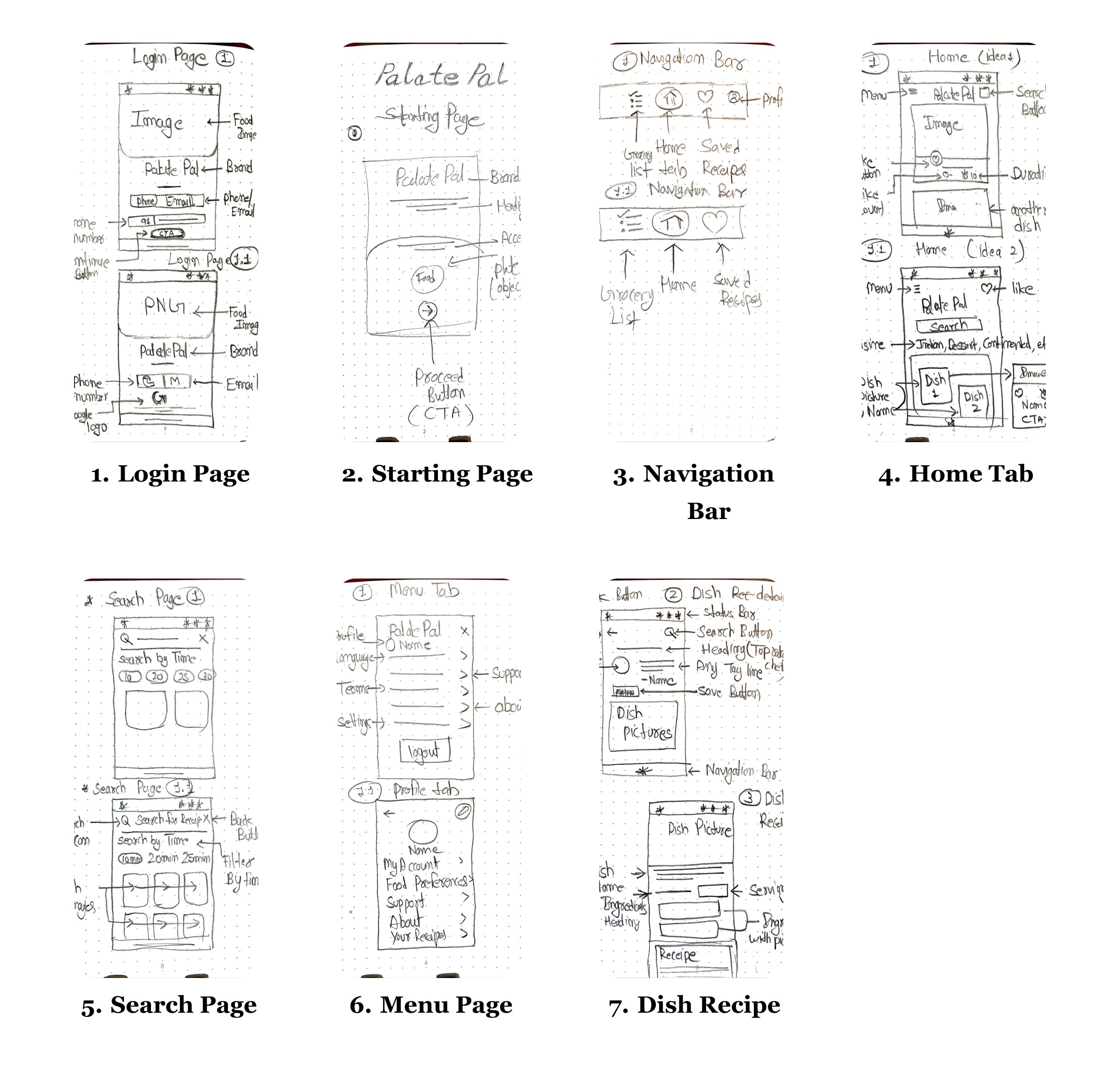
I began by seeking inspiration without going too far. I visited the Figma community to explore designs related to Recipe Apps and drew inspiration from them. After that, I started experimenting and imagining the user interface of the application and then I started by creating hand-drawn sketches to visually design the app's appearance. This approach lets me explore creative ideas and produce unique and visually appealing designs. Upon examining my sketches closely, you'll notice that I combined elements from two sketches to create a single application page. This merging would not have been possible if I had started designing directly on screen. Additionally, I revised some of my low-fidelity sketches due to their lack of functionality and visual appeal during the design process.
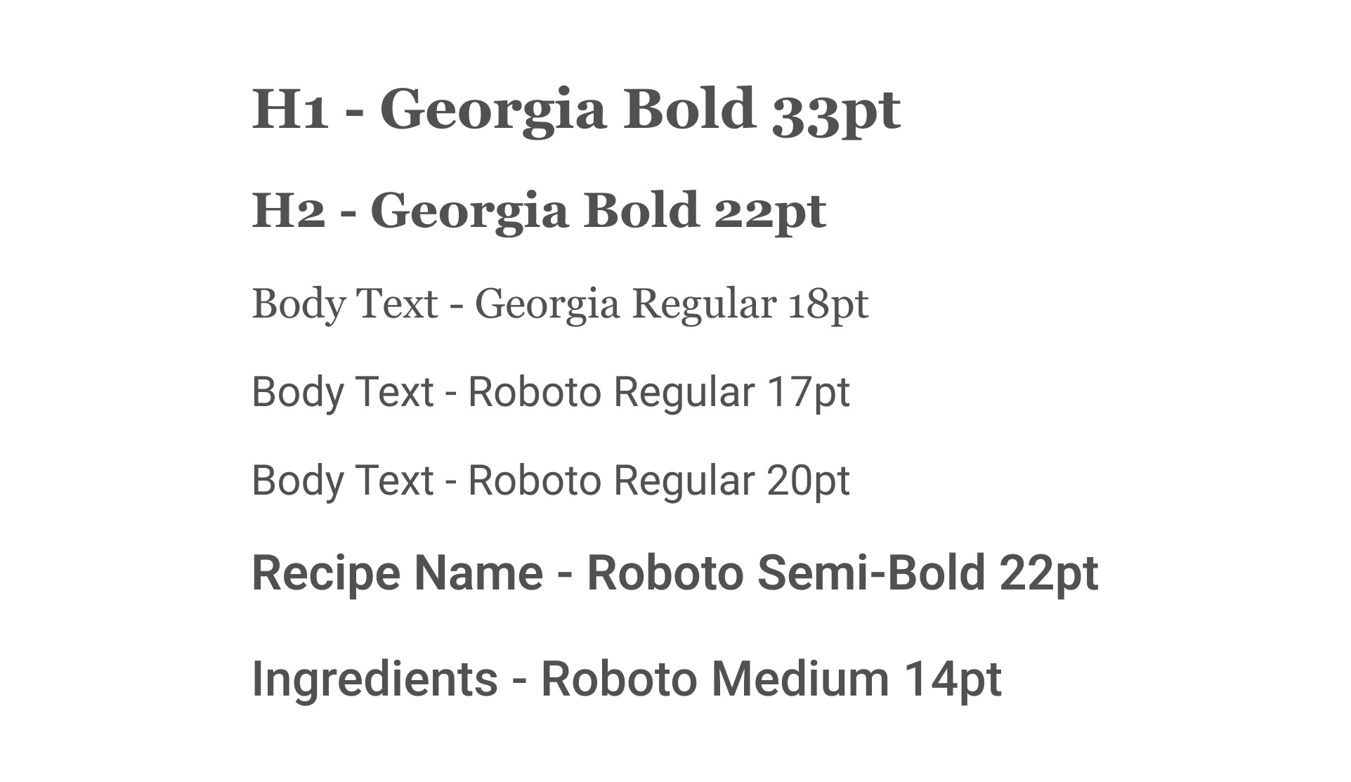
Typography
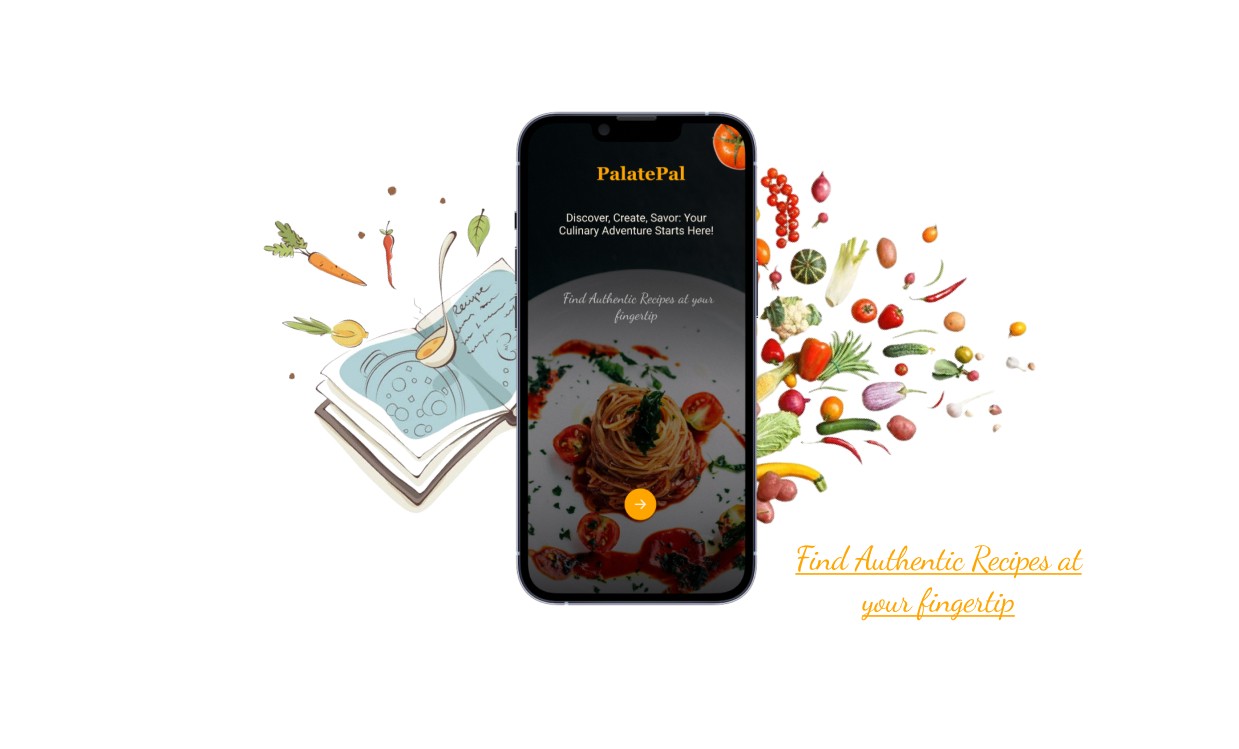
App Starting Page
The starting page features a picture sourced from Unsplash. A linear gradient fill with black color and 80% opacity overlays the picture. The brand name is centered at the top of the page. The tagline related to the application uses Roboto fonts, while the accent text utilizes the Dancing Script font as an accent font. A round CTA (Call to Action) button is positioned at the center-bottom of the page.
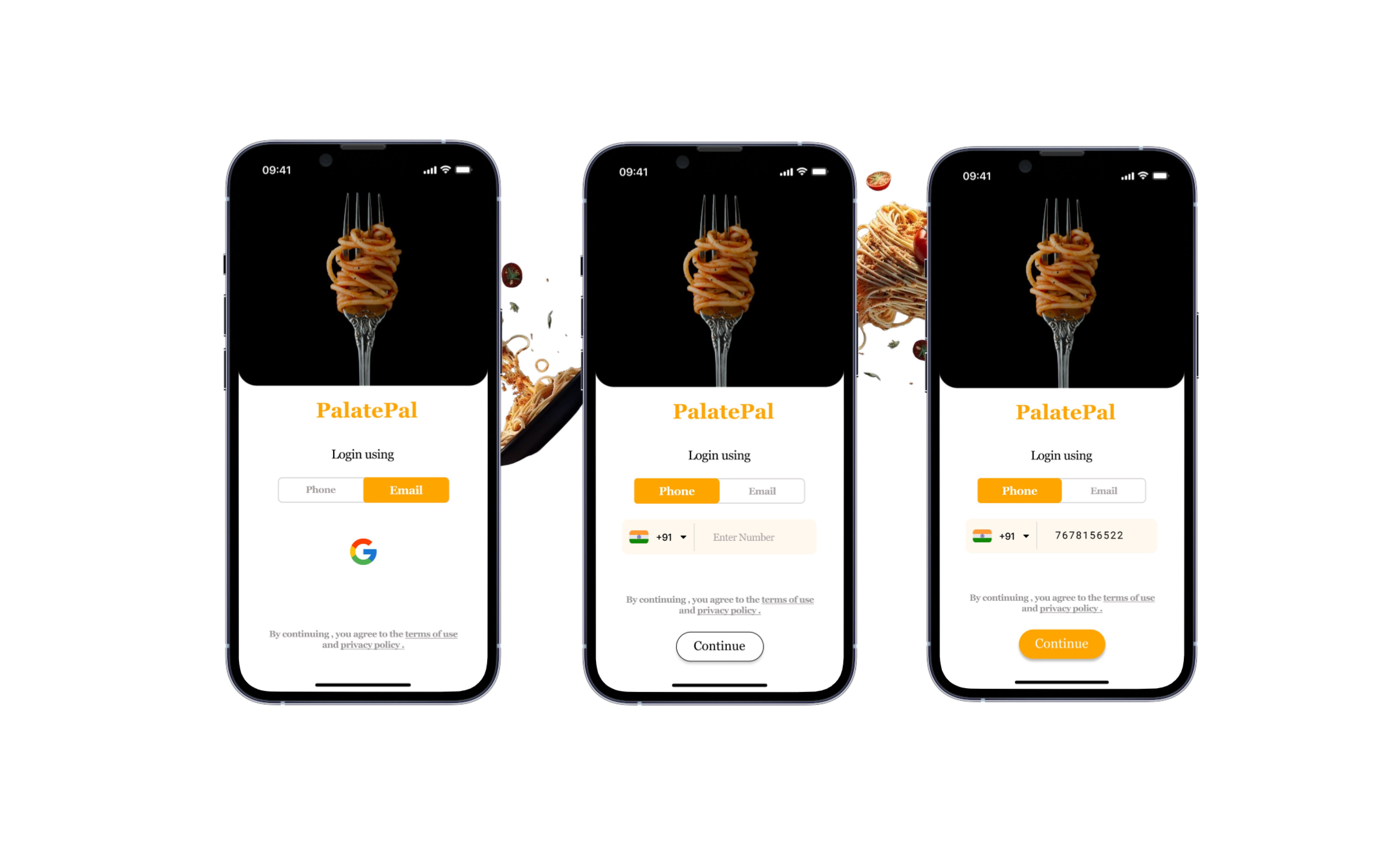
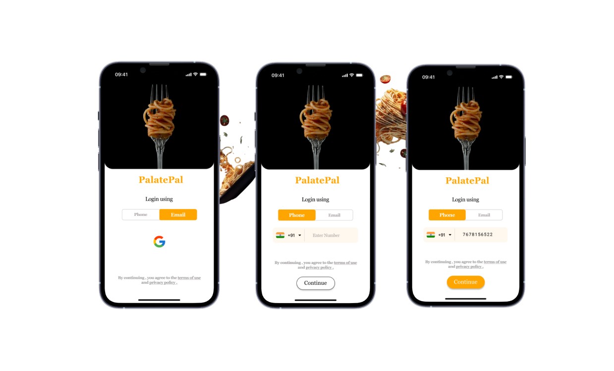
Login Pages
I've designed the login page to allow users to sign in using either their phone number or Gmail ID. This approach saves their data, enabling easy access to their recipes from any device, anytime, anywhere. The images for the login page are selected to visually convey the next step in accessing the application. The brand name is center-aligned. Two rectangles are used for toggling between login options: phone number or Gmail ID. A user can select a desired login option which will direct them to the home page. (The images are sourced from Unsplash)
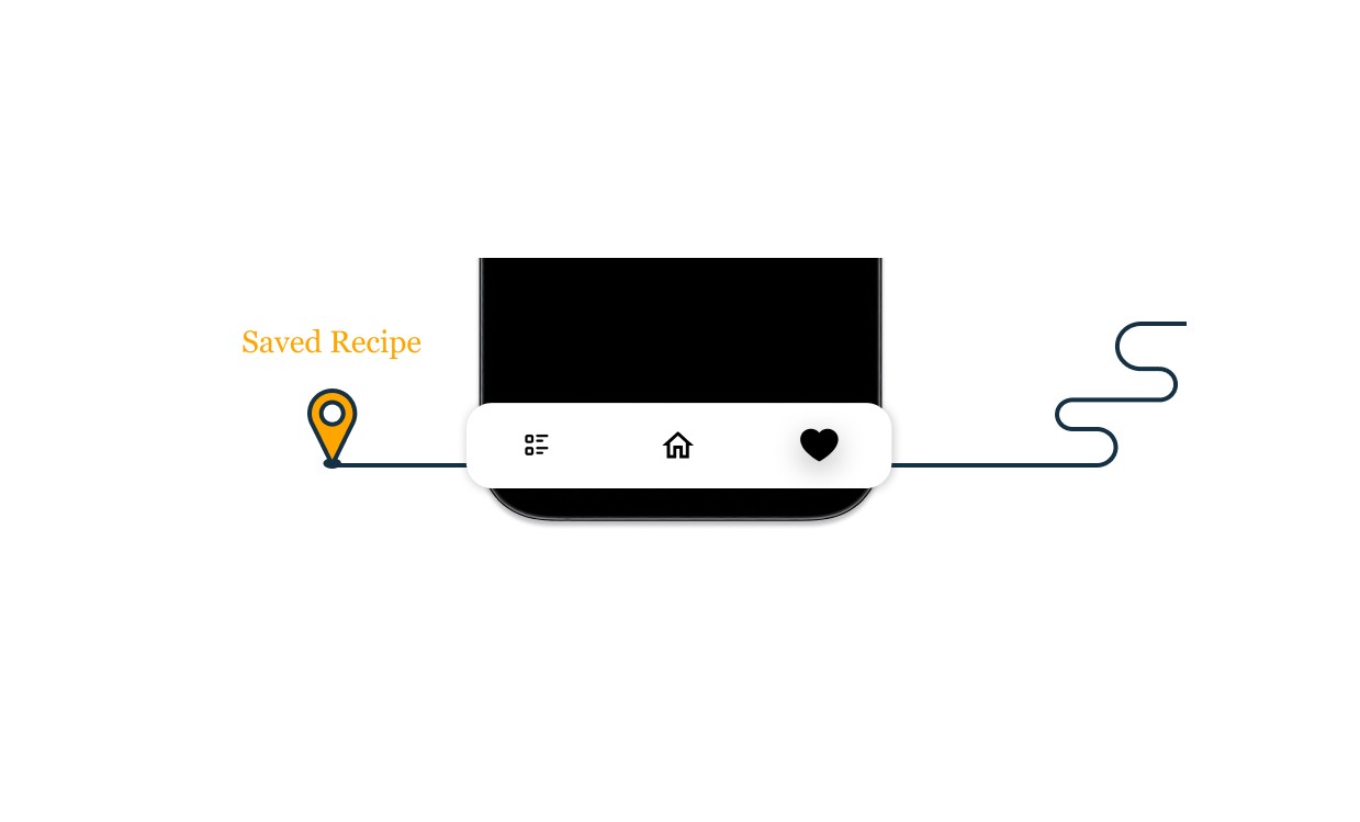
Navigation Bar
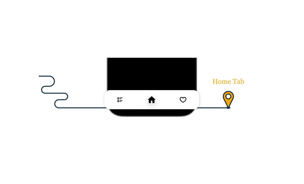
As mentioned earlier, I prioritized the core functionality of the application. I aimed to minimize the number of navigation components to ensure users can easily fulfill their primary needs within the app. In my low-fidelity sketches, I initially included four navigation components. However, after further consideration and attention on simplicity, I ultimately settled on three main navigation tabs: Home Tab, Favorites/Saved Recipes Tab, and Grocery List Tab.
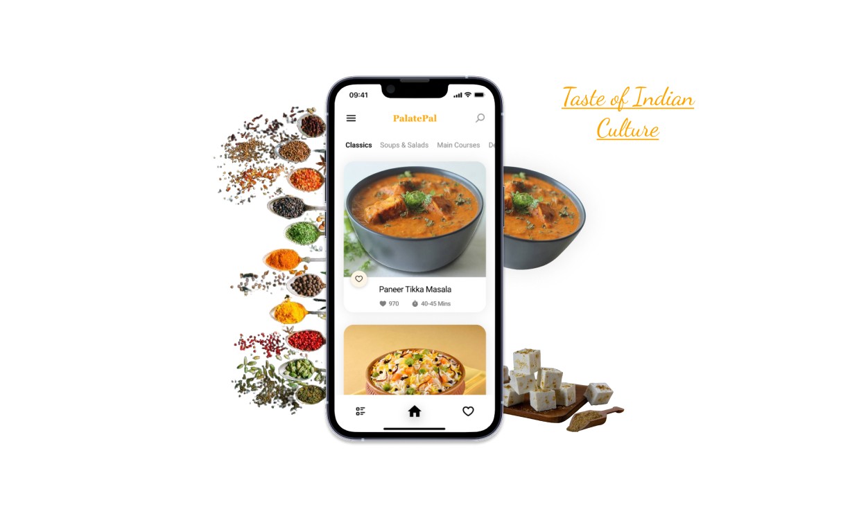
Home Tab
During my research phase, I noticed a gap in existing applications. None of them highlighted the visual appeal of a dish with a prominently displayed image. Recognizing the importance of getting users interested as soon as they open the app. This not only delights the user but also aligns with the app's primary goal of offering a distraction-free interface, allowing users to concentrate on one task at a time. I have used the principle of minimalism designing the recipe home tab interface.
At the top left corner, I positioned a menu navigation button, complemented by a search button on the top right corner. The brand name elegantly sits between these two elements. The large, captivating dish images not only enhance the visual appeal but also cater to the needs of older users who appreciate clearer visuals.
To promote easy navigation and exploration, I incorporated scrollable slider tabs. These tabs enable users to select their desired recipe category effortlessly. Each recipe is presented within a spacious container, featuring a sizable dish image, a like button for saving favorites, and essential details such as cooking time and the number of likes. For a seamless user experience, tapping on a dish image redirects users to the complete recipe.
Product Description - What is PalatePal ?
Product Description - What is PalatePal ?
The Design Process
Research
I started by exploring the related existing applications on the App Store. Many of them lacked a user-centric design, with some missing a clear main design focus. Others offered an excessive number of options that weren't particularly useful for a recipe application, in my opinion. Therefore, I focused on making it more user-friendly. I aimed to create a sleek, good-looking, and easy-to-use interface.
Initial Low Fidelity Sketches
I began by seeking inspiration without going too far. I visited the Figma community to explore designs related to Recipe Apps and drew inspiration from them. After that, I started experimenting and imagining the user interface of the application and then I started by creating hand-drawn sketches to visually design the app's appearance. This approach lets me explore creative ideas and produce unique and visually appealing designs. Upon examining my sketches closely, you'll notice that I combined elements from two sketches to create a single application page. This merging would not have been possible if I had started designing directly on screen. Additionally, I revised some of my low-fidelity sketches due to their lack of functionality and visual appeal during the design process.
PalatePal, a mobile recipe application for iOS, is crafted to meet unique tastes, presenting fresh recipes each day. It adheres to a minimalist design, emphasizing its principal aim to grant users an extensive range of meal recipes.
Thought Process behind choosing Color schemes
Primary Color: Warm orange shades #FFA500 create a vibrant and appetizing atmosphere. It was used for mainly Brand Name and main highlighting objects.
Accent Color: Creamy off-white #FDF5E6 add warmth and complement the orange tones, creating a cozy and inviting ambiance.
App Starting Page
The starting page features a picture sourced from Unsplash. A linear gradient fill with black color and 80% opacity overlays the picture. The brand name is centered at the top of the page. The tagline related to the application uses Roboto fonts, while the accent text utilizes the Dancing Script font as an accent font. A round CTA (Call to Action) button is positioned at the center-bottom of the page.
Typography
Login Pages
I've designed the login page to allow users to sign in using either their phone number or Gmail ID. This approach saves their data, enabling easy access to their recipes from any device, anytime, anywhere. The images for the login page are selected to visually convey the next step in accessing the application. The brand name is center-aligned. Two rectangles are used for toggling between login options: phone number or Gmail ID. A user can select a desired login option which will direct them to the home page. (The images are sourced from Unsplash)
Navigation Bar
As mentioned earlier, I prioritized the core functionality of the application. I aimed to minimize the number of navigation components to ensure users can easily fulfill their primary needs within the app. In my low-fidelity sketches, I initially included four navigation components. However, after further consideration and attention on simplicity, I ultimately settled on three main navigation tabs: Home Tab, Favorites/Saved Recipes Tab, and Grocery List Tab.
Home Tab
During my research phase, I noticed a gap in existing applications. None of them highlighted the visual appeal of a dish with a prominently displayed image. Recognizing the importance of getting users interested as soon as they open the app. This not only delights the user but also aligns with the app's primary goal of offering a distraction-free interface, allowing users to concentrate on one task at a time. I have used the principle of minimalism designing the recipe home tab interface.
At the top left corner, I positioned a menu navigation button, complemented by a search button on the top right corner. The brand name elegantly sits between these two elements. The large, captivating dish images not only enhance the visual appeal but also cater to the needs of older users who appreciate clearer visuals.
To promote easy navigation and exploration, I incorporated scrollable slider tabs. These tabs enable users to select their desired recipe category effortlessly. Each recipe is presented within a spacious container, featuring a sizable dish image, a like button for saving favorites, and essential details such as cooking time and the number of likes. For a seamless user experience, tapping on a dish image redirects users to the complete recipe.
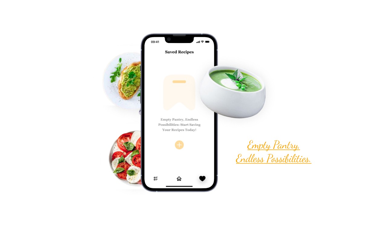
Saved Recipe Tab
A user can easily save their favorite recipes, which will be stored in a "Saved Recipes" tab. Users can save recipes on the go and return to this tab anytime to cook their saved recipes. I've kept this page minimal without overly complicated filters.
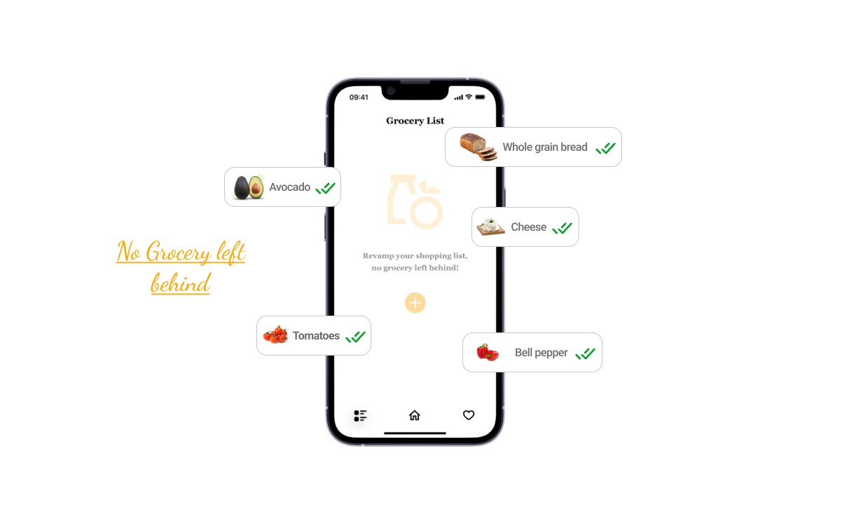
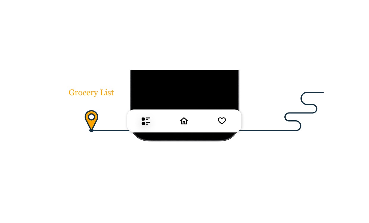
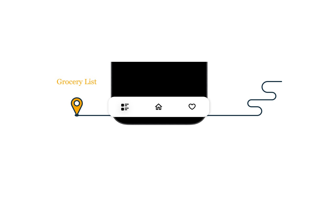
Grocery List Tab
A user can tap and hold on ingredients to directly add them to the grocery list, or they can navigate to the grocery list tab and tap the "add" icon to begin adding their desired items. I intentionally kept this tab simple and minimalistic to ensure a straightforward user experience.
Recipe Interface
I designed this interface with a diverse range of users in mind, serving to their various needs. The dish image is presented without a background to maintain a minimal and visually appealing interface. This allows users to focus simply on the dish, enhancing engagement with the content. Additionally, using only the dish image without a background reduces file sizes, leading to faster loading times, which is crucial for user experience, especially on mobile devices with slower internet connections. I know how it sucks in areas with no network at home.
The "save recipe" button is conveniently located at the top right of the image, allowing users to easily save recipes. Opposite the save button is the back navigation component, enabling users to navigate back to the recipe options. Beneath the image, the recipe name is centered to capture the user's attention. Following that, ingredient counts inform users of the number of ingredients needed, while the servings option allows them to adjust ingredient quantities based on the number of diners.
Below the above, I designed a rectangle container displays details and pictures of all the ingredients, providing clarity on ingredient quantities and aiding users who may be unfamiliar with certain ingredients. The choice of ingredient images targets the Gen Z demographic, aiming to relieve confusion and provide visual aid.
Ingredient images serve as a clear visual representation of each ingredient, aiding users in ingredient selection, particularly those who are unfamiliar with certain ingredients or prefer visual learning. For users facing language barriers or reading difficulties, ingredient images act as a universal language, enhancing accessibility and inclusivity.
An interactive experience is also incorporated, allowing users to tap and hold on ingredients to add them to their grocery list.
The above inclusive design approach ensures accessibility and equity for all users.
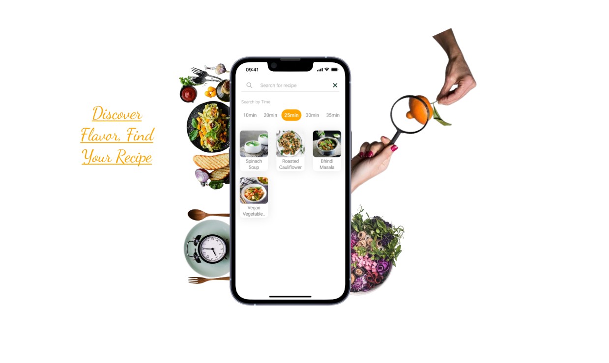
Search Tab
I designed the recipe search tab with user-friendly accessibility in mind. Users can easily type and search for their desired recipes, and for those on-the-go, there's a time filter. This filter lets users choose how much time they have available to prepare their meal, whether it's to start or end their day. Whether you're expecting someone special for a meal or rushing to begin your day, the time-based recipe search can be a lifesaver.
The search box is centrally positioned at the top of the interface, with a back navigation button located to its right, enabling users to easily return to their previous screen. Below the time filter, users can tap on the time duration they have or wish to allocate for cooking. To enhance the user experience, images of the search results are included, providing visual cues that help users engage with their desired recipes more efficiently. This visual aid minimizes search time, allowing users to focus more on cooking and less on scrolling.
To maintain a visually appealing interface, I've paid attention to the white space between interface elements. Additionally, I've applied color contrast principles; when a user selects a specific cooking time, that time duration is highlighted using the brand's primary color. This not only helps users identify their selection but also support brand identity, making the interface more recognizable and user-friendly.
Menu Tab & Profile Tab
I've designed the “Menu Tab” and “My Account Tab” interface with a minimalist approach, prioritizing essential options identified during my research phase. In the Menu tab, users can easily access it from the home tab, whereupon it smoothly slides into view from left to right, presenting all available options for interaction. To ensure a seamless experience, I utilized overlay prototyping instead of a traditional page design. Within the menu, users can effortlessly logout using the designated option
In the My Account tab, users can update their profile details, including profile picture, name. Users can conveniently update their phone number and email address as well, ensuring seamless access to their recipes across multiple devices. Additionally, they have the option to switch languages and view recipes in their preferred language. Furthermore, I've incorporated a feature allowing users to contribute their own recipes, fostering interaction and engagement among users.
Icons and Components Used in the design
Most of the icons were generated with the help of a plugin called Iconify. Components were created by me.
If you reached here thanks for going through my design process of this particular Recipe app.
I am open to receiving feedback, reviews, questions, and your own insights about this design process. I'll be glad to respond to all.
Reach out to me
Instagram @ uiprototypes
Pinterest @ Kapil Singh
Email - Kapildesignui@gmail.com
LinkedIn - Kapil Singh
PalatePal, a mobile recipe application for iOS, is crafted to meet unique tastes, presenting fresh recipes each day. It adheres to a minimalist design, emphasizing its principal aim to grant users an extensive range of meal recipes.
The Design Process
Research
I started by exploring the related existing applications on the App Store. Many of them lacked a user-centric design, with some missing a clear main design focus. Others offered an excessive number of options that weren't particularly useful for a recipe application, in my opinion. Therefore, I focused on making it more user-friendly. I aimed to create a sleek, good-looking, and easy-to-use interface.
Initial Low Fidelity Sketches
I began by seeking inspiration without going too far. I visited the Figma community to explore designs related to Recipe Apps and drew inspiration from them. After that, I started experimenting and imagining the user interface of the application and then I started by creating hand-drawn sketches to visually design the app's appearance. This approach lets me explore creative ideas and produce unique and visually appealing designs. Upon examining my sketches closely, you'll notice that I combined elements from two sketches to create a single application page. This merging would not have been possible if I had started designing directly on screen. Additionally, I revised some of my low-fidelity sketches due to their lack of functionality and visual appeal during the design process.
Thought Process behind choosing Color schemes
Primary Color: Warm orange shades #FFA500 create a vibrant and appetizing atmosphere. It was used for mainly Brand Name and main highlighting objects.
Accent Color: Creamy off-white #FDF5E6 add warmth and complement the orange tones, creating a cozy and inviting ambiance.
Typography
App Starting Page
The starting page features a picture sourced from Unsplash. A linear gradient fill with black color and 80% opacity overlays the picture. The brand name is centered at the top of the page. The tagline related to the application uses Roboto fonts, while the accent text utilizes the Dancing Script font as an accent font. A round CTA (Call to Action) button is positioned at the center-bottom of the page.
Login Pages
I've designed the login page to allow users to sign in using either their phone number or Gmail ID. This approach saves their data, enabling easy access to their recipes from any device, anytime, anywhere. The images for the login page are selected to visually convey the next step in accessing the application. The brand name is center-aligned. Two rectangles are used for toggling between login options: phone number or Gmail ID. A user can select a desired login option which will direct them to the home page. (The images are sourced from Unsplash)
Navigation Bar
As mentioned earlier, I prioritized the core functionality of the application. I aimed to minimize the number of navigation components to ensure users can easily fulfill their primary needs within the app. In my low-fidelity sketches, I initially included four navigation components. However, after further consideration and attention on simplicity, I ultimately settled on three main navigation tabs: Home Tab, Favorites/Saved Recipes Tab, and Grocery List Tab.
Home Tab
During my research phase, I noticed a gap in existing applications. None of them highlighted the visual appeal of a dish with a prominently displayed image. Recognizing the importance of getting users interested as soon as they open the app. This not only delights the user but also aligns with the app's primary goal of offering a distraction-free interface, allowing users to concentrate on one task at a time. I have used the principle of minimalism designing the recipe home tab interface.
At the top left corner, I positioned a menu navigation button, complemented by a search button on the top right corner. The brand name elegantly sits between these two elements. The large, captivating dish images not only enhance the visual appeal but also cater to the needs of older users who appreciate clearer visuals.
To promote easy navigation and exploration, I incorporated scrollable slider tabs. These tabs enable users to select their desired recipe category effortlessly. Each recipe is presented within a spacious container, featuring a sizable dish image, a like button for saving favorites, and essential details such as cooking time and the number of likes. For a seamless user experience, tapping on a dish image redirects users to the complete recipe.
Saved Recipe Tab
A user can easily save their favorite recipes, which will be stored in a "Saved Recipes" tab. Users can save recipes on the go and return to this tab anytime to cook their saved recipes. I've kept this page minimal without overly complicated filters.
Grocery List Tab
A user can tap and hold on ingredients to directly add them to the grocery list, or they can navigate to the grocery list tab and tap the "add" icon to begin adding their desired items. I intentionally kept this tab simple and minimalistic to ensure a straightforward user experience.
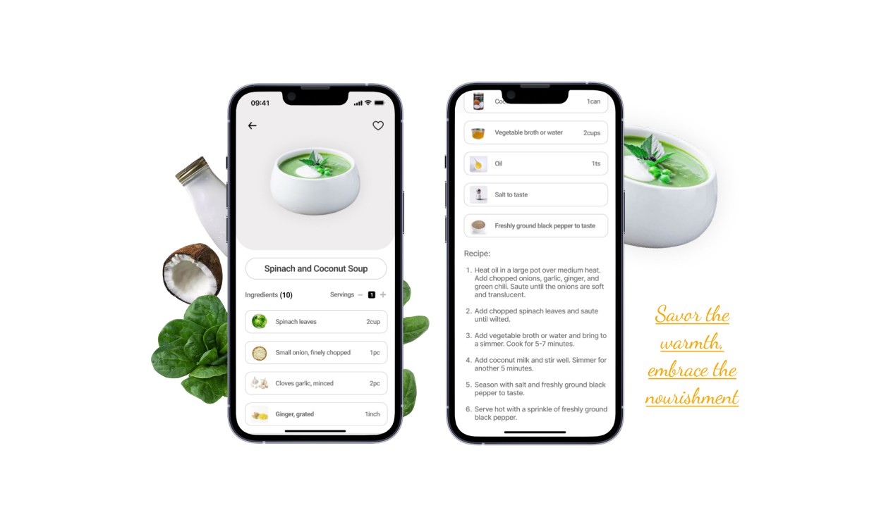
Recipe Interface
I designed this interface with a diverse range of users in mind, serving to their various needs. The dish image is presented without a background to maintain a minimal and visually appealing interface. This allows users to focus simply on the dish, enhancing engagement with the content. Additionally, using only the dish image without a background reduces file sizes, leading to faster loading times, which is crucial for user experience, especially on mobile devices with slower internet connections. I know how it sucks in areas with no network at home.
The "save recipe" button is conveniently located at the top right of the image, allowing users to easily save recipes. Opposite the save button is the back navigation component, enabling users to navigate back to the recipe options. Beneath the image, the recipe name is centered to capture the user's attention. Following that, ingredient counts inform users of the number of ingredients needed, while the servings option allows them to adjust ingredient quantities based on the number of diners.
Below the above, I designed a rectangle container displays details and pictures of all the ingredients, providing clarity on ingredient quantities and aiding users who may be unfamiliar with certain ingredients. The choice of ingredient images targets the Gen Z demographic, aiming to relieve confusion and provide visual aid.
Ingredient images serve as a clear visual representation of each ingredient, aiding users in ingredient selection, particularly those who are unfamiliar with certain ingredients or prefer visual learning. For users facing language barriers or reading difficulties, ingredient images act as a universal language, enhancing accessibility and inclusivity.
An interactive experience is also incorporated, allowing users to tap and hold on ingredients to add them to their grocery list.
The above inclusive design approach ensures accessibility and equity for all users.
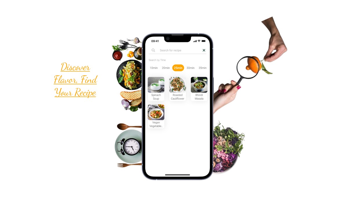
Search Tab
I designed the recipe search tab with user-friendly accessibility in mind. Users can easily type and search for their desired recipes, and for those on-the-go, there's a time filter. This filter lets users choose how much time they have available to prepare their meal, whether it's to start or end their day. Whether you're expecting someone special for a meal or rushing to begin your day, the time-based recipe search can be a lifesaver.
The search box is centrally positioned at the top of the interface, with a back navigation button located to its right, enabling users to easily return to their previous screen. Below the time filter, users can tap on the time duration they have or wish to allocate for cooking. To enhance the user experience, images of the search results are included, providing visual cues that help users engage with their desired recipes more efficiently. This visual aid minimizes search time, allowing users to focus more on cooking and less on scrolling.
To maintain a visually appealing interface, I've paid attention to the white space between interface elements. Additionally, I've applied color contrast principles; when a user selects a specific cooking time, that time duration is highlighted using the brand's primary color. This not only helps users identify their selection but also support brand identity, making the interface more recognizable and user-friendly.
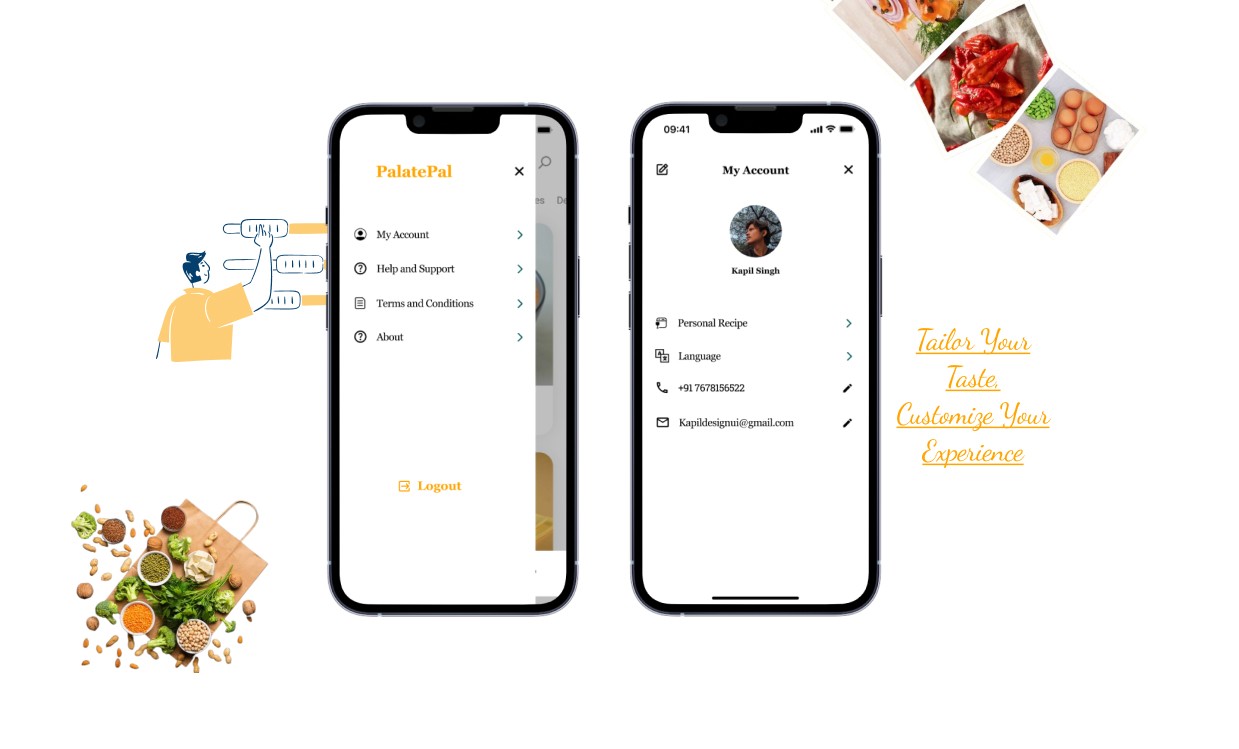
Menu Tab & Profile Tab
I've designed the “Menu Tab” and “My Account Tab” interface with a minimalist approach, prioritizing essential options identified during my research phase. In the Menu tab, users can easily access it from the home tab, whereupon it smoothly slides into view from left to right, presenting all available options for interaction. To ensure a seamless experience, I utilized overlay prototyping instead of a traditional page design. Within the menu, users can effortlessly logout using the designated option
In the My Account tab, users can update their profile details, including profile picture, name. Users can conveniently update their phone number and email address as well, ensuring seamless access to their recipes across multiple devices. Additionally, they have the option to switch languages and view recipes in their preferred language. Furthermore, I've incorporated a feature allowing users to contribute their own recipes, fostering interaction and engagement among users.
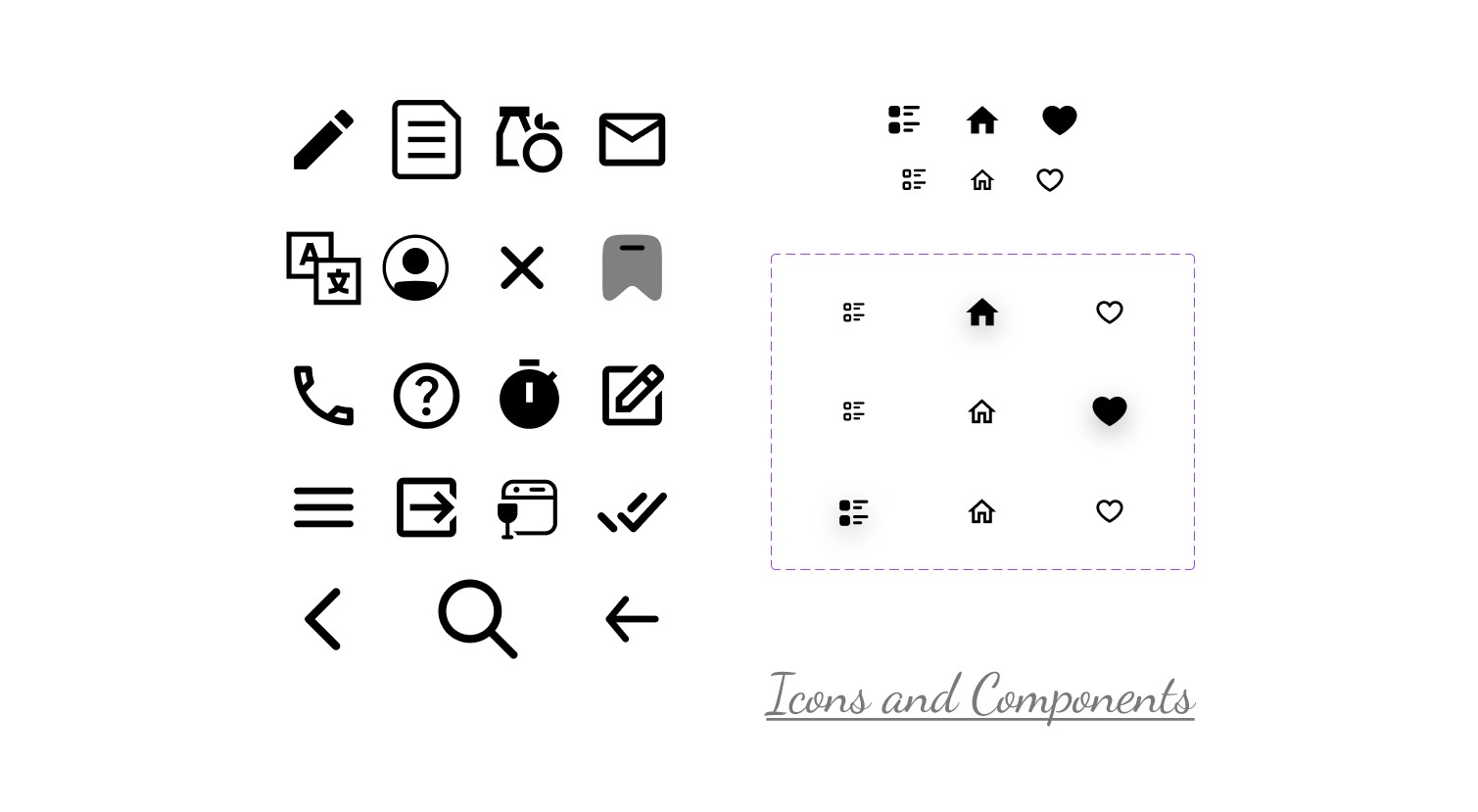
Icons and Components Used in the design
Most of the icons were generated with the help of a plugin called Iconify. Components were created by me.
If you reached here thanks for going through my design process of this particular Recipe app.
I am open to receiving feedback, reviews, questions, and your own insights about this design process. I'll be glad to respond to all.
Reach out to me
Instagram @ uiprototypes
Pinterest @ Kapil Singh
Email - Kapildesignui@gmail.com
LinkedIn - Kapil Singh
Saved Recipe Tab
A user can easily save their favorite recipes, which will be stored in a "Saved Recipes" tab. Users can save recipes on the go and return to this tab anytime to cook their saved recipes. I've kept this page minimal without overly complicated filters.
Grocery List Tab
A user can tap and hold on ingredients to directly add them to the grocery list, or they can navigate to the grocery list tab and tap the "add" icon to begin adding their desired items. I intentionally kept this tab simple and minimalistic to ensure a straightforward user experience.
Recipe Interface
I designed this interface with a diverse range of users in mind, serving to their various needs. The dish image is presented without a background to maintain a minimal and visually appealing interface. This allows users to focus simply on the dish, enhancing engagement with the content. Additionally, using only the dish image without a background reduces file sizes, leading to faster loading times, which is crucial for user experience, especially on mobile devices with slower internet connections. I know how it sucks in areas with no network at home.
The "save recipe" button is conveniently located at the top right of the image, allowing users to easily save recipes. Opposite the save button is the back navigation component, enabling users to navigate back to the recipe options. Beneath the image, the recipe name is centered to capture the user's attention. Following that, ingredient counts inform users of the number of ingredients needed, while the servings option allows them to adjust ingredient quantities based on the number of diners.
Below the above, I designed a rectangle container displays details and pictures of all the ingredients, providing clarity on ingredient quantities and aiding users who may be unfamiliar with certain ingredients. The choice of ingredient images targets the Gen Z demographic, aiming to relieve confusion and provide visual aid.
Ingredient images serve as a clear visual representation of each ingredient, aiding users in ingredient selection, particularly those who are unfamiliar with certain ingredients or prefer visual learning. For users facing language barriers or reading difficulties, ingredient images act as a universal language, enhancing accessibility and inclusivity.
An interactive experience is also incorporated, allowing users to tap and hold on ingredients to add them to their grocery list.
The above inclusive design approach ensures accessibility and equity for all users.
Search Tab
I designed the recipe search tab with user-friendly accessibility in mind. Users can easily type and search for their desired recipes, and for those on-the-go, there's a time filter. This filter lets users choose how much time they have available to prepare their meal, whether it's to start or end their day. Whether you're expecting someone special for a meal or rushing to begin your day, the time-based recipe search can be a lifesaver.
The search box is centrally positioned at the top of the interface, with a back navigation button located to its right, enabling users to easily return to their previous screen. Below the time filter, users can tap on the time duration they have or wish to allocate for cooking. To enhance the user experience, images of the search results are included, providing visual cues that help users engage with their desired recipes more efficiently. This visual aid minimizes search time, allowing users to focus more on cooking and less on scrolling.
To maintain a visually appealing interface, I've paid attention to the white space between interface elements. Additionally, I've applied color contrast principles; when a user selects a specific cooking time, that time duration is highlighted using the brand's primary color. This not only helps users identify their selection but also support brand identity, making the interface more recognizable and user-friendly.
Menu Tab & Profile Tab
I've designed the “Menu Tab” and “My Account Tab” interface with a minimalist approach, prioritizing essential options identified during my research phase. In the Menu tab, users can easily access it from the home tab, whereupon it smoothly slides into view from left to right, presenting all available options for interaction. To ensure a seamless experience, I utilized overlay prototyping instead of a traditional page design. Within the menu, users can effortlessly logout using the designated option
In the My Account tab, users can update their profile details, including profile picture, name. Users can conveniently update their phone number and email address as well, ensuring seamless access to their recipes across multiple devices. Additionally, they have the option to switch languages and view recipes in their preferred language. Furthermore, I've incorporated a feature allowing users to contribute their own recipes, fostering interaction and engagement among users.
Icons and Components Used in the design
Most of the icons were generated with the help of a plugin called Iconify. Components were created by me.
If you reached here thanks for going through my design process of this particular Recipe app.
I am open to receiving feedback, reviews, questions, and your own insights about this design process. I'll be glad to respond to all.
Reach out to me
Instagram @ uiprototypes
Pinterest @ Kapil Singh
Email - Kapildesignui@gmail.com
LinkedIn - Kapil Singh