Case Study - Mind Matters
Project Overview
"Mind Matters" is a user-centered website designed to provide accessible, personalized mental health tools and resources. As my first responsive website design from scratch for the Google UX Design Certificate, this project focused on creating a compassionate platform to help users track emotions, set wellness goals, and connect with affordable therapy options.

"I designed Mind Matters to address a universal yet deeply personal challenge: the lack of empathetic, judgment-free mental health tools for people navigating daily stressors alone.
Having experienced anxiety myself, I understood how overwhelming it can feel to find trustworthy resources that balance clinical credibility with warmth. Existing platforms often felt either too clinical (alienating users) or overly simplistic (lacking actionable tools).
By prioritizing cultural relevance, privacy, and human-centered interaction, I aimed to create a space where users—whether students, professionals, or caregivers—could feel seen and empowered without stigma. This project wasn’t just about UX best practices; it was about proving that design can be a lifeline for those silently struggling."
My Role & Tools
Design Process : Design thinking UX framework
For this case study, I used the design thinking UX framework, which is a user-centered approach to problem-solving. The framework follows five key phases: empathize, define, ideate, prototype, and test. By working through each phase, I was able to better understand who my users are, what challenges they face, and how my design could address their needs. This process helped me dive deep into research, create prototypes, and test ideas to ensure the design was effective and user-focused.
A. Empethize Phase
Primary Research - Surveys and Questionnaires
For empathising with users to identify what challenges they face to relate to mental health resources, what motivates them to seek support online and how do they currently engage with mental health platforms ?
Identifying the Target Users for MindMatters
To create a meaningful and effective design for MindMatters, I needed to first clearly identify the target users. Understanding their specific needs, challenges, and behaviors was crucial in making thoughtful, data-driven design decisions that align with their mental health concerns. Defining the core user base allowed me to conduct focused research, ensuring that the platform truly resonates with its audience and offers the right solutions.
User Demographics
I selected this user group because mental health awareness is growing among younger individuals, and many are actively seeking digital solutions for therapy, self-help, and emotional well-being. This audience often experiences high levels of stress due to academic pressure, work-life balance, social expectations, or personal challenges, making it essential to design a platform that truly meets their needs.
By focusing on this audience, MindMatters ensures that its features, user interface, and overall experience cater to their specific mental health needs, providing accessible, stigma-free, and professional support.
I used google form to gather Data from a larger audience, I included a mix of quantitative and qualitative questions.
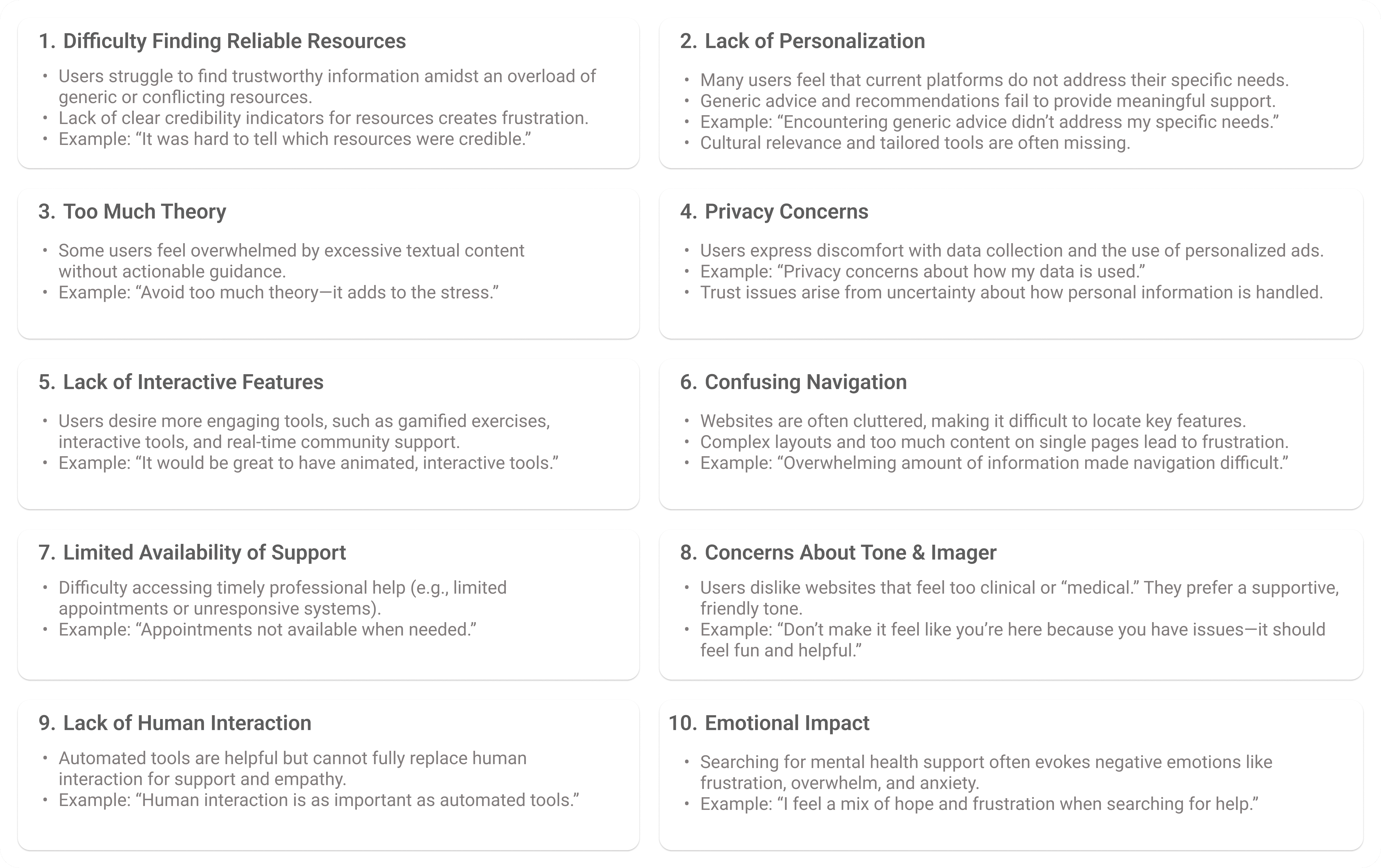
User Pain Points
From my survey i identified key pain points experienced by users while getting help related to mental health. These insights helped me understand the challenges users faced and informed my design decisions to address their needs more effectively. Through analyzing these pain points, I was able to develop a more user-centered solution tailored to improving the overall support online.
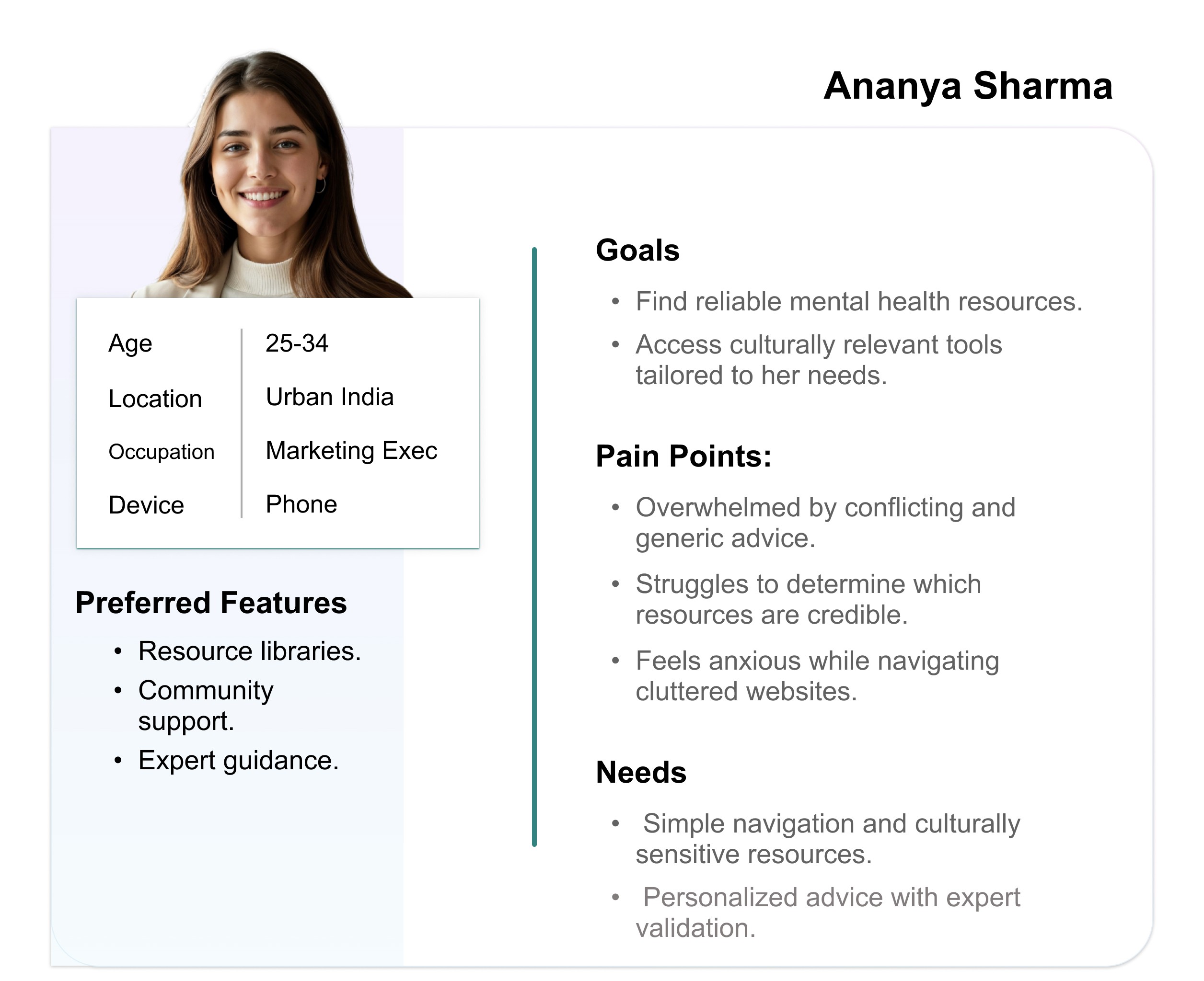
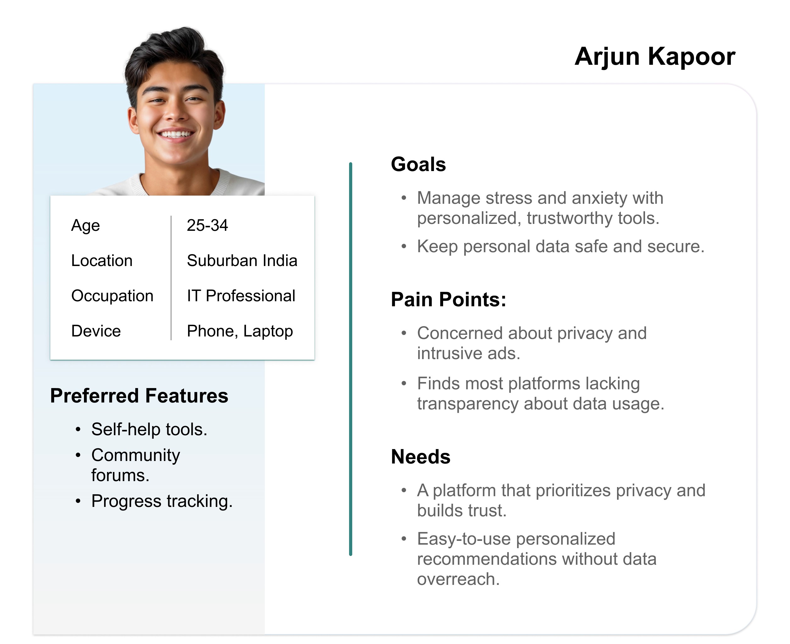
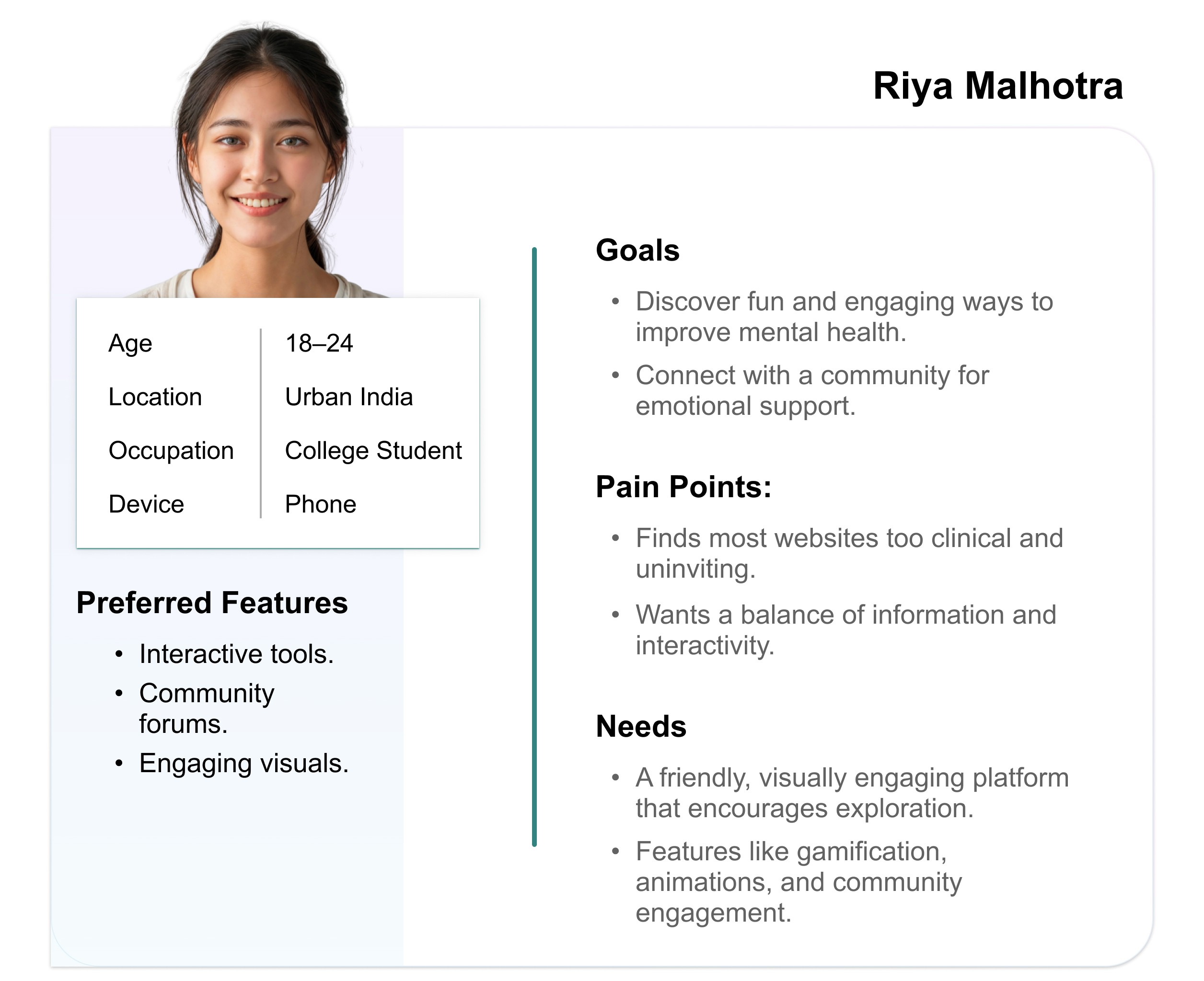
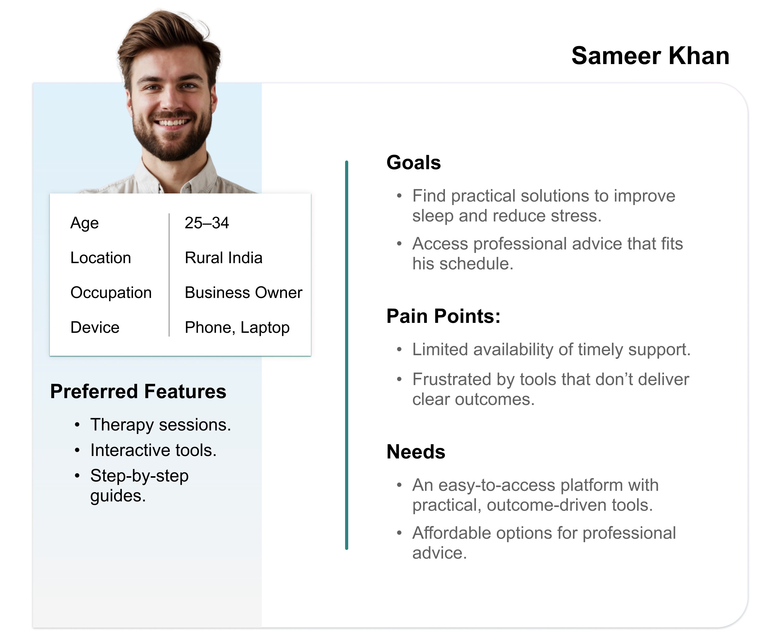
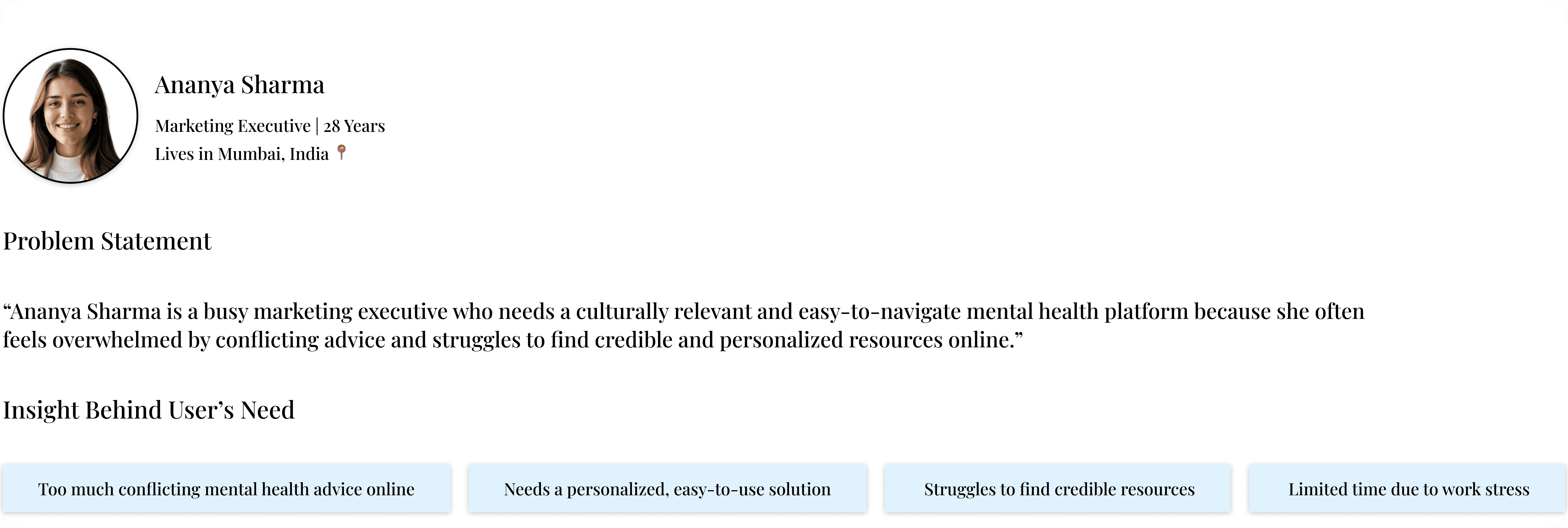
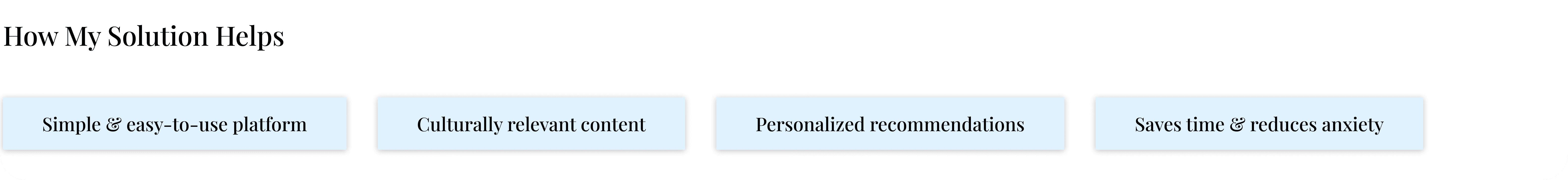
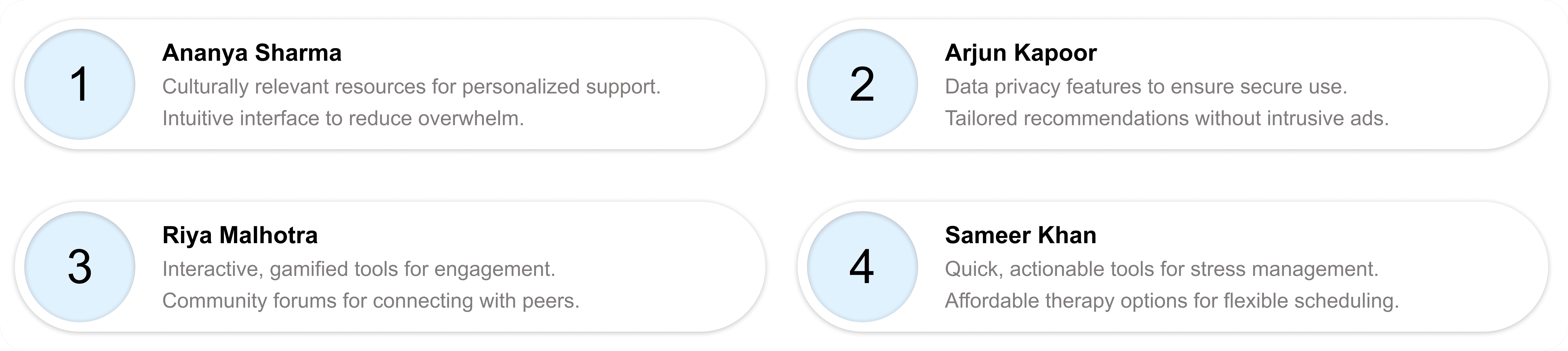
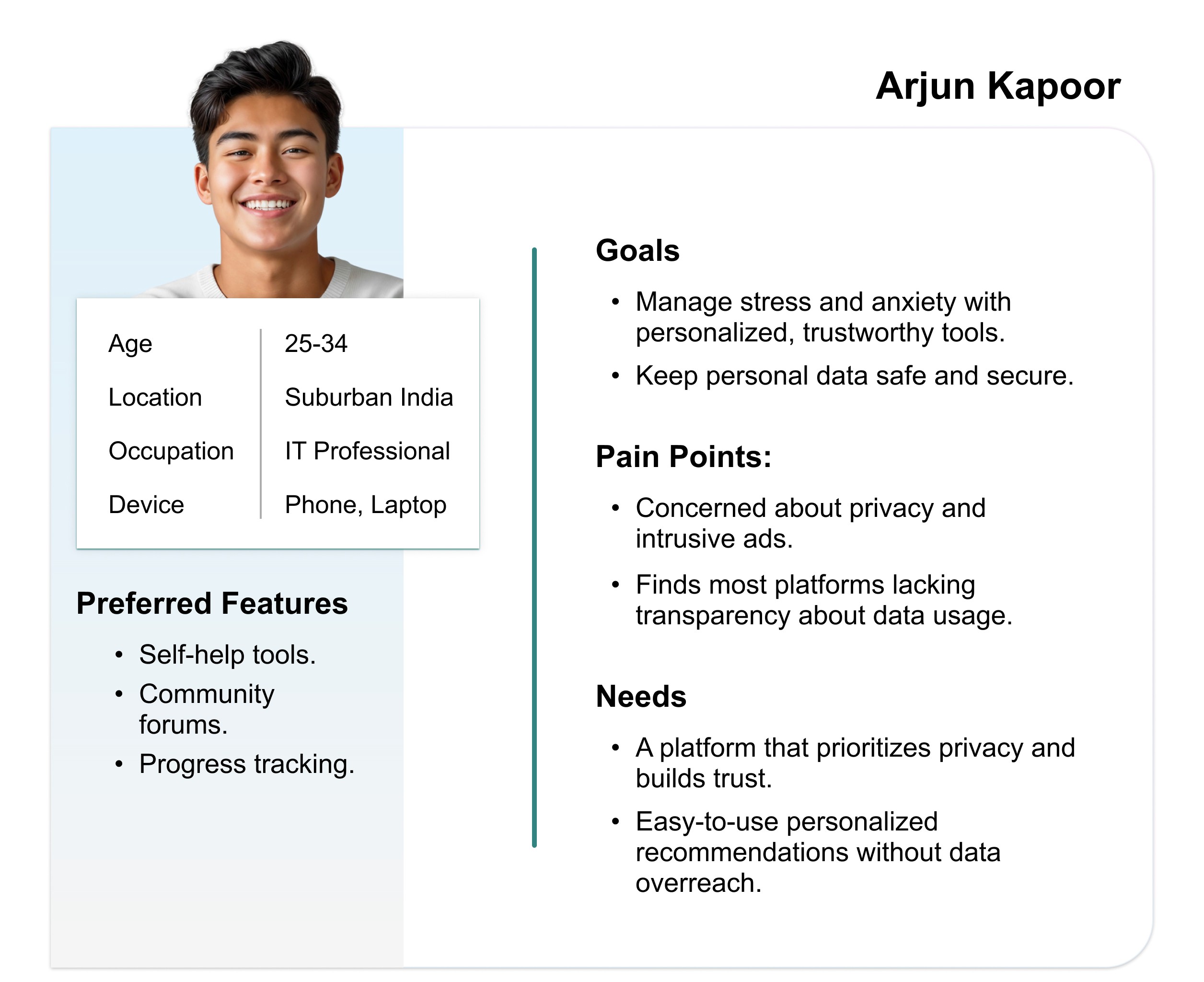
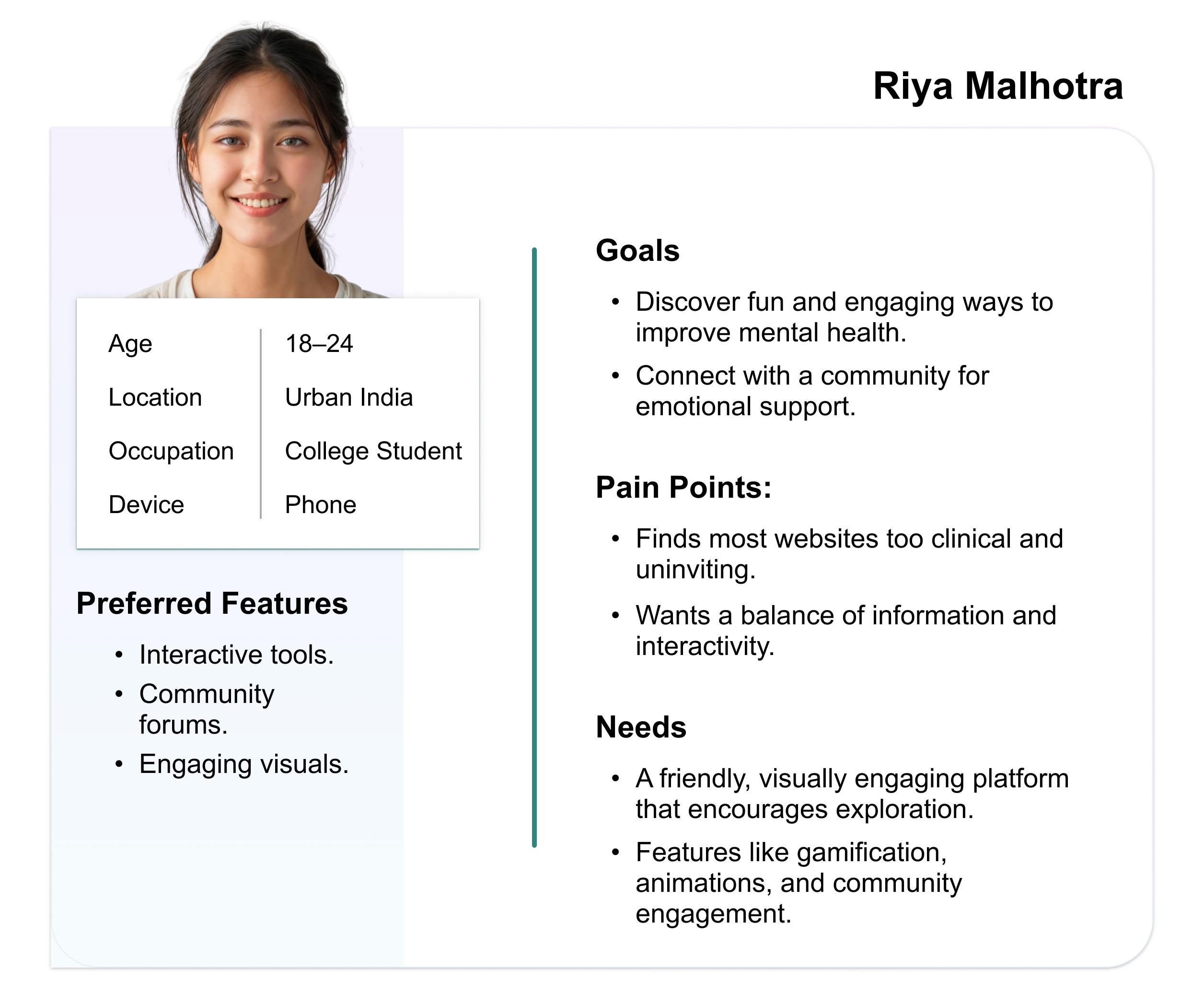
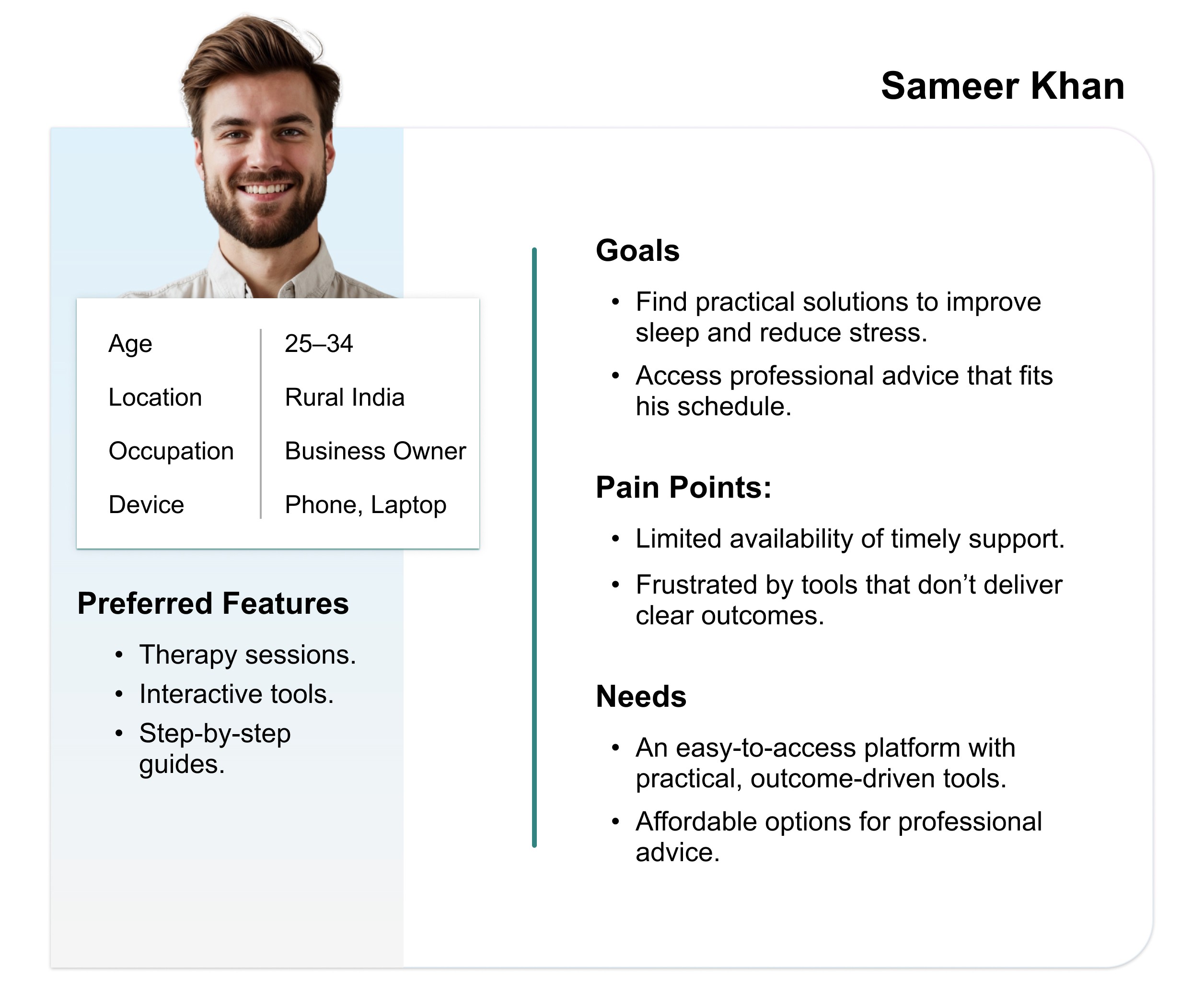
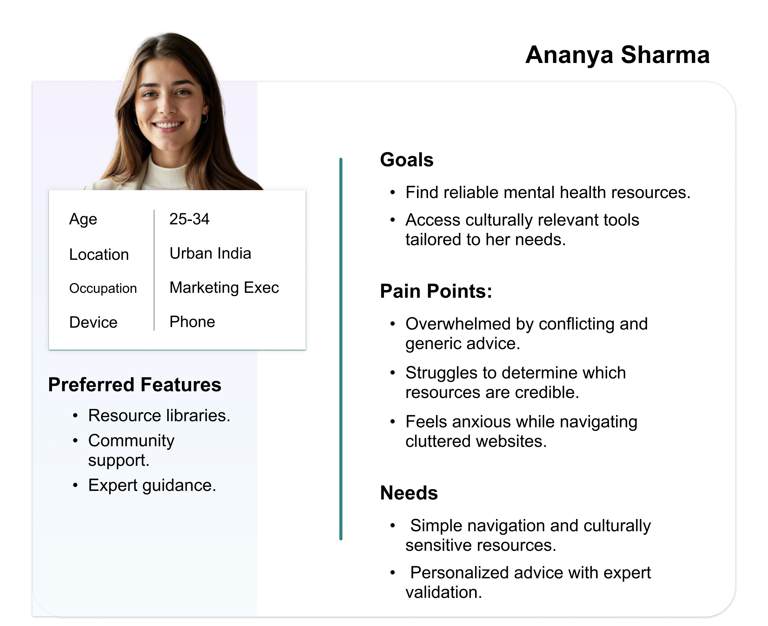
3. User Personas
I gathered and organised data from user survey and user pain points and turned them into user personas which are representing different groups of users.
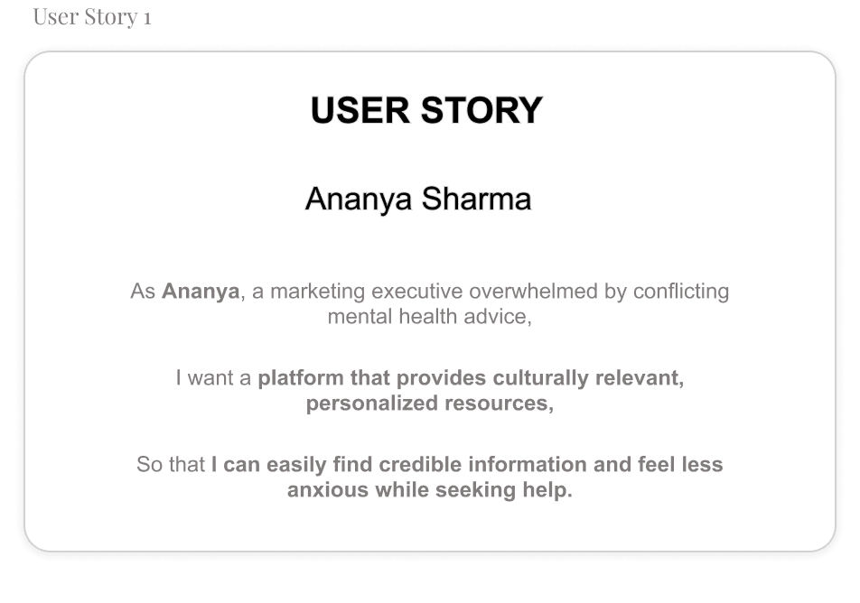
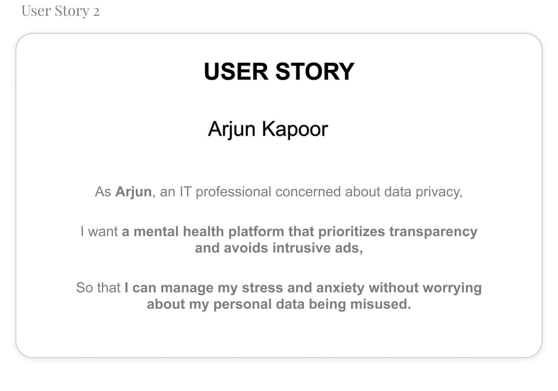
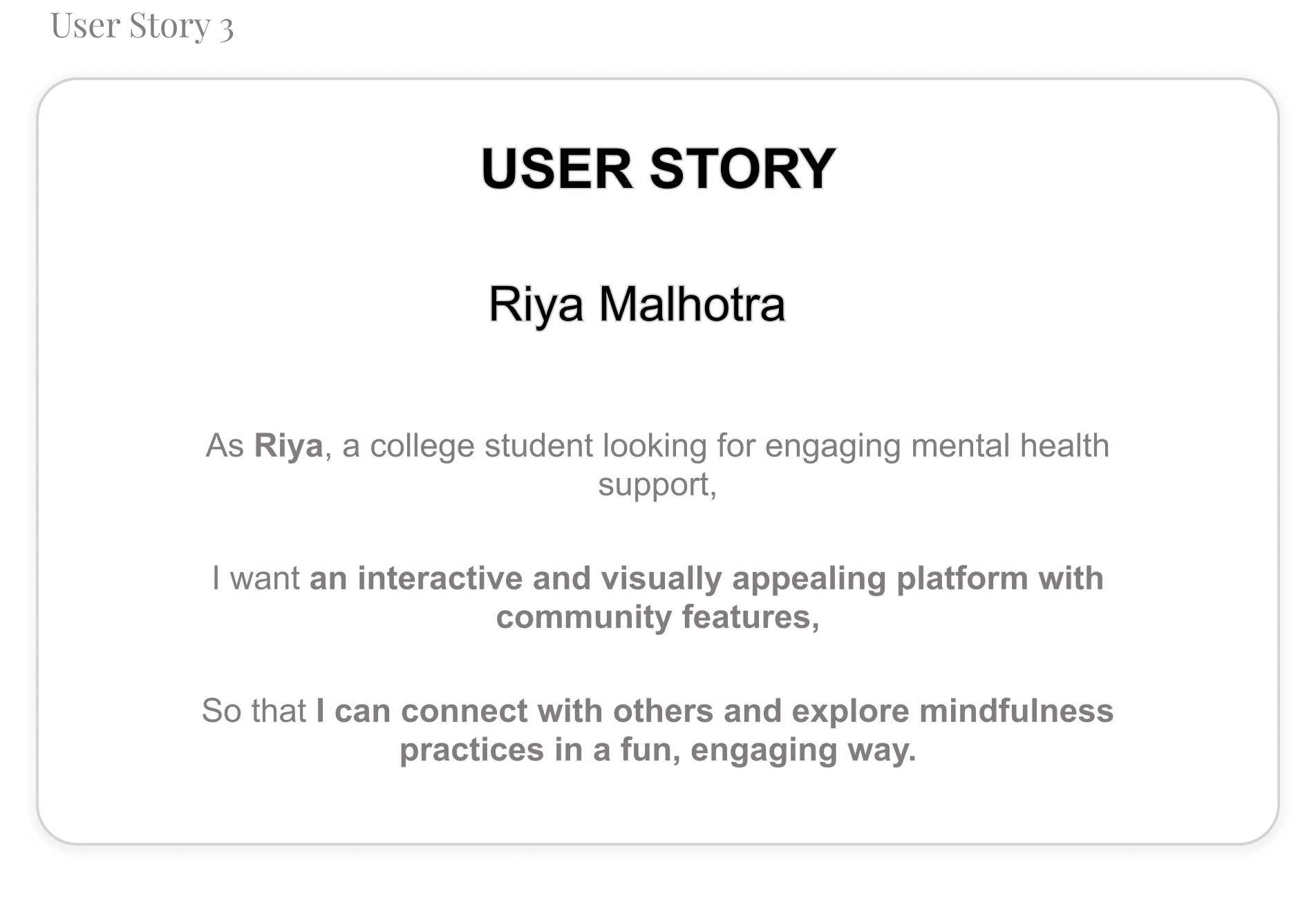
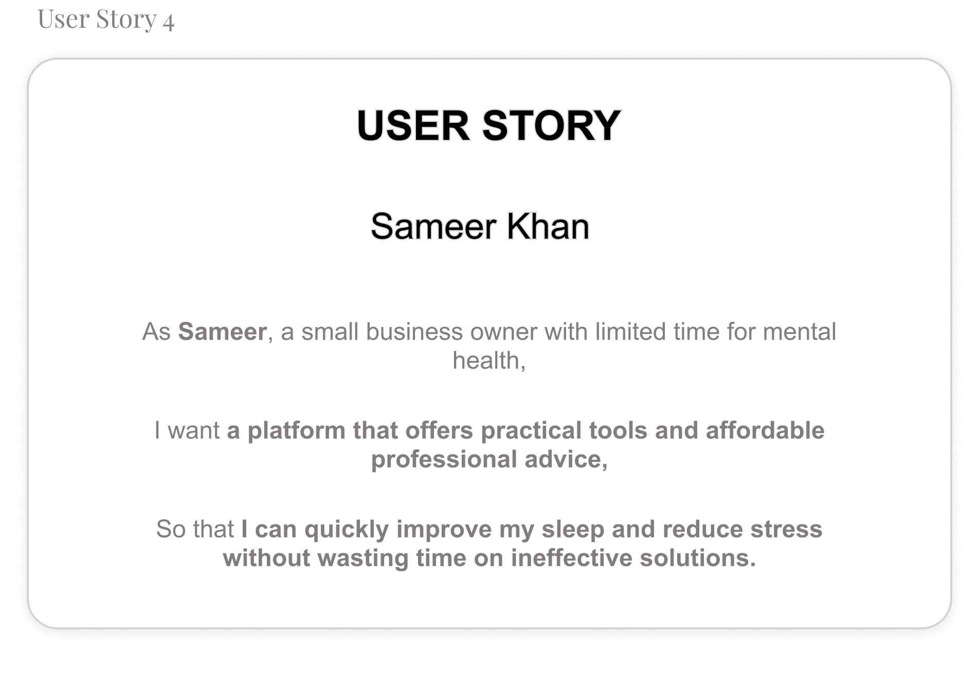
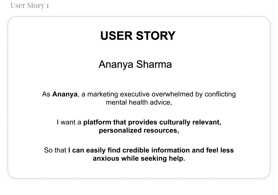
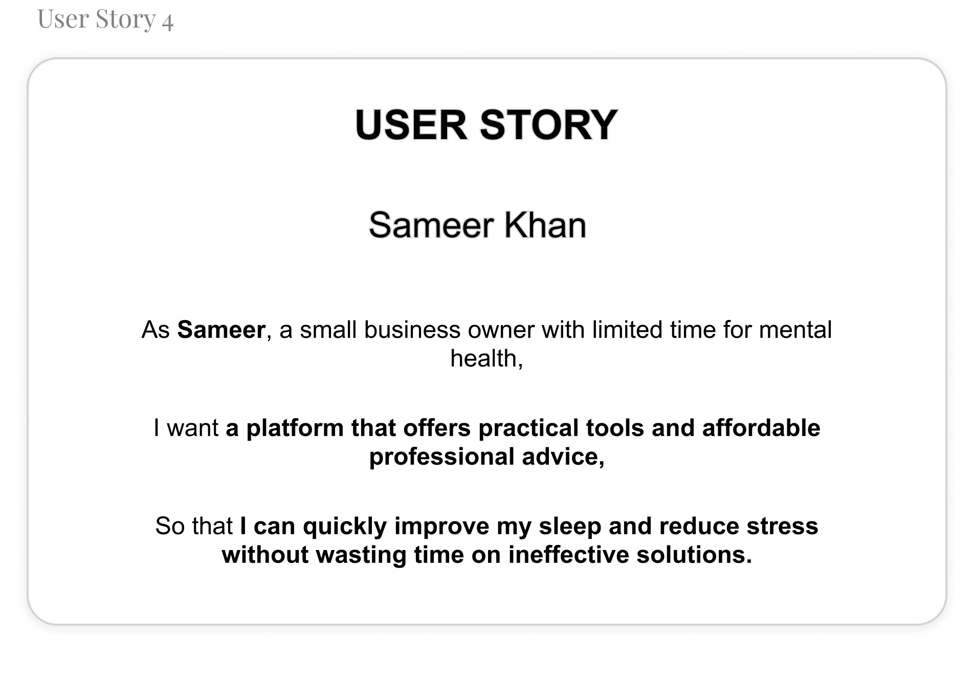
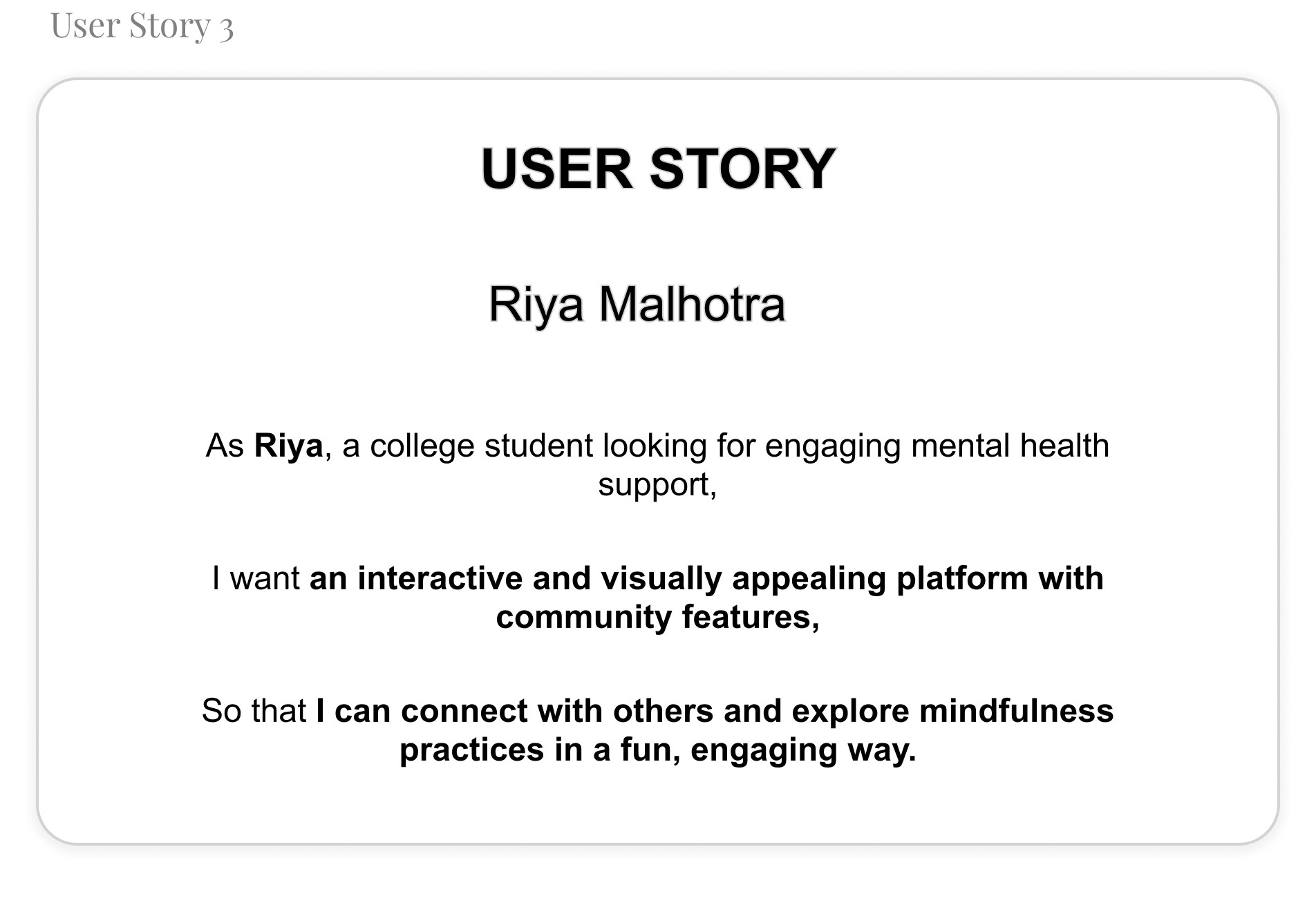
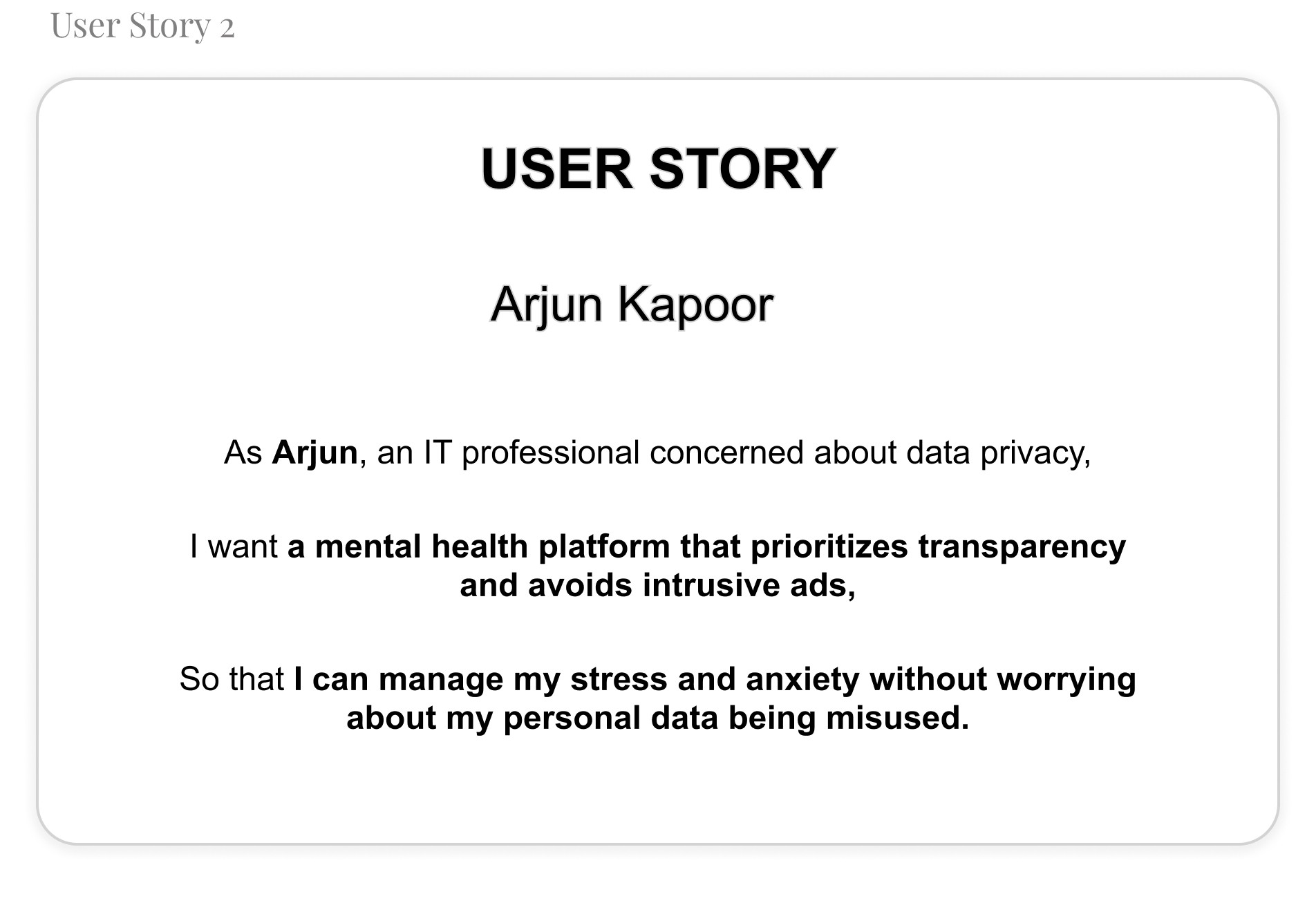
User Stories
To better understand my users, I created user stories that reflect their experiences with Mindmatters.
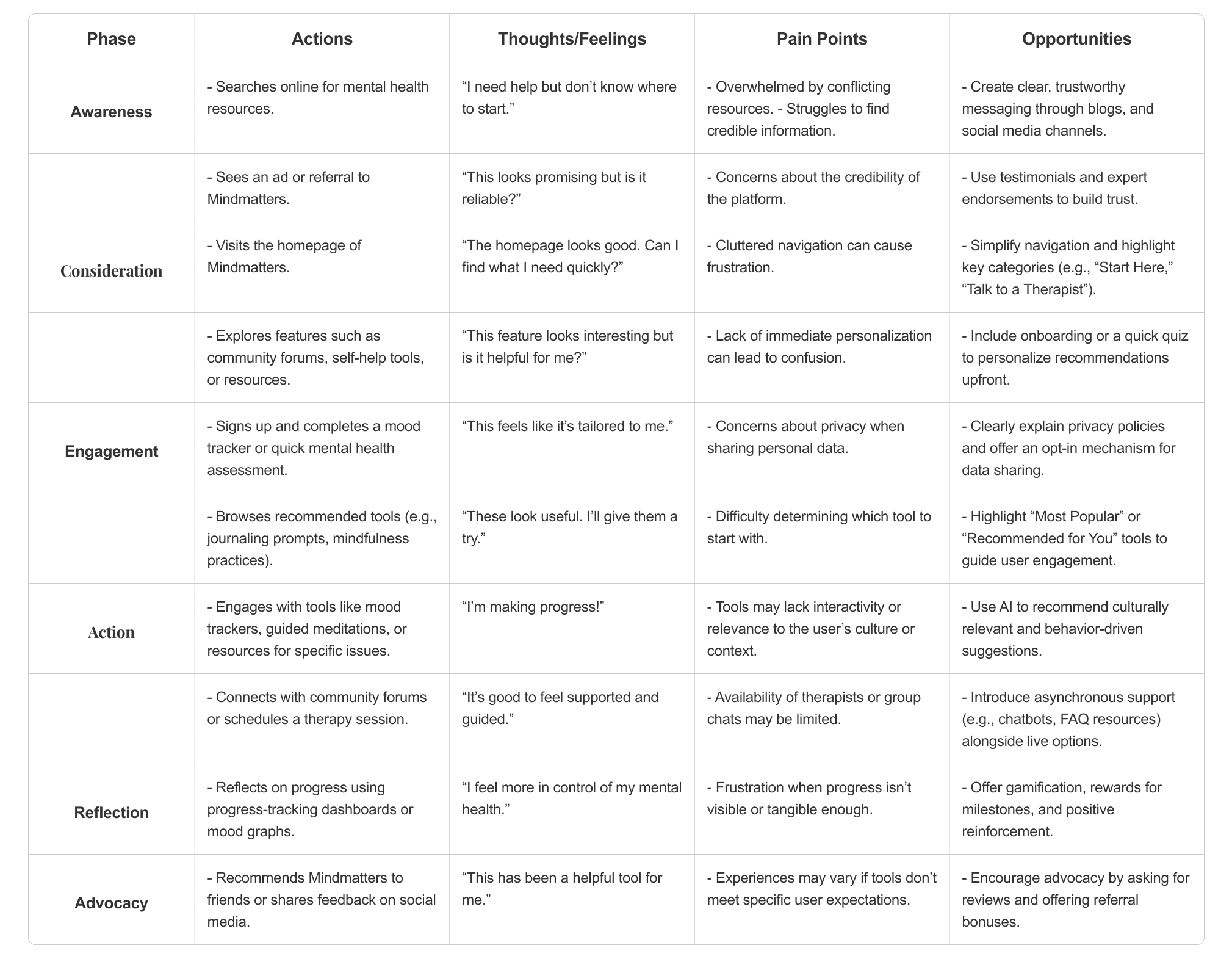
5. User Journey Mapping
I make a user journey map to better understand users needs
B. Define Phase
User Problem Statement
I made a problem statement to address central focus of my survey’s pain points.
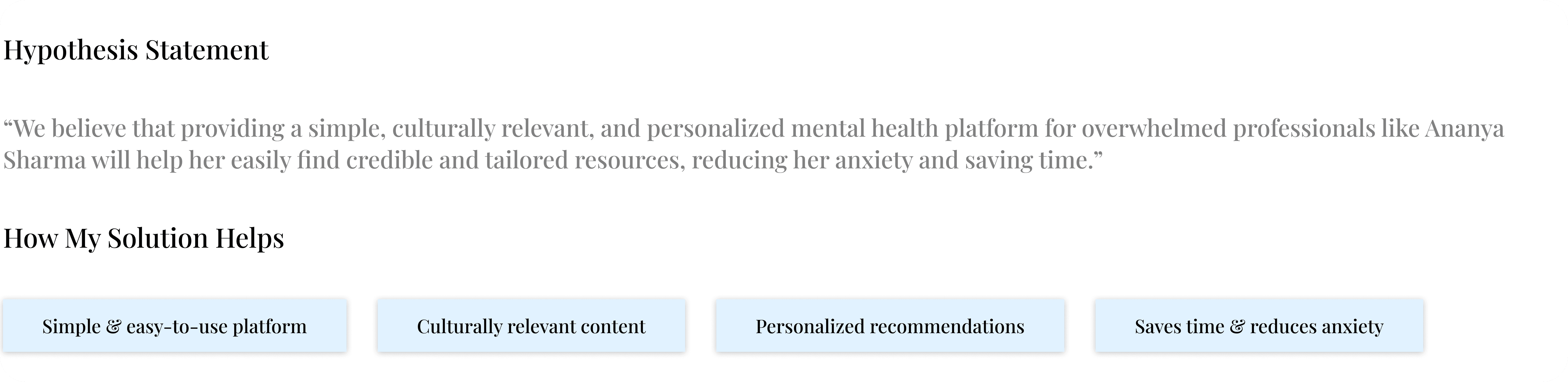
Hypothesis statement
I write hypothesis statement which helped me transition from defining user problems to brainstorming potential solutions. I made an educated guess about what could be the most effective solution to the problem I identified in the problem statement.
“Ananya Sharma is a busy marketing executive who needs a culturally relevant and easy-to-navigate mental health platform because she often feels overwhelmed by conflicting advice and struggles to find credible and personalized resources online.”
Value Propositions
I wrote compelling statements about how I addresses users’ needs and creates unique value for users. It was summarized and synthesized the user benefits from the hypothesis statement.
To create a value proposition, I answer these key questions:
What does my product do? Here, I clearly state the key actions the product enables users to perform and the key benefits it enables them to achieve.
Why should the user care? Here, I emphasize how my product addresses users’ pain points in unique ways that aren’t offered by other products.
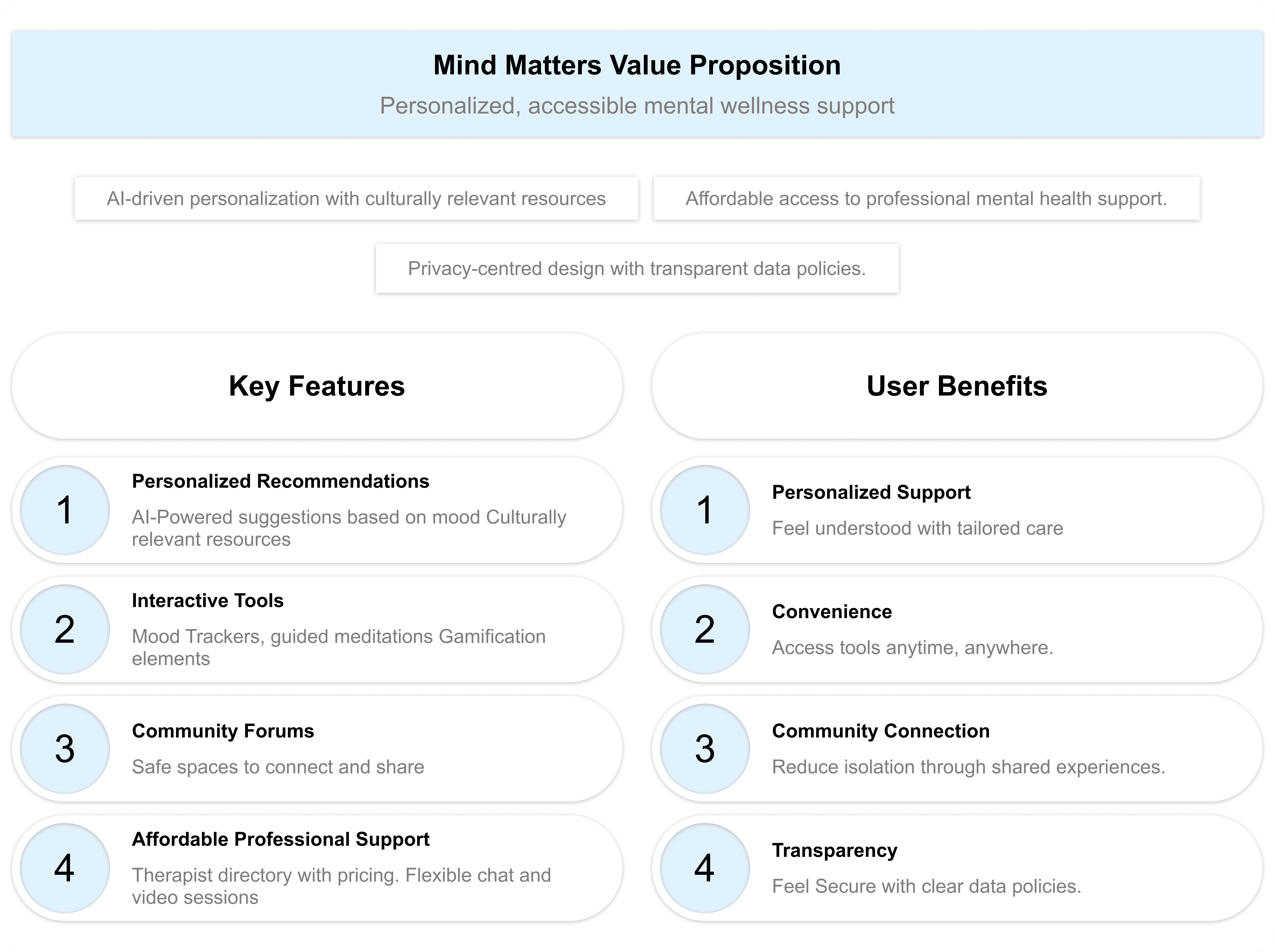
Connection of Features and Benefits with User Needs
Goal Statements:
The Mindmatters website will provide users with personalized mental health resources, interactive tools, and affordable therapy options that will help users manage stress, anxiety, and other mental health challenges by delivering tailored, culturally relevant content and professional support that fits their unique needs and schedules. Users will benefit from an engaging, easy-to-navigate experience that provides real-time mood tracking, progress reports, and access to a supportive community.
I measured effectiveness by offering a personalized recommendation system, secure privacy features, and easy access to therapy sessions, ensuring users can find relevant resources and seek professional help without feeling overwhelmed or losing trust (impact).
Competitive Audit:
To create a truly impactful and user-centric mental health platform, I carefully analyzed both direct and indirect competitors in the industry. These platforms had already established themselves, influencing how users perceive and engage with digital mental health solutions.
By studying their designs, marketing strategies, and user feedback, I identified key strengths, gaps, and opportunities. This competitive analysis provided valuable insights that helped shape MindMatters into a platform that not only meets but exceeds user expectations.
A detailed overview of the competitors is available in the Google Sheet linked below.
C. Ideate Phase
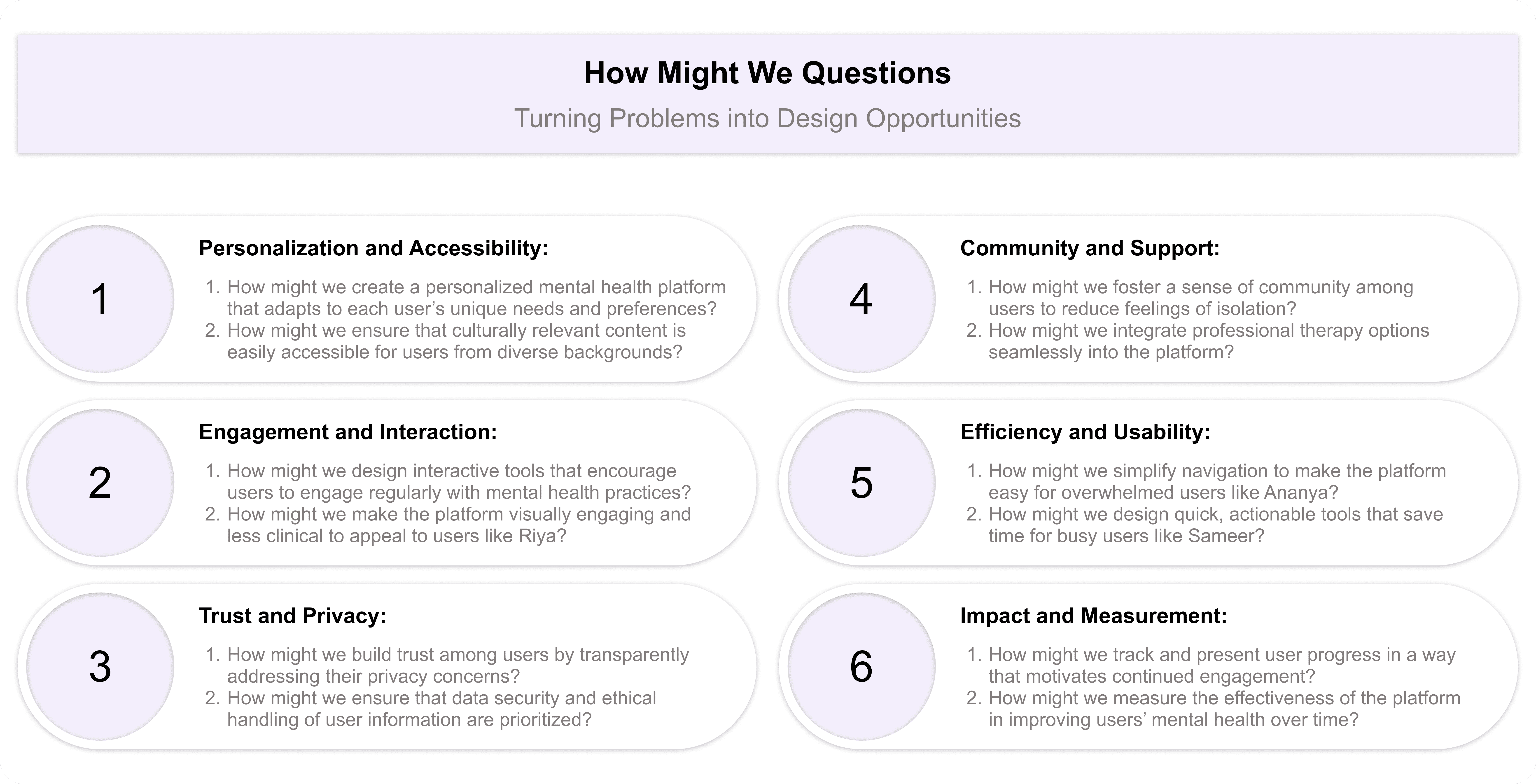
How Might We Questions:
For starting my ideate phase i have started it with asking myself how might we question excercise. This helped me turn problems into design opportunities. I was able to approach the problem from different angles and generate a variety of potential solutions. It was a valuable way to spark creativity and explore innovative ideas. I have revisited my problem statement then reframed these problems into questions that would inspire new ideas and solutions.
After reviewing the problem statements, these were the questions that came to my mind:
D. Prototype Phase
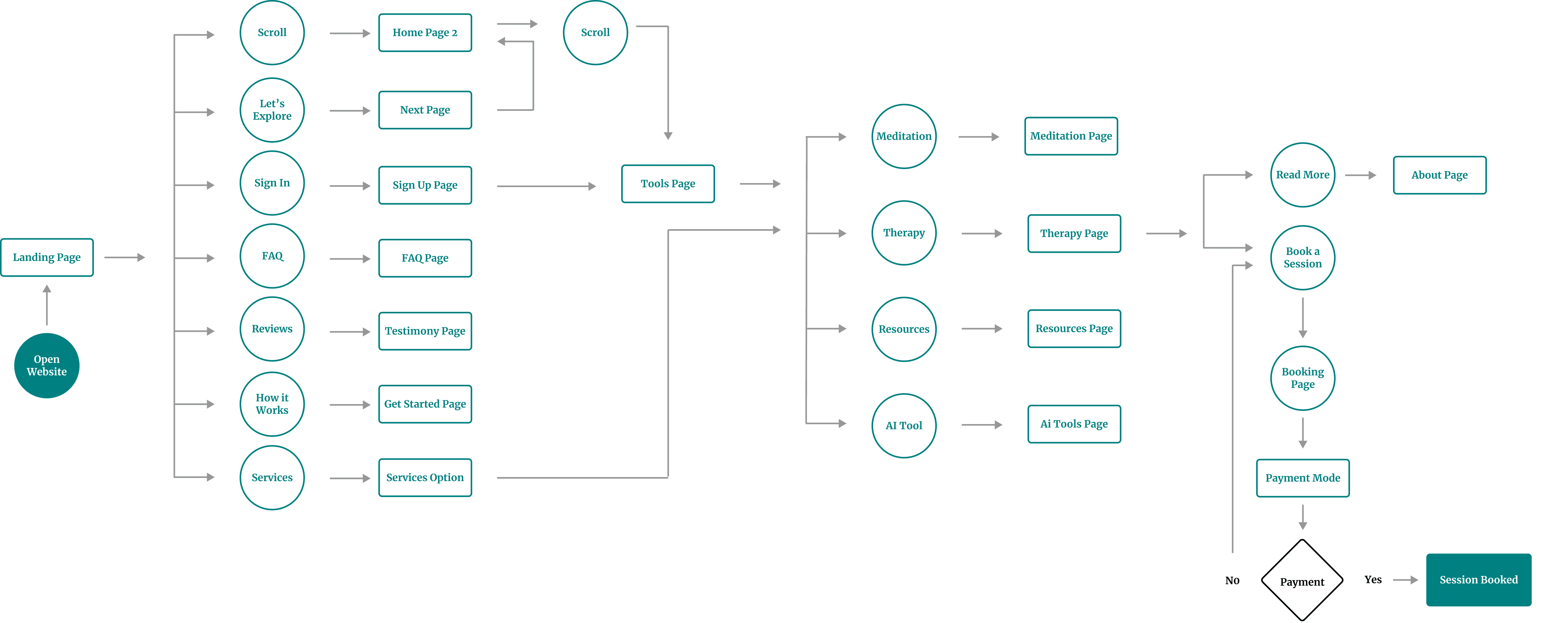
User Flows:
The user flow map I created for Mind Matters website outlined the step-by-step journey a user took, from opening the website to booking a session. I designed it to provide a seamless and intuitive experience, guiding users efficiently through the website’s features and functions.
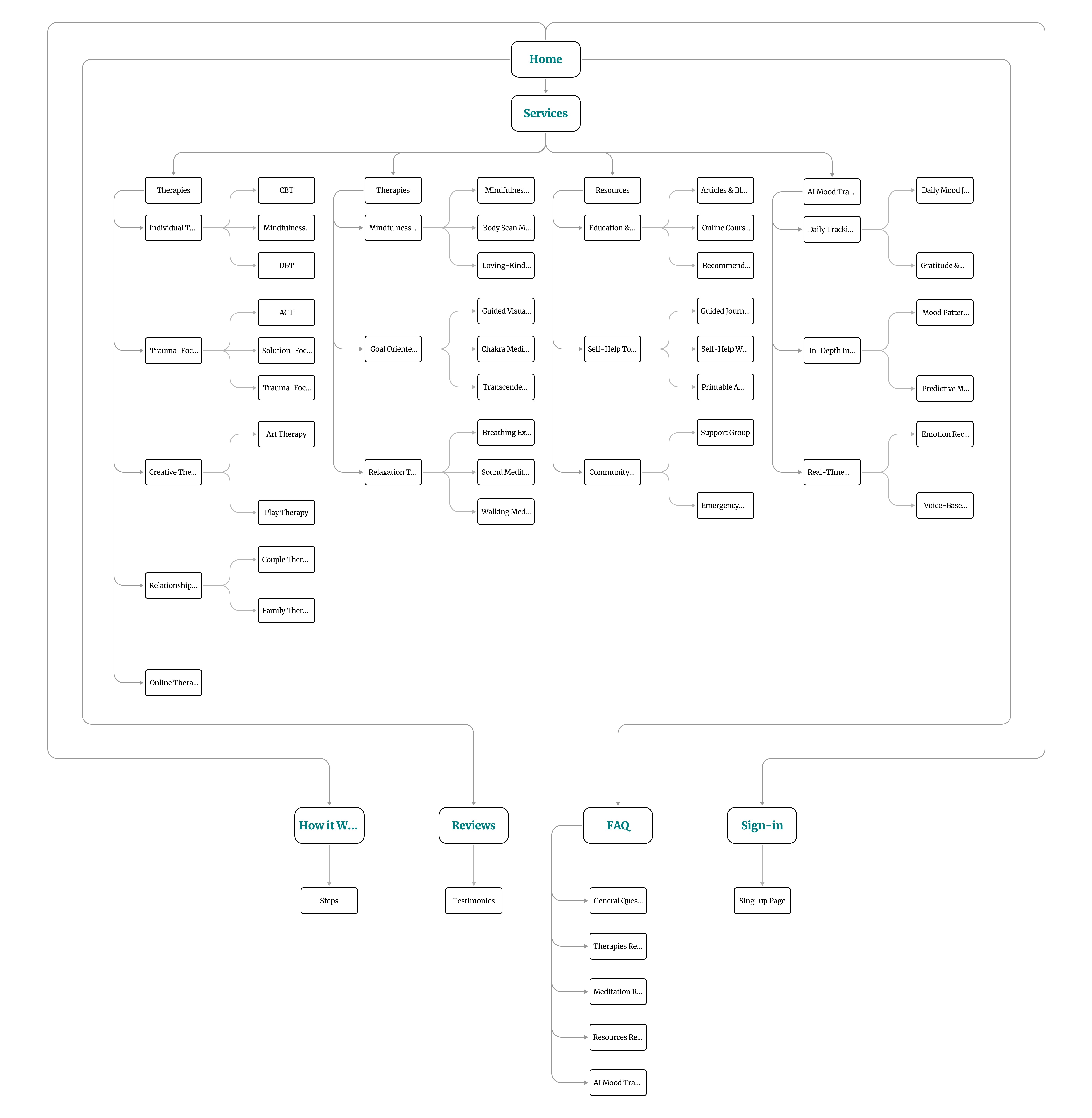
Information Arcthitecture (IA) & Sitemap
My goal was to ensure users could effortlessly navigate the website and find resources, tools, and support that align with their needs. I carefully structured the information to act as a roadmap, guiding users smoothly from one point to another.
Here’s how I approached the information architecture for Mind Matters:
Organization: I emphasized how various elements, such as therapy options, mindfulness practices, and AI-powered mood tracking tools, are interrelated. This logical structure ensures users can easily navigate through the website and find what they’re looking for.
Hierarchy: Using a tree structure, I placed broader categories at the top level, with more detailed subcategories underneath (e.g., CBT, Guided Journaling Group, Daily Mood Journaling Tool). This hierarchical organization helps users understand the relationships between different sections and prevents cognitive overload.
Sequence: I designed a clear path for users to follow, enabling them to explore services and tools step by step. For example, users can start by exploring therapies, move on to mindfulness practices, and then dive into advanced features like AI mood tracking or community support.
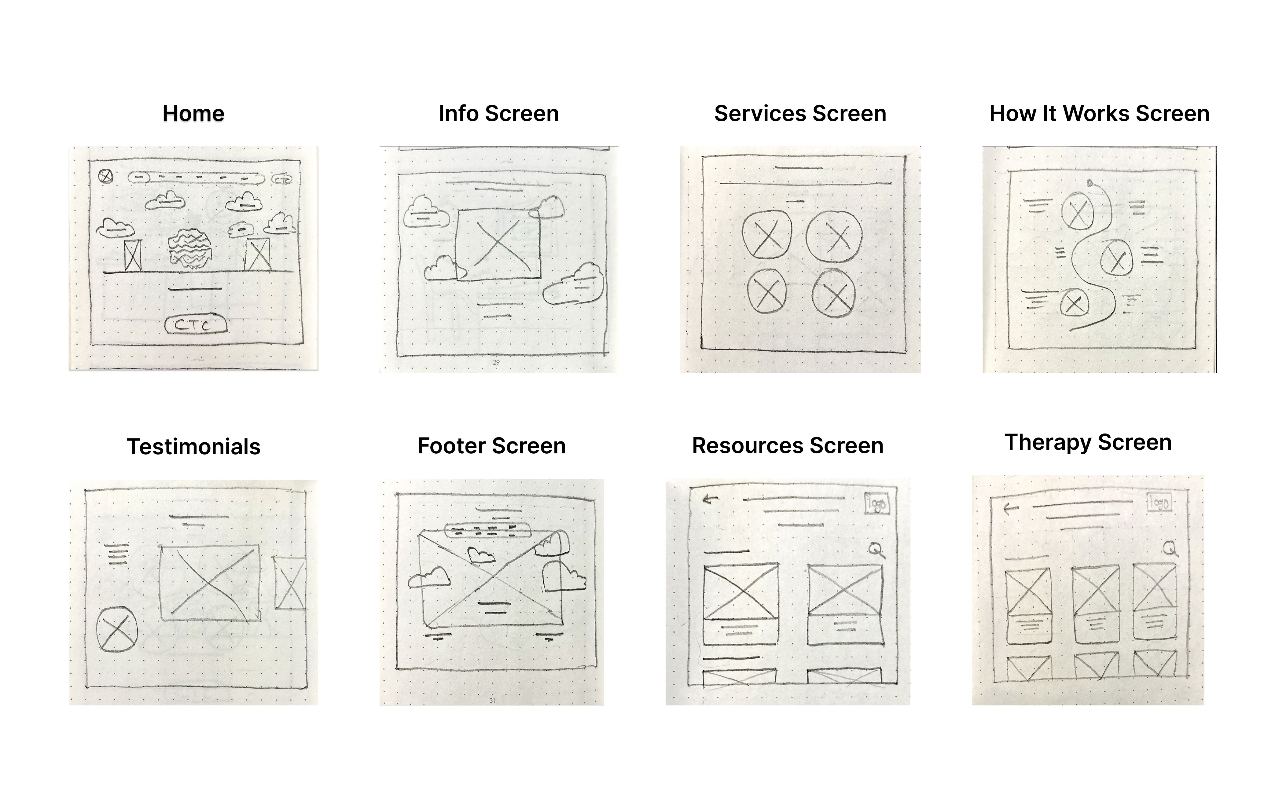
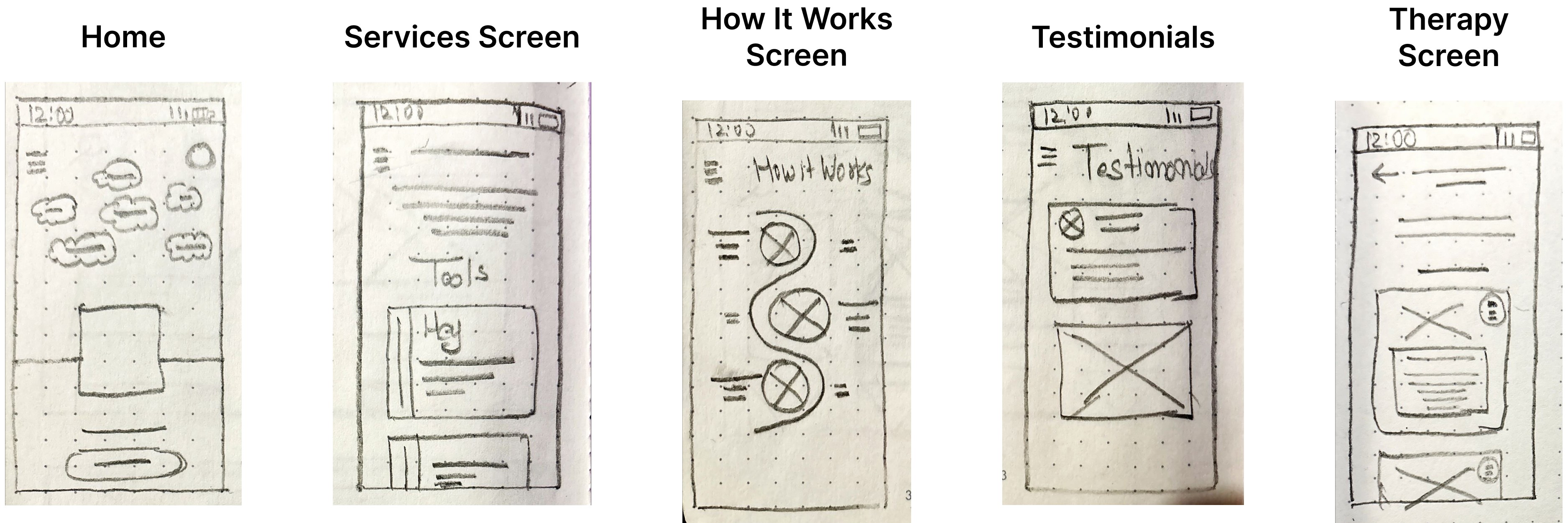
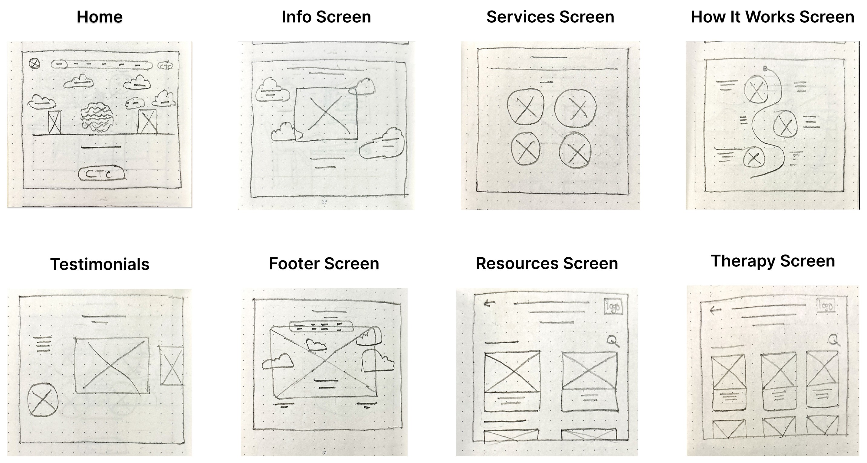
Paper wireframes
To build the basic structure of the Mind Matters website, I started by drawing paper wireframes. This helped me organize ideas and plan the layout, hierarchy, and main features of the website.
Using pen and paper, I sketched different homepage layouts to quickly explore and test ideas. This approach made it easy to focus on the placement of key elements, like menus and content, without worrying about the design details yet.
These paper wireframes became the foundation for creating digital wireframes, low-fidelity prototypes, and eventually high-fidelity prototypes, making sure the design was clear and user-friendly every step of the way.
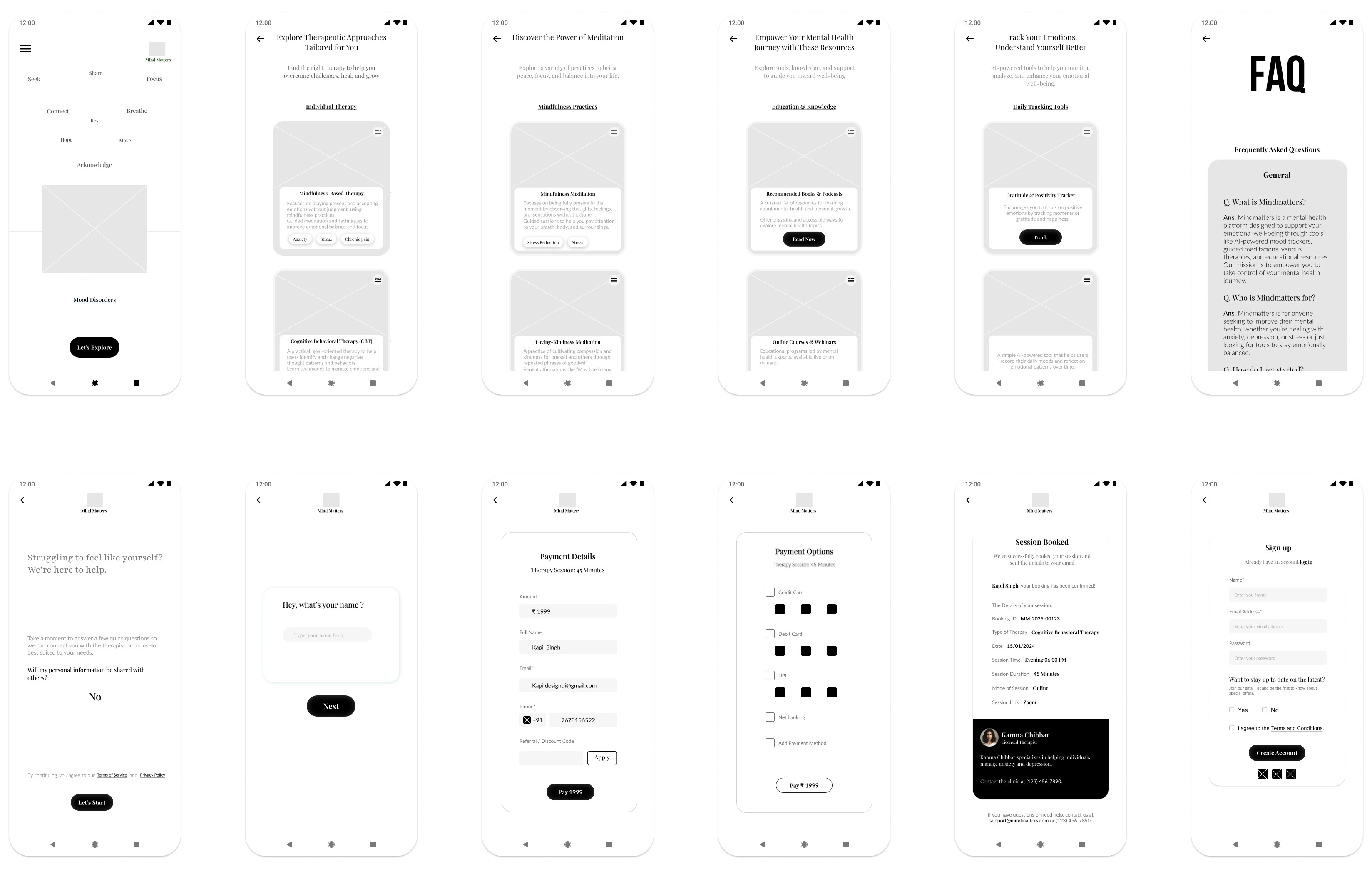
Low-Fidelity(Lo-Fi) Prototype :
I started designing the digital wireframe screens for the Mind Matters website by focusing on each page’s structure and layout. Once the screens were ready, I added connection nodes to map out the navigation. These nodes showed how users would move from one page to another, ensuring a smooth and logical flow. This step helped me visualize the user journey and refine the website’s navigation before moving on to prototypes.
Low-Fidelity(Lo-Fi) Prototype :
Lo-fi prototypes show how users will navigate through each screen of the app. This helps troubleshoot and make necessary corrections. Let’s take a look at how I went about creating a lo-fi prototype from the completed user flow.
First, I designed all the digital wireframe screens needed for the app. Once I had those in place, I used connection nodes to map out the navigation. These nodes indicate where a connection begins and where it should direct users next.
E. Test Phase
Planning UX research studies:
After completing the low-fidelity prototype for Mind Matters, I needed to ensure the lo-fi prototype structure, navigation, and content flow aligned with user expectations before moving into high-fidelity design.
To validate this, I designed a usability testing survey focused on:
• Understanding first impressions of the layout.
• Testing navigation clarity (e.g., finding therapy options, FAQs, and the “How to Start” page).
• Comparing mobile vs. desktop usability for responsiveness.
• Evaluating readability and accessibility for a seamless experience.
This feedback helps refine the wireframe, ensuring an intuitive, user-friendly foundation before progressing to prototyping.
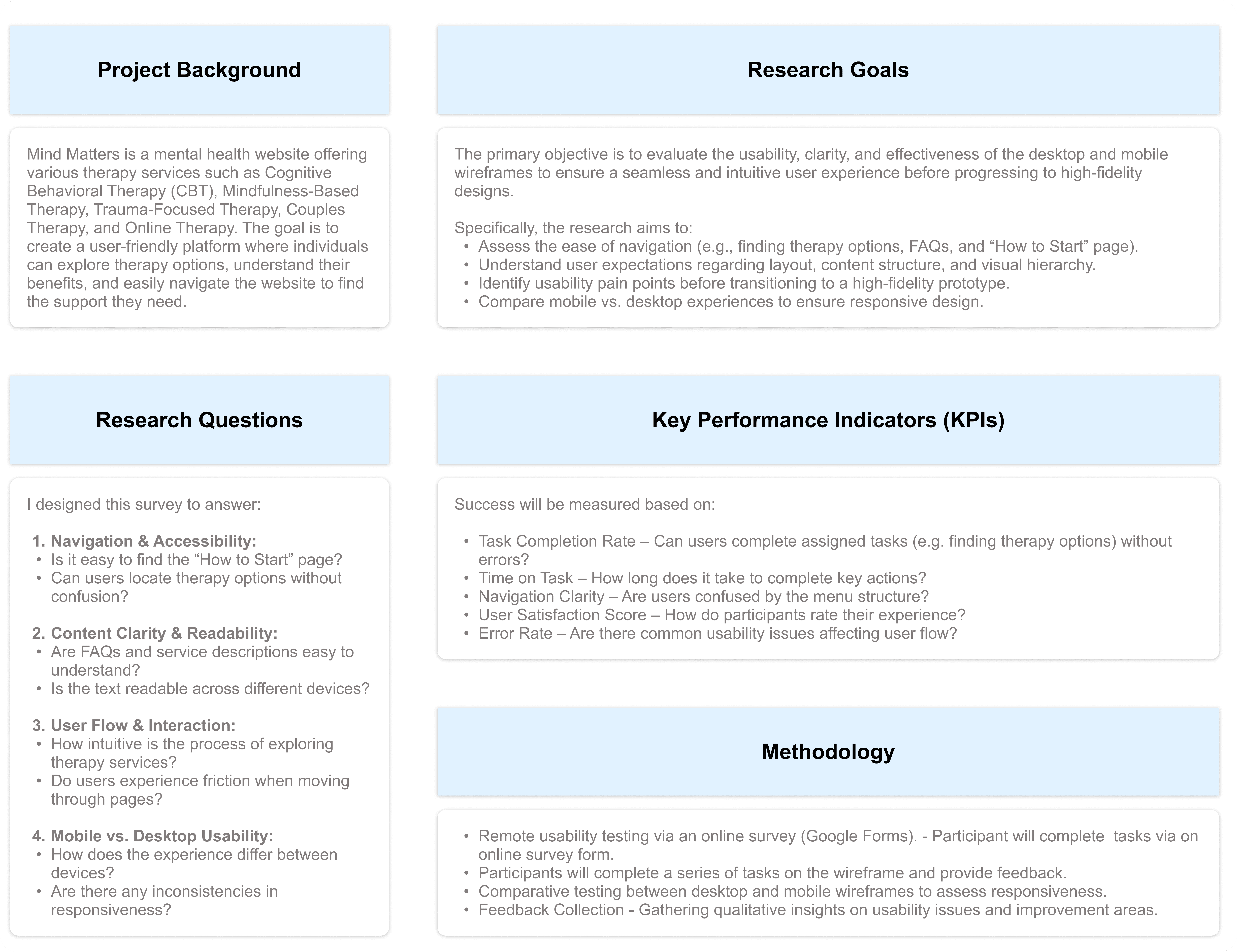
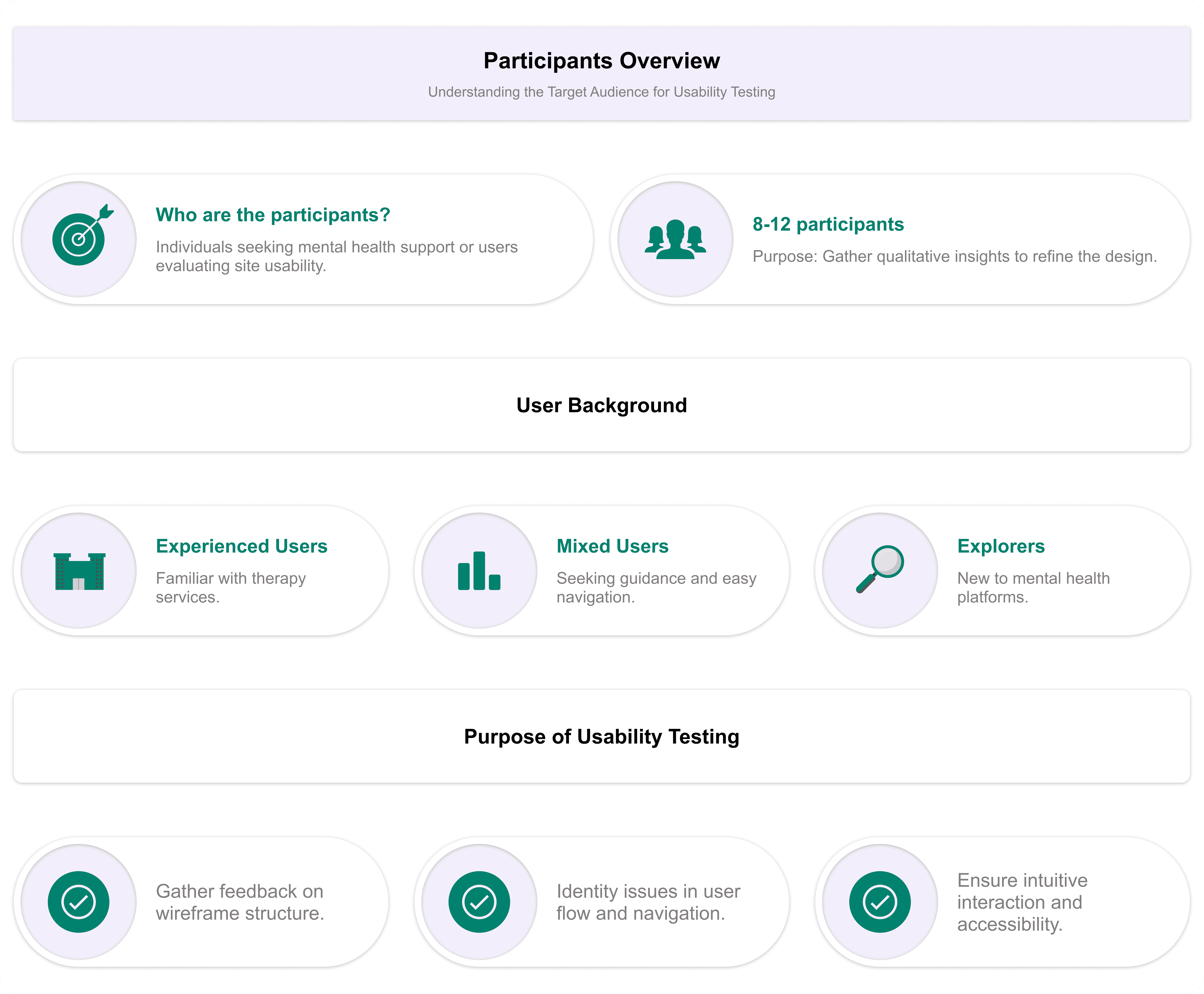
Participants
Survey Form - Google Form
Spreadsheet of Usability Study Data:
To begin reviewing the usability study results, I structured my note-taking process by entering each participant’s name into the blue box in Row 1, Column A of my spreadsheet. From there, I systematically recorded observations based on the participants’ interactions, feedback, and behaviors documented in the usability test responses.
I categorized the first five columns of my spreadsheet to focus on the most relevant usability study elements:
• Tasks Participants Complete – Recorded in Column A.
• Click Path (Sequence of Actions for Each Task) – Recorded in Column B.
• Observations About Participant Behaviors, Feelings, and Pain Points – Recorded in Column C.
• Direct Quotes Highlighting Participant Experiences – Recorded in Column D.
• Ease or Difficulty of Task Completion – Recorded in Column E.
Spreadsheet - Google Sheet
Approach to Analyzing the Usability Test
After conducting the usability study, I transferred the Google Form responses to a spreadsheet, organizing key insights to ensure all feedback was properly documented for analysis. This structured approach helped me evaluate user experiences, identify usability challenges, and pinpoint areas for potential improvement in the MindMatters design.
Affinity diagrams:
While I conducted this activity independently, I kept in mind that in a real-world setting, it is often done collaboratively to streamline research data analysis. Here’s how I structured the process:
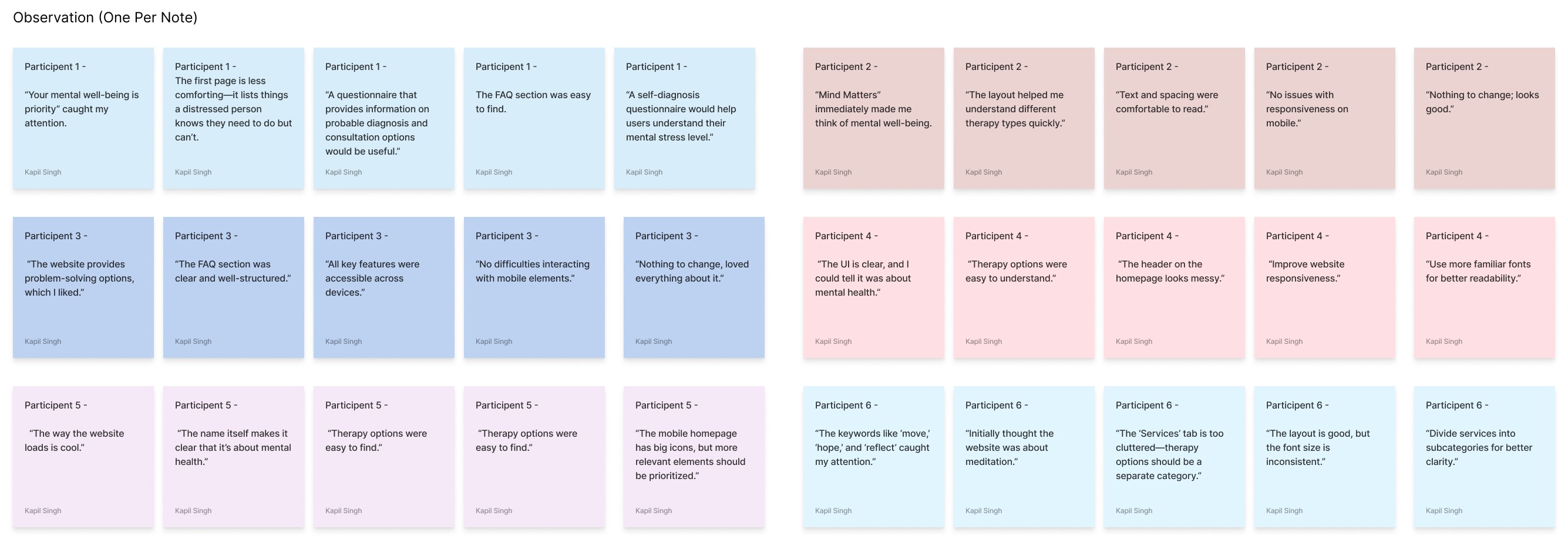
Step 1: Creating Sticky Notes
I transferred all key observations from the usability study into individual sticky notes.
Each sticky note contained only one idea, observation, or direct quote for clarity.
Direct quotes from participants were enclosed in quotation marks to preserve their exact wording.
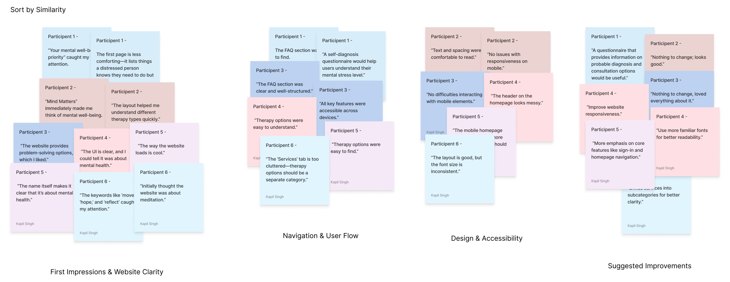
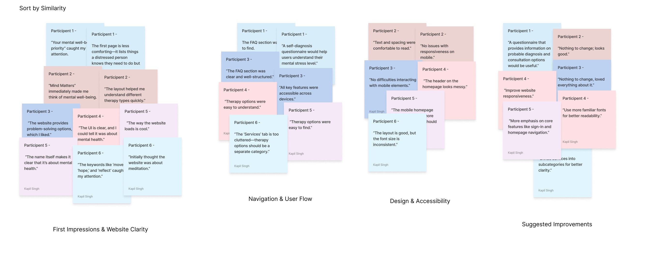
Step 2: Organizing Sticky Notes into Groups
I grouped the sticky notes by common themes or categories.
Some obvious categories emerged quickly, while others were refined as I analyzed the data.
Step 3: Categorizing All Sticky Notes
I ensured that every participant’s feedback was represented within distinct groups.
Based on patterns from the usability study, I identified four major categories:
First Impressions & Website Clarity – Users’ initial reactions and whether they immediately understood the website’s purpose.
Navigation & User Flow – Ease of finding therapy options, FAQs, and other essential pages.
Design & Accessibility – Issues related to responsiveness, layout clarity, readability, and overall user-friendliness.
Suggested Improvements – Participants’ feedback on additional features or structural changes.
Step 4: Reviewing & Refining Groups
Since affinity diagramming is a flexible process, I reviewed my groups and rearranged sticky notes where necessary.
Emerging patterns allowed me to refine categories further and adjust insights accordingly.
Step 5: Creating the Affinity Diagram
The completed affinity diagram helped me visualize key usability themes, making it easier to pinpoint UX problems.
This approach allowed for a creative and structured way to interpret feedback, revealing usability pain points and potential design improvements that weren’t as obvious when reviewing individual responses.
By following this process, I successfully synthesized and categorized usability feedback for Mind Matters, helping to prioritize areas for refinement in the website’s design. Would you like a visual representation of the affinity diagram?
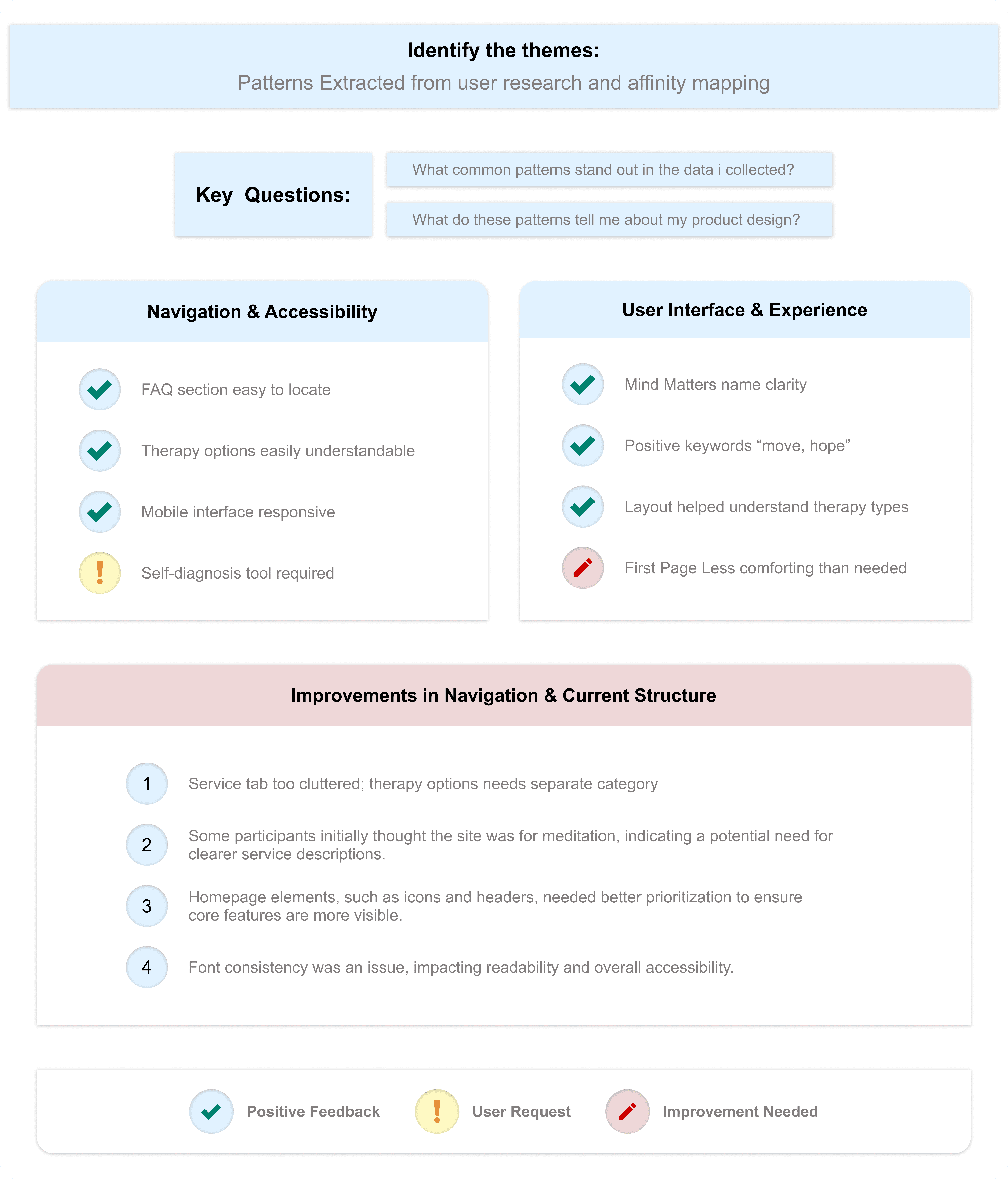
Identify the themes
At this stage, I had already identified several themes by creating an affinity diagram.
Insight Identification from Affinity Diagram:
Prioritizing Design Insights for Enhanced Usability:
By addressing these insights, I aim to create a more structured, accessible, and user-friendly experience for Mind Matters, ensuring that users can easily find the support they need. The iterative design process will continue based on ongoing research and feedback, refining the platform to better serve its users.
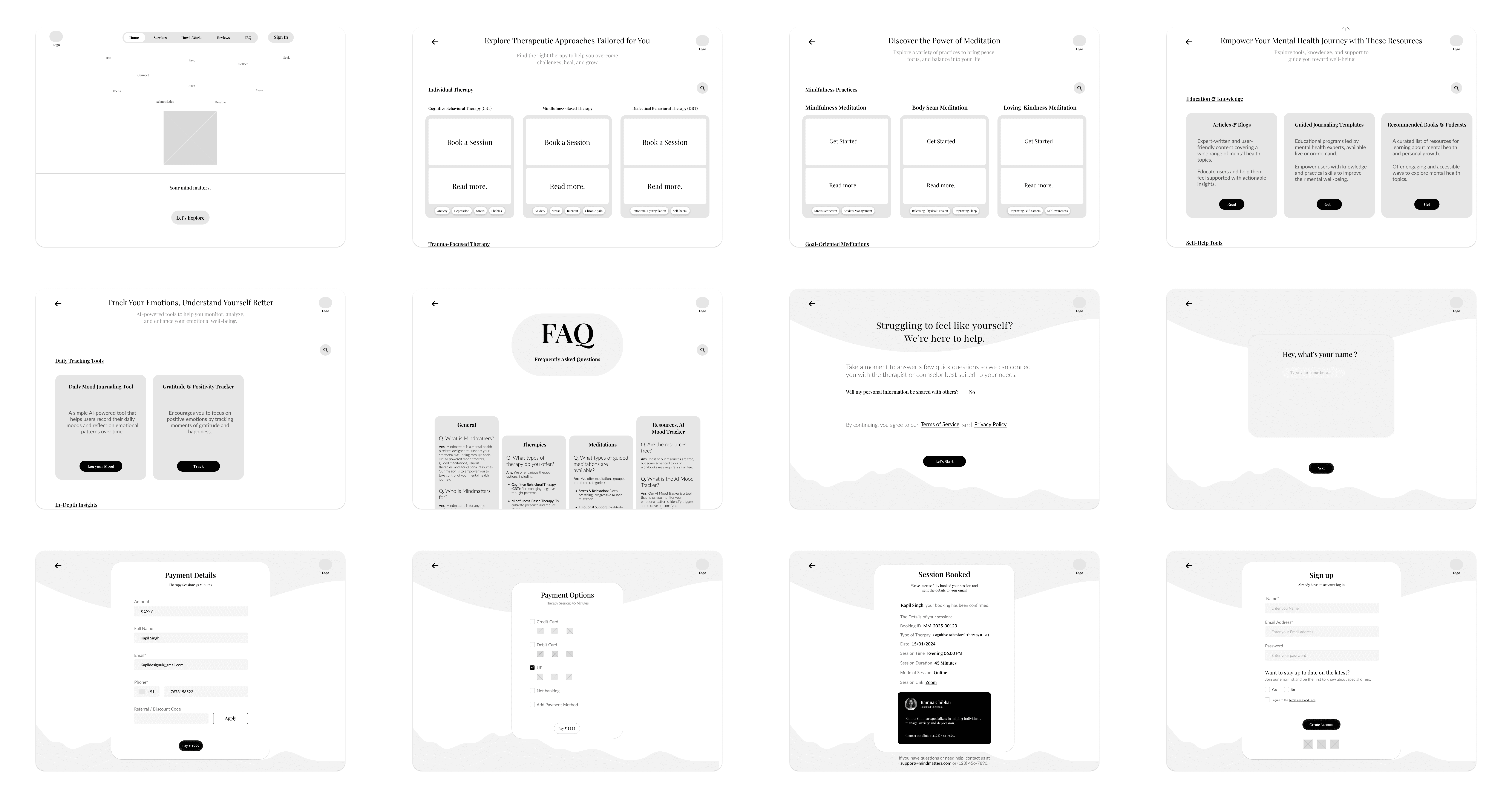
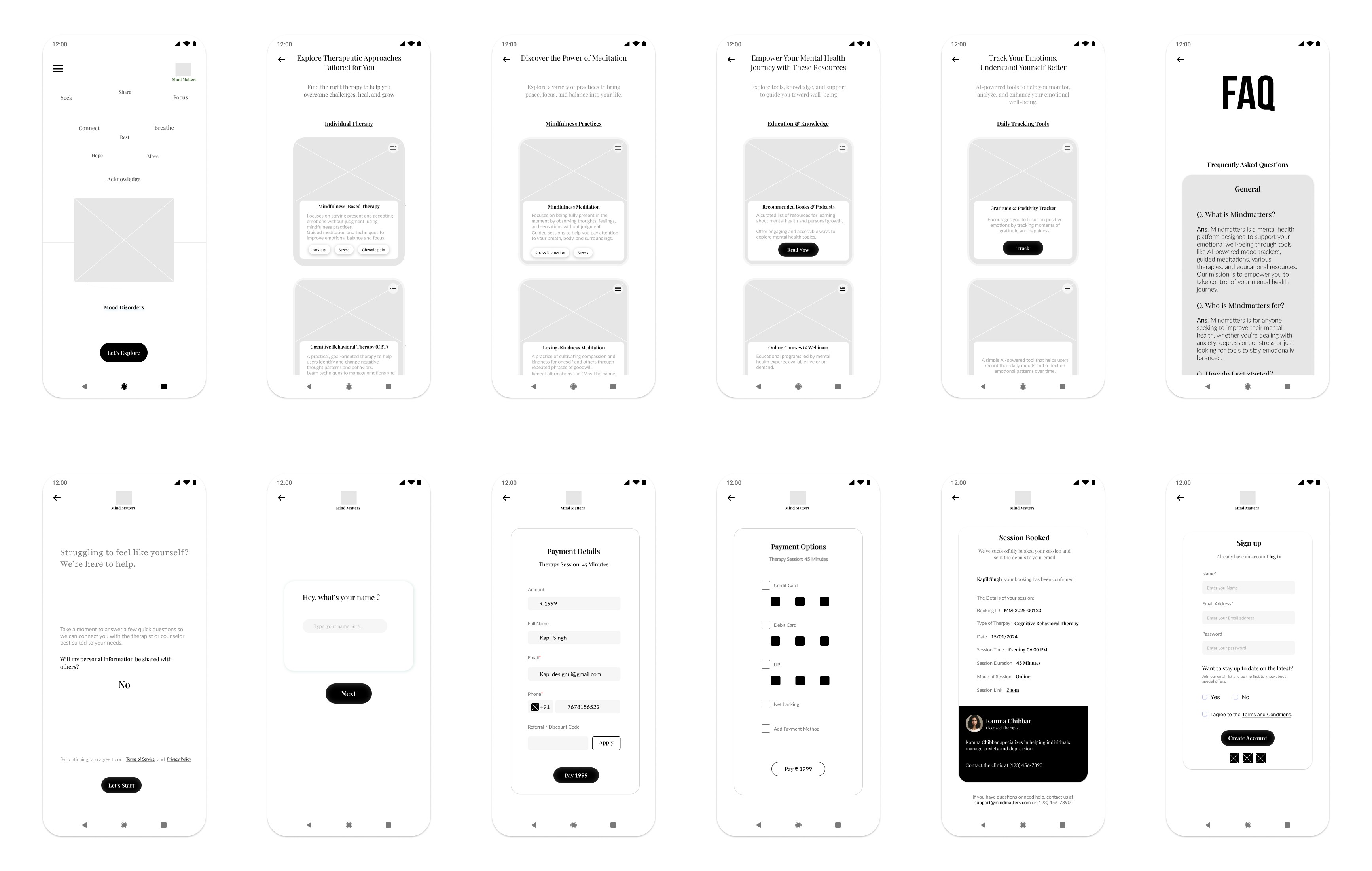
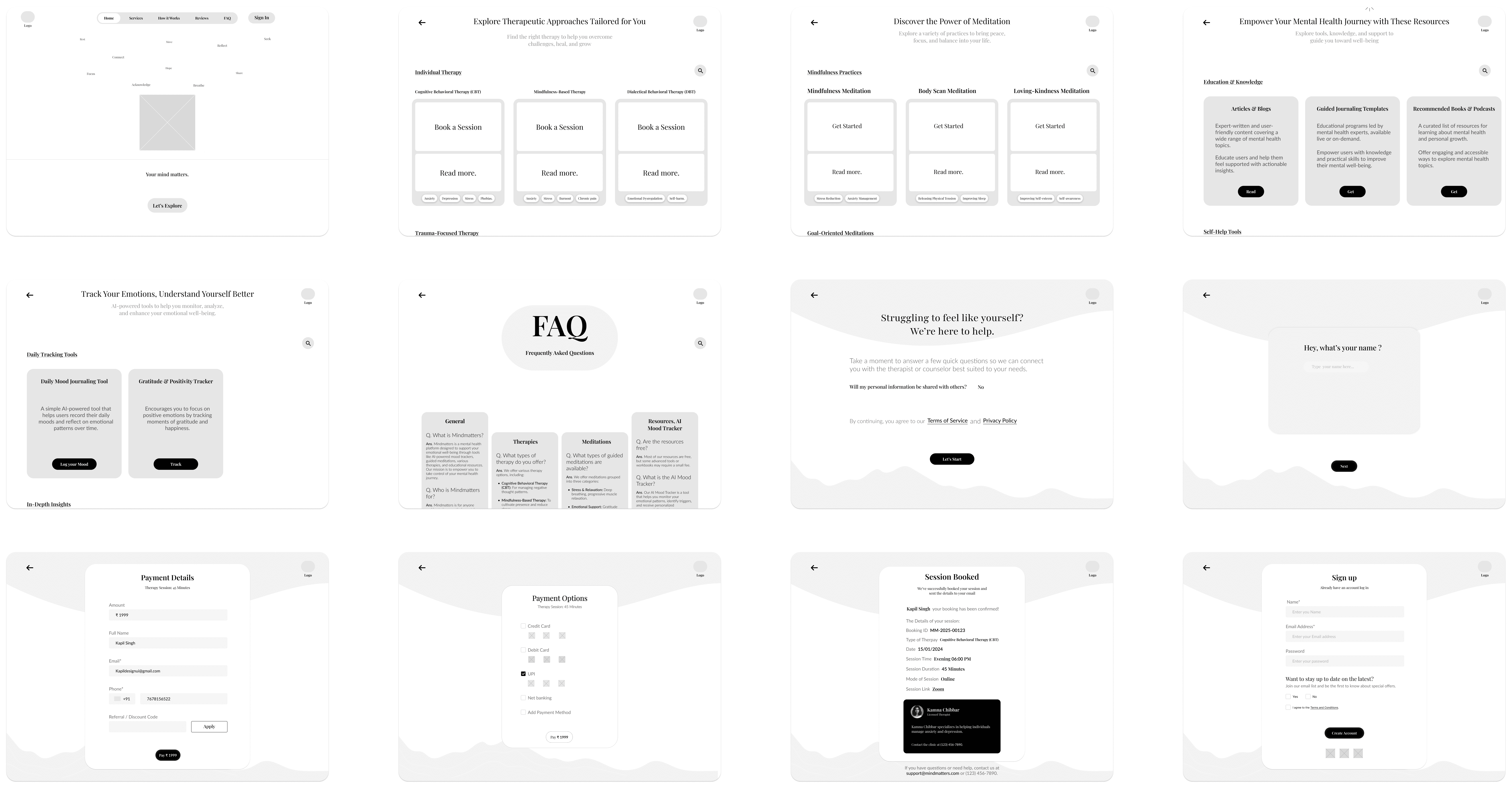
Iterating on Hi-Fi Prototype Based on User Insights
With a well-structured low-fidelity prototype in place, I moved forward with designing the high-fidelity prototype for Mind Matters. This phase involved refining the visual aesthetics, enhancing interactions, and ensuring a seamless, engaging, and accessible user experience.
Key Enhancements in the High-Fidelity Prototype:
Refined Visual Aesthetics: Implemented a calming and professional color palette, typography, and imagery to align with the mental health theme.
Streamlined Navigation: Maintained intuitive navigation elements, ensuring users can easily explore therapy options, book sessions, and access resources.
Enhanced Accessibility & Readability: Improved text hierarchy, button visibility, and contrast for a more inclusive user experience.
Optimized Booking Flow: Designed a clear step-by-step process for selecting therapy types, choosing therapists, and confirming appointments.
Summary of Changes:
Before Hi-Fi Prototype:
Minimal visual design with basic grayscale wireframes.
Limited interaction elements and static navigation.
No clear distinction between primary and secondary actions.
b. After Hi-Fi Prototype:
Enhanced UI & Branding: Applied a soothing color scheme, structured typography, and meaningful imagery to create a welcoming experience.
Interactive & Engaging Elements: Introduced subtle animations, hover effects, and smooth transitions for an intuitive user experience.
Refined Therapy Booking Process: Improved clarity in session selection, therapist profiles, and appointment confirmation.
The high-fidelity prototype successfully translates the core concepts into a functional, visually appealing, and user-friendly platform. This version is now ready for usability testing to gather final insights before the design handoff phase.
To view all the prototypes, visit here: Figma Prototypes
Component and Elements used in the design:
The Mind Matters website is built with a strong emphasis on usability, accessibility, and a calming user experience. The design incorporates carefully chosen components and elements that enhance both the aesthetics and functionality of the platform.
Interactive Components
The website includes dynamic elements such as:
Session Booking Flow: Users can seamlessly select therapy types, choose therapists, and confirm appointments through an interactive booking system.
Progressive Form Fields: Form inputs dynamically update based on user selections, ensuring a smooth and guided experience.
Feedback & Assessments: Users can take self-assessment tests and receive interactive progress feedback.
Buttons & Call-to-Actions (CTAs)
Well-defined primary and secondary buttons guide users through key actions like “Book a Session,” “Take a Self-Assessment,” and “Start Therapy.”
Buttons are designed with high contrast and clear hover states for better usability.
Color Palette
The chosen color scheme promotes a sense of calm and trust:
Celadon Green (#31847F): Symbolizes growth, healing, and mental well-being.
White & Light Gray: Enhance readability and maintain a clean, modern aesthetic.
Typography
Playfair Display: Used for headings to create a sense of warmth and readability.
lato: Selected for body text due to its modern, clean, and approachable feel, improving the website’s accessibility.
The thoughtful selection of these elements ensures a seamless, user-centric experience, making Mind Matters an inviting and effective mental health support platform.
Final Usability Testing & Next Steps
And that’s a wrap! I have created a Google Form for the final usability study of the MindMatters Responsive Website and Web App. The survey has been shared with relevant users, and iterations will be made based on the feedback received.
So far, I have received a few responses, but nothing significant has been identified that requires immediate iteration. However, I remain open to refining and improving the platform to better fulfill its purpose and enhance the overall user experience.
Usability Testing Goals & Key Insights
Goal: Ensure a seamless and intuitive experience for users seeking mental health support.
Method: A structured usability study evaluating task completion efficiency, user confidence, and feature clarity.
Expected Impact:
Improved accessibility and discoverability of therapy options.
Enhanced self-evaluation experience for personalized therapy recommendations.
Streamlined booking and payment process to reduce friction.
I’m open to any suggestions! If you’d like to participate in the usability survey, feel free to take some time and share your feedback. Google Form
To view all the prototypes, visit here: Figma Website Prototypes and Figma Web Application Prototype
Takeaway
Through this case study, I learned the importance of understanding user motivations and pain points in seeking mental health support. By focusing on accessibility, trust, and ease of navigation, I was able to design a platform that resonates with users who need personalized therapy recommendations, guided self-help tools, and a seamless therapy booking experience.
The usability study provided valuable insights, helping me refine MindMatters to ensure an intuitive and supportive experience for users. The self-evaluation tool, enhanced search functionality for therapy options, and improved crisis support accessibility were key design choices that emerged from user research and usability testing.
This project reinforced the importance of iterative design based on real user feedback, ensuring that MindMatters is not just visually appealing but also truly functional, accessible, and impactful for those seeking mental health support.

If you reached here thanks for going through my case study.
I am open to receiving feedback, reviews, questions, and your own insights about this case study.
I'll be glad to respond to all.
The social links for all my profiles can be found at https://bento.me/kapildesign
"I designed Mind Matters to address a universal yet deeply personal challenge: the lack of empathetic, judgment-free mental health tools for people navigating daily stressors alone.
Having experienced anxiety myself, I understood how overwhelming it can feel to find trustworthy resources that balance clinical credibility with warmth. Existing platforms often felt either too clinical (alienating users) or overly simplistic (lacking actionable tools).
By prioritizing cultural relevance, privacy, and human-centered interaction, I aimed to create a space where users—whether students, professionals, or caregivers—could feel seen and empowered without stigma. This project wasn’t just about UX best practices; it was about proving that design can be a lifeline for those silently struggling."
"Mind Matters" is a user-centered website designed to provide accessible, personalized mental health tools and resources. As my first website design from scratch for the Google UX Design Certificate, this project focused on creating a compassionate platform to help users track emotions, set wellness goals, and connect with affordable therapy options.
Project Overview
Case Study - Mind Matters
My Role & Tools
Design Process : Design thinking UX framework
For this case study, I used the design thinking UX framework, which is a user-centered approach to problem-solving. The framework follows five key phases: empathize, define, ideate, prototype, and test. By working through each phase, I was able to better understand who my users are, what challenges they face, and how my design could address their needs. This process helped me dive deep into research, create prototypes, and test ideas to ensure the design was effective and user-focused.
A. Empethize Phase
User Demographics
I selected this user group because mental health awareness is growing among younger individuals, and many are actively seeking digital solutions for therapy, self-help, and emotional well-being. This audience often experiences high levels of stress due to academic pressure, work-life balance, social expectations, or personal challenges, making it essential to design a platform that truly meets their needs.
By focusing on this audience, MindMatters ensures that its features, user interface, and overall experience cater to their specific mental health needs, providing accessible, stigma-free, and professional support.
I used google form to gather Data from a larger audience, I included a mix of quantitative and qualitative questions.
Primary Research - Surveys and Questionnaires
For empathising with users to identify what challenges they face to relate to mental health resources, what motivates them to seek support online and how do they currently engage with mental health platforms ?
Identifying the Target Users for MindMatters
To create a meaningful and effective design for MindMatters, I needed to first clearly identify the target users. Understanding their specific needs, challenges, and behaviors was crucial in making thoughtful, data-driven design decisions that align with their mental health concerns. Defining the core user base allowed me to conduct focused research, ensuring that the platform truly resonates with its audience and offers the right solutions.
User Pain Points
From my survey i identified key pain points experienced by users while getting help related to mental health. These insights helped me understand the challenges users faced and informed my design decisions to address their needs more effectively. Through analyzing these pain points, I was able to develop a more user-centered solution tailored to improving the overall support online.
3. User Personas
I gathered and organised data from user survey and user pain points and turned them into user personas which are representing different groups of users.
4. User Stories
To better understand my users, I created user stories that reflect their experiences with Mindmatters.
5. User Journey Mapping
I make a user journey map to better understand users needs
B. Define Phase
User Problem Statement
I made a problem statement to address central focus of my survey’s pain points.
Hypothesis statement
I write hypothesis statement which helped me transition from defining user problems to brainstorming potential solutions. I made an educated guess about what could be the most effective solution to the problem I identified in the problem statement.
“Ananya Sharma is a busy marketing executive who needs a culturally relevant and easy-to-navigate mental health platform because she often feels overwhelmed by conflicting advice and struggles to find credible and personalized resources online.”
Value Propositions
I wrote compelling statements about how I addresses users’ needs and creates unique value for users. It was summarized and synthesized the user benefits from the hypothesis statement.
To create a value proposition, I answer these key questions:
What does my product do? Here, I clearly state the key actions the product enables users to perform and the key benefits it enables them to achieve.
Why should the user care? Here, I emphasize how my product addresses users’ pain points in unique ways that aren’t offered by other products.
Goal Statements:
The Mindmatters website will provide users with personalized mental health resources, interactive tools, and affordable therapy options that will help users manage stress, anxiety, and other mental health challenges by delivering tailored, culturally relevant content and professional support that fits their unique needs and schedules. Users will benefit from an engaging, easy-to-navigate experience that provides real-time mood tracking, progress reports, and access to a supportive community.
I measured effectiveness by offering a personalized recommendation system, secure privacy features, and easy access to therapy sessions, ensuring users can find relevant resources and seek professional help without feeling overwhelmed or losing trust (impact).
Competitive Audit:
To create a truly impactful and user-centric mental health platform, I carefully analyzed both direct and indirect competitors in the industry. These platforms had already established themselves, influencing how users perceive and engage with digital mental health solutions.
By studying their designs, marketing strategies, and user feedback, I identified key strengths, gaps, and opportunities. This competitive analysis provided valuable insights that helped shape MindMatters into a platform that not only meets but exceeds user expectations.
A detailed overview of the competitors is available in the Google Sheet linked below.
C. Ideate Phase
How Might We Questions:
For starting my ideate phase i have started it with asking myself how might we question excercise. This helped me turn problems into design opportunities. I was able to approach the problem from different angles and generate a variety of potential solutions. It was a valuable way to spark creativity and explore innovative ideas. I have revisited my problem statement then reframed these problems into questions that would inspire new ideas and solutions.
After reviewing the problem statements, these were the questions that came to my mind:
E. Test
D. Prototype Phase
User Flows:
The user flow map I created for Mind Matters website outlined the step-by-step journey a user took, from opening the website to booking a session. I designed it to provide a seamless and intuitive experience, guiding users efficiently through the website’s features and functions.
Information Arcthitecture (IA) & Sitemap :
My goal was to ensure users could effortlessly navigate the website and find resources, tools, and support that align with their needs. I carefully structured the information to act as a roadmap, guiding users smoothly from one point to another.
Here’s how I approached the information architecture for Mind Matters:
Organization: I emphasized how various elements, such as therapy options, mindfulness practices, and AI-powered mood tracking tools, are interrelated. This logical structure ensures users can easily navigate through the website and find what they’re looking for.
Hierarchy: Using a tree structure, I placed broader categories (e.g., Therapies, Mindfulness & Meditation, Resources) at the top level, with more detailed subcategories underneath (e.g., CBT, Guided Journaling Group, Daily Mood Journaling Tool). This hierarchical organization helps users understand the relationships between different sections and prevents cognitive overload.
Sequence: I designed a clear path for users to follow, enabling them to explore services and tools step by step. For example, users can start by exploring therapies, move on to mindfulness practices, and then dive into advanced features like AI mood tracking or community support.
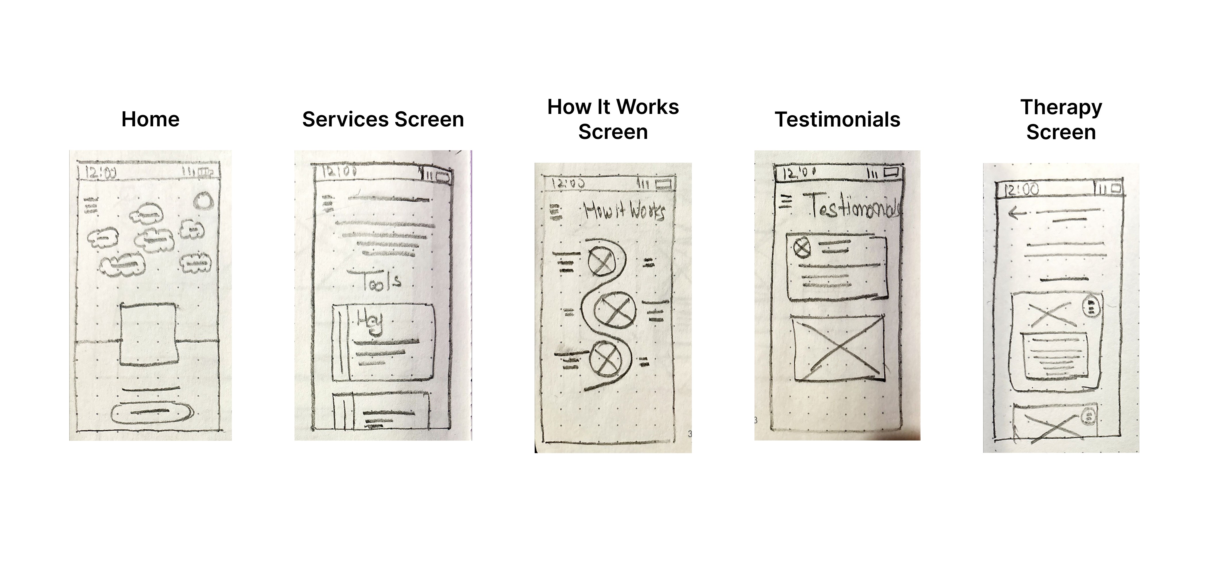
Paper wireframes :
To build the basic structure of the Mind Matters website, I started by drawing paper wireframes. This helped me organize ideas and plan the layout, hierarchy, and main features of the website.
Using pen and paper, I sketched different homepage layouts to quickly explore and test ideas. This approach made it easy to focus on the placement of key elements, like menus and content, without worrying about the design details yet.
These paper wireframes became the foundation for creating digital wireframes, low-fidelity prototypes, and eventually high-fidelity prototypes, making sure the design was clear and user-friendly every step of the way.
Low-Fidelity(Lo-Fi) Prototype :
I started designing the digital wireframe screens for the Mind Matters website by focusing on each page’s structure and layout. Once the screens were ready, I added connection nodes to map out the navigation. These nodes showed how users would move from one page to another, ensuring a smooth and logical flow. This step helped me visualize the user journey and refine the website’s navigation before moving on to prototypes.
Planning UX research studies:
After completing the low-fidelity prototype for Mind Matters, I needed to ensure the lo-fi prototype structure, navigation, and content flow aligned with user expectations before moving into high-fidelity design.
To validate this, I designed a usability testing survey focused on:
• Understanding first impressions of the layout.
• Testing navigation clarity (e.g., finding therapy options, FAQs, and the “How to Start” page).
• Comparing mobile vs. desktop usability for responsiveness.
• Evaluating readability and accessibility for a seamless experience.
This feedback helps refine the wireframe, ensuring an intuitive, user-friendly foundation before progressing to prototyping.
Participants:
Spreadsheet of Usability Study Data:
To begin reviewing the usability study results, I structured my note-taking process by entering each participant’s name into the blue box in Row 1, Column A of my spreadsheet. From there, I systematically recorded observations based on the participants’ interactions, feedback, and behaviors documented in the usability test responses.
I categorized the first five columns of my spreadsheet to focus on the most relevant usability study elements:
• Tasks Participants Complete – Recorded in Column A.
• Click Path (Sequence of Actions for Each Task) – Recorded in Column B.
• Observations About Participant Behaviors, Feelings, and Pain Points – Recorded in Column C.
• Direct Quotes Highlighting Participant Experiences – Recorded in Column D.
• Ease or Difficulty of Task Completion – Recorded in Column E.
Approach to Analyzing the Usability Test
After conducting the usability study, I transferred the Google Form responses to a spreadsheet, organizing key insights to ensure all feedback was properly documented for analysis. This structured approach helped me evaluate user experiences, identify usability challenges, and pinpoint areas for potential improvement in the MindMatters design.
Affinity diagrams:
Affinity diagramming is an effective method for synthesizing data by organizing it into shared themes and relationships. While I conducted this activity independently, I kept in mind that in a real-world setting, it is often done collaboratively to streamline research data analysis. Here’s how I structured the process:
Step 1: Creating Sticky Notes
I transferred all key observations from the usability study into individual sticky notes.
Each sticky note contained only one idea, observation, or direct quote for clarity.
Direct quotes from participants were enclosed in quotation marks to preserve their exact wording.
Step 2: Organizing Sticky Notes into Groups
I grouped the sticky notes by common themes or categories.
Some obvious categories emerged quickly, while others were refined as I analyzed the data.
Step 3: Categorizing All Sticky Notes
I ensured that every participant’s feedback was represented within distinct groups.
Based on patterns from the usability study, I identified four major categories:
First Impressions & Website Clarity – Users’ initial reactions and whether they immediately understood the website’s purpose.
Navigation & User Flow – Ease of finding therapy options, FAQs, and other essential pages.
Design & Accessibility – Issues related to responsiveness, layout clarity, readability, and overall user-friendliness.
Suggested Improvements – Participants’ feedback on additional features or structural changes.
Step 4: Reviewing & Refining Groups
Since affinity diagramming is a flexible process, I reviewed my groups and rearranged sticky notes where necessary.
Emerging patterns allowed me to refine categories further and adjust insights accordingly.
Step 5: Creating the Affinity Diagram
The completed affinity diagram helped me visualize key usability themes, making it easier to pinpoint UX problems.
This approach allowed for a creative and structured way to interpret feedback, revealing usability pain points and potential design improvements that weren’t as obvious when reviewing individual responses.
By following this process, I successfully synthesized and categorized usability feedback for Mind Matters, helping to prioritize areas for refinement in the website’s design. Would you like a visual representation of the affinity diagram?
Identify the themes:
At this stage, I had already identified several themes by creating an affinity diagram.
Insight Identification from Affinity Diagram:
Prioritizing Design Insights for Enhanced Usability:
Iterating on Hi-Fi Prototype Based on User Insights
With a well-structured low-fidelity prototype in place, I moved forward with designing the high-fidelity prototype for Mind Matters. This phase involved refining the visual aesthetics, enhancing interactions, and ensuring a seamless, engaging, and accessible user experience.
Key Enhancements in the High-Fidelity Prototype:
Refined Visual Aesthetics: Implemented a calming and professional color palette, typography, and imagery to align with the mental health theme.
Streamlined Navigation: Maintained intuitive navigation elements, ensuring users can easily explore therapy options, book sessions, and access resources.
Enhanced Accessibility & Readability: Improved text hierarchy, button visibility, and contrast for a more inclusive user experience.
Optimized Booking Flow: Designed a clear step-by-step process for selecting therapy types, choosing therapists, and confirming appointments.
Summary of Changes:
Before Hi-Fi Prototype:
Minimal visual design with basic grayscale wireframes.
Limited interaction elements and static navigation.
No clear distinction between primary and secondary actions.
b. After Hi-Fi Prototype:
Enhanced UI & Branding: Applied a soothing color scheme, structured typography, and meaningful imagery to create a welcoming experience.
Interactive & Engaging Elements: Introduced subtle animations, hover effects, and smooth transitions for an intuitive user experience.
Refined Therapy Booking Process: Improved clarity in session selection, therapist profiles, and appointment confirmation.
The high-fidelity prototype successfully translates the core concepts into a functional, visually appealing, and user-friendly platform. This version is now ready for usability testing to gather final insights before the design handoff phase.
To view all the prototypes, visit here: Figma Prototypes
Component and Elements used in the design:
The Mind Matters website is built with a strong emphasis on usability, accessibility, and a calming user experience. The design incorporates carefully chosen components and elements that enhance both the aesthetics and functionality of the platform.
Interactive Components
The website includes dynamic elements such as:
Session Booking Flow: Users can seamlessly select therapy types, choose therapists, and confirm appointments through an interactive booking system.
Progressive Form Fields: Form inputs dynamically update based on user selections, ensuring a smooth and guided experience.
Feedback & Assessments: Users can take self-assessment tests and receive interactive progress feedback.
Buttons & Call-to-Actions (CTAs)
Well-defined primary and secondary buttons guide users through key actions like “Book a Session,” “Take a Self-Assessment,” and “Start Therapy.”
Buttons are designed with high contrast and clear hover states for better usability.
Color Palette
The chosen color scheme promotes a sense of calm and trust:
Celadon Green (#31847F): Symbolizes growth, healing, and mental well-being.
White & Light Gray: Enhance readability and maintain a clean, modern aesthetic.
Typography
Playfair Display: Used for headings to create a sense of warmth and readability.
lato: Selected for body text due to its modern, clean, and approachable feel, improving the website’s accessibility.
The thoughtful selection of these elements ensures a seamless, user-centric experience, making Mind Matters an inviting and effective mental health support platform.
To view all the prototypes, visit here: Figma Website Prototypes and Figma Web Application Prototype
Final Usability Testing & Next Steps
And that’s a wrap! I have created a Google Form for the final usability study of the MindMatters Responsive Website and Web App. The survey has been shared with relevant users, and iterations will be made based on the feedback received.
So far, I have received a few responses, but nothing significant has been identified that requires immediate iteration. However, I remain open to refining and improving the platform to better fulfill its purpose and enhance the overall user experience.
Usability Testing Goals & Key Insights
Goal: Ensure a seamless and intuitive experience for users seeking mental health support.
Method: A structured usability study evaluating task completion efficiency, user confidence, and feature clarity.
Expected Impact:
Improved accessibility and discoverability of therapy options.
Enhanced self-evaluation experience for personalized therapy recommendations.
Streamlined booking and payment process to reduce friction.