

Case Study - 2nd Shop: Because shopping second-hand is the first rule of thrift.
2nd Shop app is the ultimate destination for fashion-forward folks. Imagine a treasure trove of pre-loved clothes, all in one convenient place. No more digging through dusty thrift stores or scrolling endlessly online. So get ready to unleash your inner thrift warrior and discover your new favorite outfit without breaking the bank!

The Design Evolution
Summary
This is my first case study after completing my course. It’s a bit lengthy, so grab a drink, settle in, and get ready to scroll! I’ve packed it with knowledge I have gained from my learnings, and I’m confident it’ll be worth your time.
When I started this project, I was staring at a blank screen, unsure of where to begin. Despite learning a lot in the course, my brain was in overdrive as I tried to organize my thoughts and make this case study as great as possible.
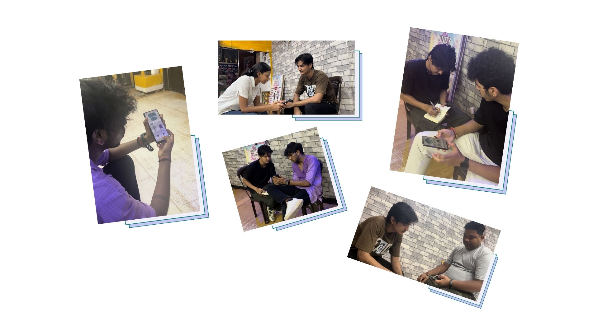
Once I prepared myself, I thought about the design process, and when I was ready with my plan, I was good to go. But here’s the kicker—I started working at night, so gathering primary research wasn’t an option. Instead, I hopped on Google and got to work with some solid secondary research.
I read some articles on Medium and wandered through various websites until my brain was sufficiently stuffed with information. After this late-night research journey, here’s what I discovered:
" There's a growing fashion craze among millennials and gen-z to middle-aged adults, leading to a surge in online fashion shopping. However, the second-hand shopping market hasn't quite caught on in India. Several factors contribute to this lag, but the gist is that online thrift stores need to get creative to lure in customers and keep them around. The main goal of my app is to help users buy pre-owned clothes. "
The read and research was worth spending my time on it. In conclusion, if at first you don’t succeed… do a bunch of reading and research. And all set !
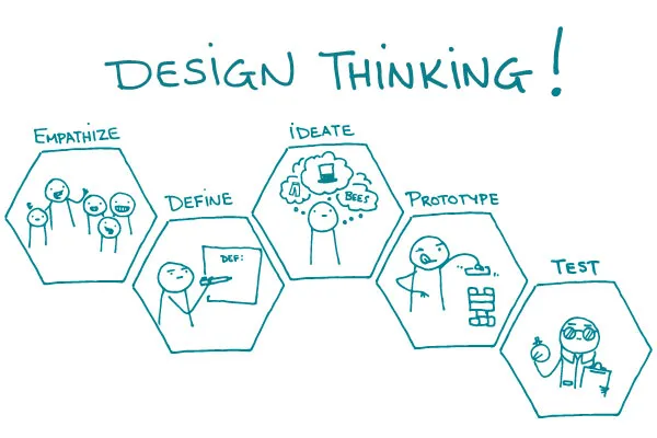
Design Process : Design thinking UX framework
For this case study, I used the design thinking UX framework, which is a user-centered approach to problem-solving. The framework follows five key phases: empathize, define, ideate, prototype, and test. By working through each phase, I was able to better understand who my users are, what challenges they face, and how my design could address their needs. This process helped me dive deep into research, create prototypes, and test ideas to ensure the design was effective and user-focused.
A. Empethize Phase
Primary Research
After gathering details from secondary research, it was time to talk to real users. I asked them questions to learn more about:
Who they are
What problems they have
What they want from an app like mine
I used a list of questions I had prepared beforehand. These helped me understand:
What frustrates them
What they need
How they use similar apps
This information helped me design an app that truly works for them.
Interview Script
The interview script helped me maintain focus and ensured that key topics were addressed. It served as a roadmap for the interview.
Introduction
I started by introducing myself and explaining the purpose of the interview.
I asked, "Could you please share your full name and what your current role or occupation is?"
I asked, "How would your friends or family describe your personality?"
Background Questions
I inquired about their thoughts on the evolving fashion trends in India.
I asked how frequently they shopped at thrift stores.
I requested that they describe their experience with thrift shopping.
I asked what they enjoyed or disliked about thrift shopping.
I asked if they had ever used any online platforms for purchasing thrift clothing, and if so, to tell me about their experience with those platforms.
Platform-Specific Questions
I asked if they had a favorite online platform for thrift shopping and, if so, why they preferred it.
I asked what features or aspects they appreciated about their preferred platform.
I inquired how easy it was for them to find the items they were looking for on the platform.
I asked if the product descriptions and photos on the platform were clear and helpful.
I asked if there were any aspects of their preferred platform that they found lacking or wished were different.
I inquired what would encourage them to switch to a different platform.
I asked for their thoughts on an app that combines Instagram thrift stores and major offline thrift stores, offering e-commerce features like a shopping cart, wish list, payment options, and delivery tracking.
I asked what expectations they would have for such an app.
User Behavior Questions
I inquired how they usually searched for and browsed items when shopping for thrift clothes.
I asked what factors they took into account when making a purchase decision.
I asked if they tended to make purchases on impulse or carefully evaluated their options before buying.
I inquired how often they returned items bought online.
Wrap-up
I thanked the participant for their time and feedback.
I asked if there was anything else they would like to add.
I informed them how their feedback would be used and if there would be any follow-up.
Identifying the Target Users
To achieve a successful outcome, I knew it was important to clearly identify who the design was meant for. Understanding the needs of the users was key to making thoughtful, data-driven choices throughout the design process. By defining my users, I could focus my research more effectively and better pinpoint my target audience.
Basic Demographic Details Required for User Research:
Age: 16–30 years old
Gender Ratio: 60% Male, 40% Female
Location: Tier 1, 2, and 3 cities (urban population)
Occupation: Young working professionals and school/college students
User Interview Bio:
Interview User Bio 1 - Rishab Jain
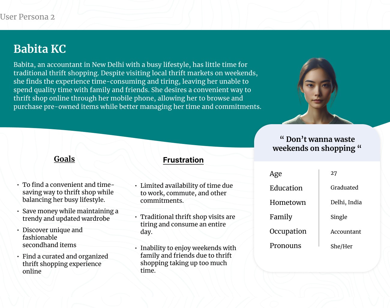
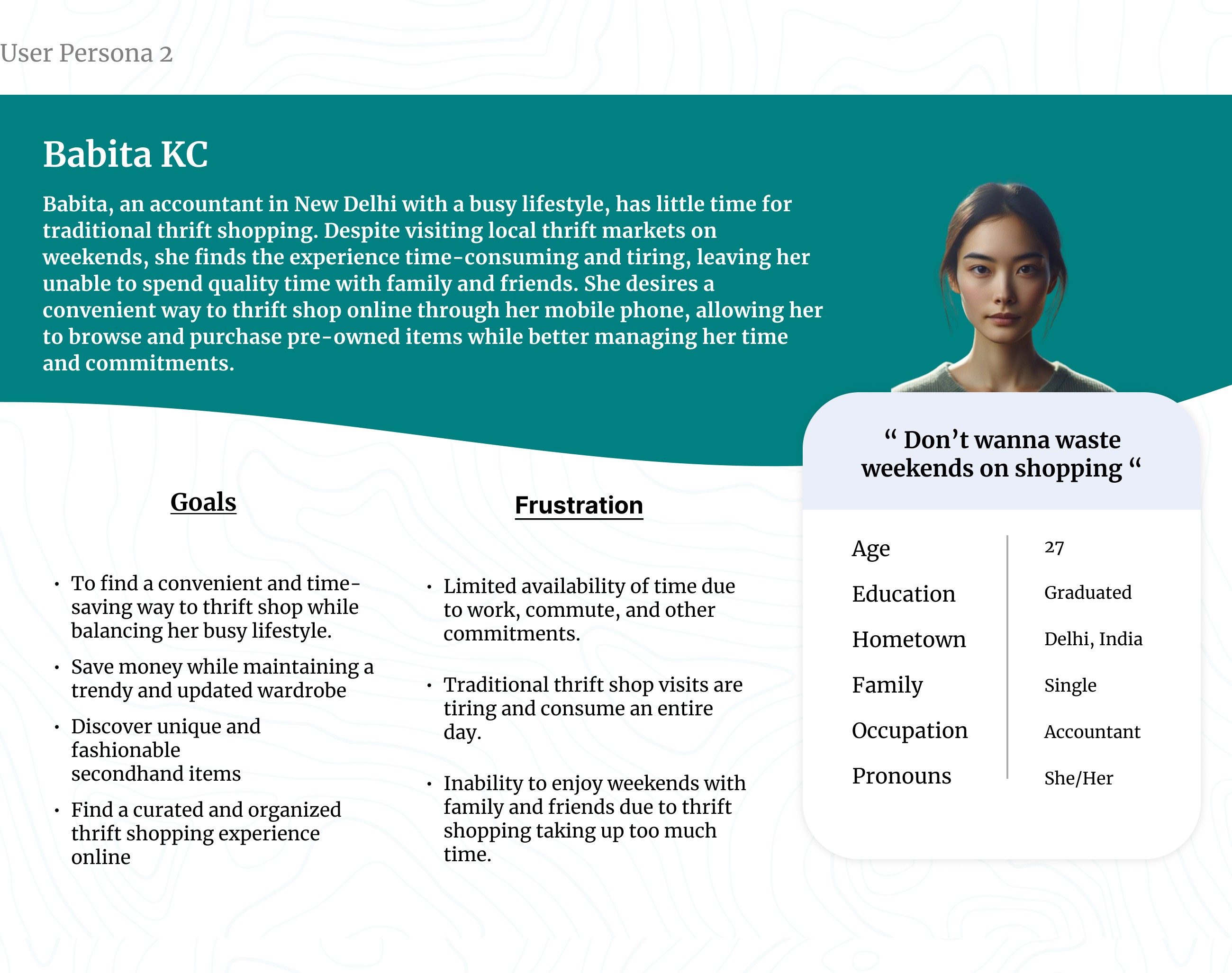
Interview User Bio 2 - Babita KC
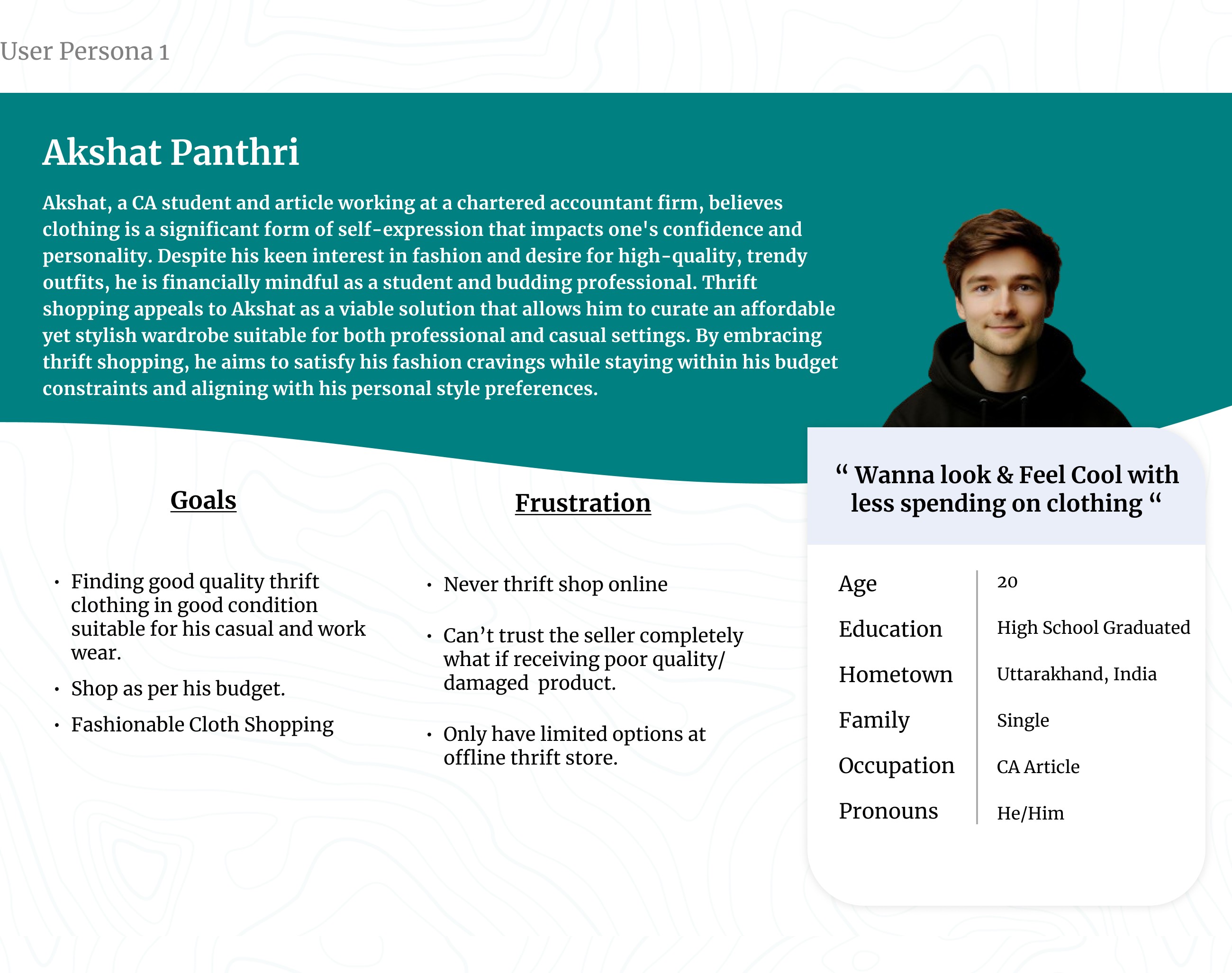
Interview User Bio 3 - Akshat Panthri
User Pain Points -
From my primary research, I identified key pain points experienced by users while thrift shopping. These insights helped me understand the challenges users faced and informed my design decisions to address their needs more effectively. Through analyzing these pain points, I was able to develop a more user-centered solution tailored to improving the overall thrift shopping experience.
Access to Offline Thrift Stores:
Small thrift stores often lack an online presence, making it difficult for customers to browse and purchase items online.
Customers may have to physically visit multiple thrift stores to find desired products, which can be time-consuming and inconvenient.
Time-Consuming Browsing Experience:
Browsing through social media thrift stores can be a time-intensive process, requiring users to sift through numerous posts and pages.
Quality Concerns:
The quality of pre-owned products in online thrift shopping can be a significant issue, as customers cannot physically inspect the items before making a purchase.
Inaccurate or incomplete product descriptions, as well as misleading photographs, can lead to disappointed customers and potential returns or disputes.
Lack of Organization and Visibility:
Offline thrift shopping often suffers from disorganized displays and messy environments, making it challenging to locate specific items or sizes.
The lack of visibility and proper categorization can result in customers missing out on unique or desired products, leading to a frustrating shopping experience.
Overcrowding at Physical Stores:
Offline thrift shops can become overcrowded, especially during peak hours or sales events, creating an unpleasant and stressful shopping environment.
Overcrowding can also contribute to disorganization, making it more difficult to browse and locate desired items effectively.
Limited Inventory and Selection:
Offline thrift stores often have a limited inventory and selection, as they rely on donated or consigned items.
Accessibility Challenges:
Physical thrift stores may not be easily accessible for customers with mobility issues or those living in remote areas.
Lack of accessible options can exclude potential customers and limit the reach of thrift shopping opportunities.
Sustainability and Environmental Concerns:
Some customers may have concerns about the environmental impact of purchasing new items and may prefer the more sustainable option of thrift shopping.
However, the lack of organized and accessible thrift shopping experience can make it challenging to support these sustainable lifestyle.
3. User Personas
At that stage, I organized the data gathered during the interviews into an easily understandable format by creating personas that represented different groups of users.

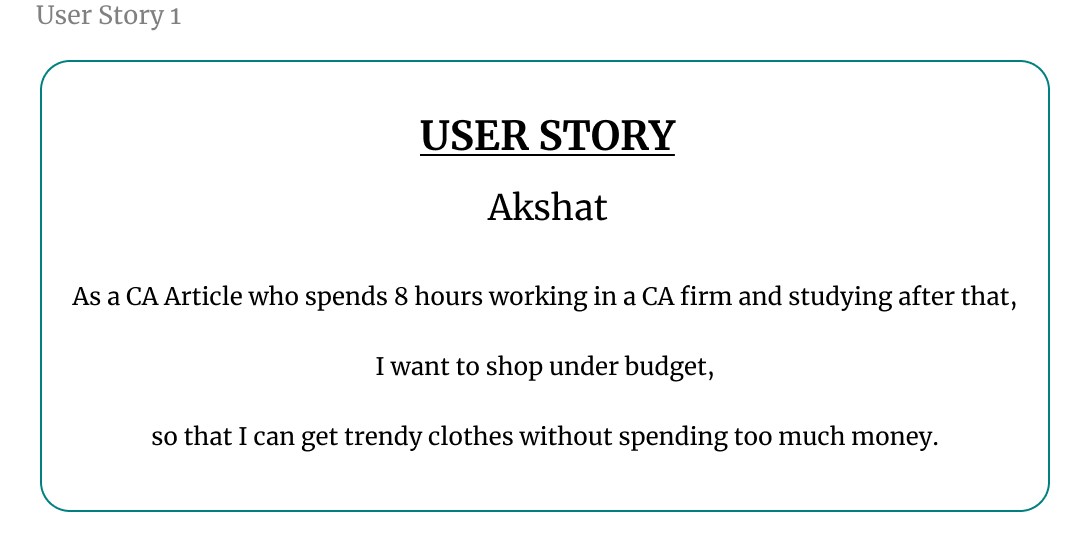
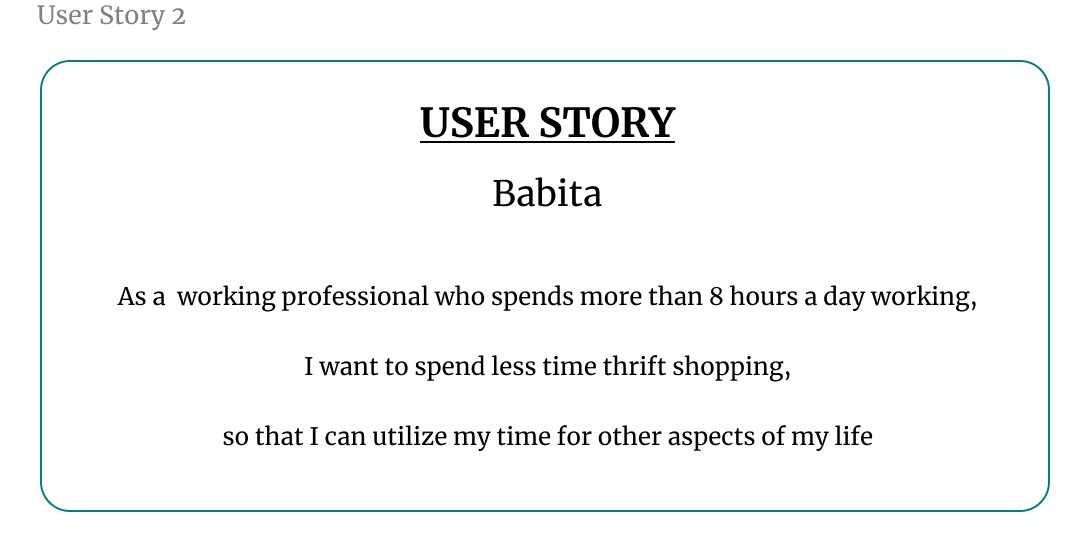
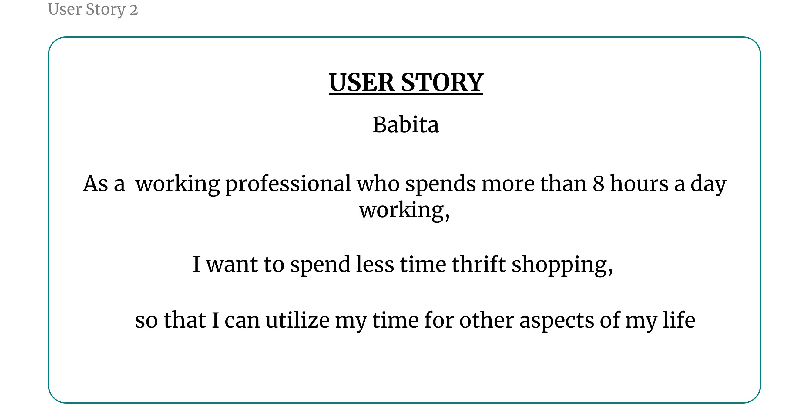
4. User Stories
To better understand my users, I created user stories that reflect their experiences with my product. A user story is a concise, fictional statement from the perspective of a persona, designed to inspire and guide my design decisions. This method allowed me to creatively imagine the needs and goals of my users, ensuring that my designs effectively meet their expectations.
I crafted these user stories using a specific format to clearly define the user, their desired actions, and the benefits they seek:
As a type of user (WHO), I want to action (WHAT), so that benefit (WHY).
5. User Journey Mapping
I used user journey mapping to create seamless experiences by thoroughly understanding and addressing user needs. The primary advantage of a user journey map is that it helps prevent designer bias, ensuring that the design is centered around the user's needs rather than my own preferences. By meticulously documenting every interaction and experience from a user's perspective, I can empathize with specific personas and uncover pain points that might otherwise be overlooked.
User Jounrey Map of Akshat Panthri
B. Define Phase
5W's and H Framework
Once I pinpointed the user’s pain points, I used the 5 W's and H framework to address the who, what, when, where, why, and how of solving their problem. This approach helped me create clear and actionable problem statements that guided my design process.
Five W's and H framework I used for the problem statement:
Who – A busy working CA article (Akshat Panthri)
What – Akshat wanted to thrift shop hassle-free.
Where – Akshat was likely using the app on his way to the office or gym, on the go.
When – Akshat got frustrated shopping for thrift items offline.
Why – Akshat didn't have much time for thrift shopping and had a tight budget.
How – Akshat wanted to find his outfits for daily workwear and exercise with minimal navigation of filters
User Problem Statement
A problem statement summarizes who the user is, what they need from a design, and why.
User Name: Akshat Panthri
Short Description: Akshat has a busy lifestyle, working 8 hours a day as a CA article and studying after work.
User's Need: Akshat needs to buy clothes cheaply and spend less time searching for products.
Insight Behind the User's Need: Akshat wants to thrift shop easily without spending too much time or money, allowing him to save money and focus on other aspects of his busy lifestyle.
"Akshat Panthri is a busy CA article working 8 hours a day and studying after work who needs a quick and affordable way to thrift shop for clothes because he has limited time and a tight budget, making it difficult to shop for clothes offline."
3. Hypothesis statement
In my design process, hypothesis statements helped me transition from defining user problems to brainstorming potential solutions. When I created a hypothesis statement, I made an educated guess about what could be the most effective solution to the problem I identified in the problem statement. I followed a classic if/then method to structure my hypothesis:
"If Akshat Panthri could use the 2nd Shop thrift shopping app to quickly search for and purchase pre-owned clothing items with minimal effort, then he would save time and money, allowing him to focus on his work and other aspects of his busy lifestyle."
These above statements illustrate how my problem and hypothesis statements are closely aligned to ensure that the solutions I propose directly address user pain points and provide tangible benefits.
The features and benefits of a thrift shopping app:
Features:
User-friendly interface with easy navigation and search filters (category, size, brand, color, etc.)
Browse and purchase secondhand clothing items from multiple thrift stores in one place
Detailed product descriptions with high-quality images from multiple angles
Secure payment gateway integration for safe online transactions
Order tracking and delivery status updates
User profiles to save payment info, sizes, favorite brands/styles
Wishlist and notification alerts for newly listed items matching preferences
Ratings/reviews system for providing feedback on purchases
Social sharing options to share favorite finds on social media
Benefits:
Convenience of thrift shopping from home, saving time and effort
Access to a wide variety of secondhand clothing options across multiple stores
Eco-friendly and sustainable way of shopping by giving new life to used items
Cost savings compared to buying new clothing at regular retail prices
Ability to find unique, vintage, or rare pieces not available in mainstream stores
Streamlined discovery of desired styles/brands using filtering options
Transparency with detailed descriptions and images to judge condition
Social sharing caters to desire of finding unique pieces to build personal style
Builds community of like-minded thrift shoppers through reviews/sharing
Value of Product:
Cost-Friendly:
Thrift online shopping offers a cost-effective alternative to purchasing new items at regular retail prices.
By providing access to gently used or pre-owned items, customers can save significant amounts of money while still obtaining quality products.
Accessible:
An online thrift shopping platform makes secondhand shopping accessible to a wider audience, regardless of their geographical location.
Customers can conveniently browse and purchase items from the comfort of their homes, without the need to physically visit multiple thrift stores.
Quality Check:
The online platform can implement various quality checks and detailed product descriptions, ensuring transparency about the condition of each item.
This helps manage customer expectations and builds trust in the products being offered.
Unique and Exclusive Finds:
Thrift stores often offer unique, vintage, or limited-edition items that may not be readily available in mainstream retail stores.
An online thrift platform can provide access to a diverse range of one-of-a-kind pieces, catering to customers seeking individuality and exclusivity.
Connection of features and benefits of app with the needs of users -
Akshat Panthri - 1. Budget Friendly 2. Fashionable Cloths 3. Outfits versatility.
Babita KC - Easy-to-use app interface.
Rishab Jain - Notification alert for new arrivals.
Goal Statements:
This App (Product (what)) will let user place their order conveniently and allowing them to shop a wide variety of products within their budget (Perform Specific actions (what)) which will benefit users with limited budgets and little time for clothes shopping (Who the action will affect (who)) by browsing and purchasing items from the comfort of their homes, users can save time and effort compared to physically visiting multiple thrift stores (How the action will positively affect users (why)).
I measured effectiveness by including a navigation feature that allowed users to place their orders and track them live, anytime, anywhere. (Impact)
Competitive Audit:
I considered how much effort both direct and indirect competitors had put into designing and marketing their products. They had already made an impact on the industry my product was entering. By studying these companies, analyzing their designs, and paying attention to user feedback, I gathered valuable insights that helped me make the 2nd Shop app both unique and user-centric
A detailed overview of the competitors is available in the Google Sheet linked below.
C. Ideate Phase
How Might We Questions:
When brainstorming solutions to design problems, I found it to be a great opportunity to get creative and have fun. One of the most effective methods I used was the “How might we” (HMW) exercise.
The HMW exercise helped me turn problems into design opportunities. By asking questions that started with “How might we,” I was able to approach the problem from different angles and generate a variety of potential solutions. It was a valuable way to spark creativity and explore innovative ideas.
To create effective "How might we" questions, I first revisited clear and well-defined problem statements. I then reframed these problems into questions that would inspire new ideas and solutions. This approach allowed me to think creatively and explore various ways to address the user's needs.
After reviewing the problem statements, these were the questions that came to my mind:
HMW create a personalized recommendation system that quickly suggests used/secondhand items based on the average preferences and needs?
HMW add a one-click purchase feature to minimize the time spent on completing transactions?
HMW design a mobile app interface that allows the person to shop for used/secondhand items during short breaks or while commuting?
HMW provide a filtering system that requires minimal input but delivers highly relevant search results?
HMW implement a notification system to alert the person about new arrivals or deals that match their preferences without overwhelming them?
D. Prototype Phase
User Flows:
User flows were essential in my UX design process as they mapped out the path a user took to complete a task within the app. By visualizing these paths, I ensured the product was intuitive, efficient, and met user needs. Designing user flows helped me predict user actions and decisions, which reduced obstacles and enhanced the overall user experience. This approach allowed me to predict potential user needs and simplify their journey, ultimately leading to higher user satisfaction and engagement.
The user flow map I created for my 2nd Shop app outlined the step-by-step journey a user took, from opening the app to completing a purchase. I designed it to provide a seamless and intuitive experience, guiding users efficiently through the app's features and functions.
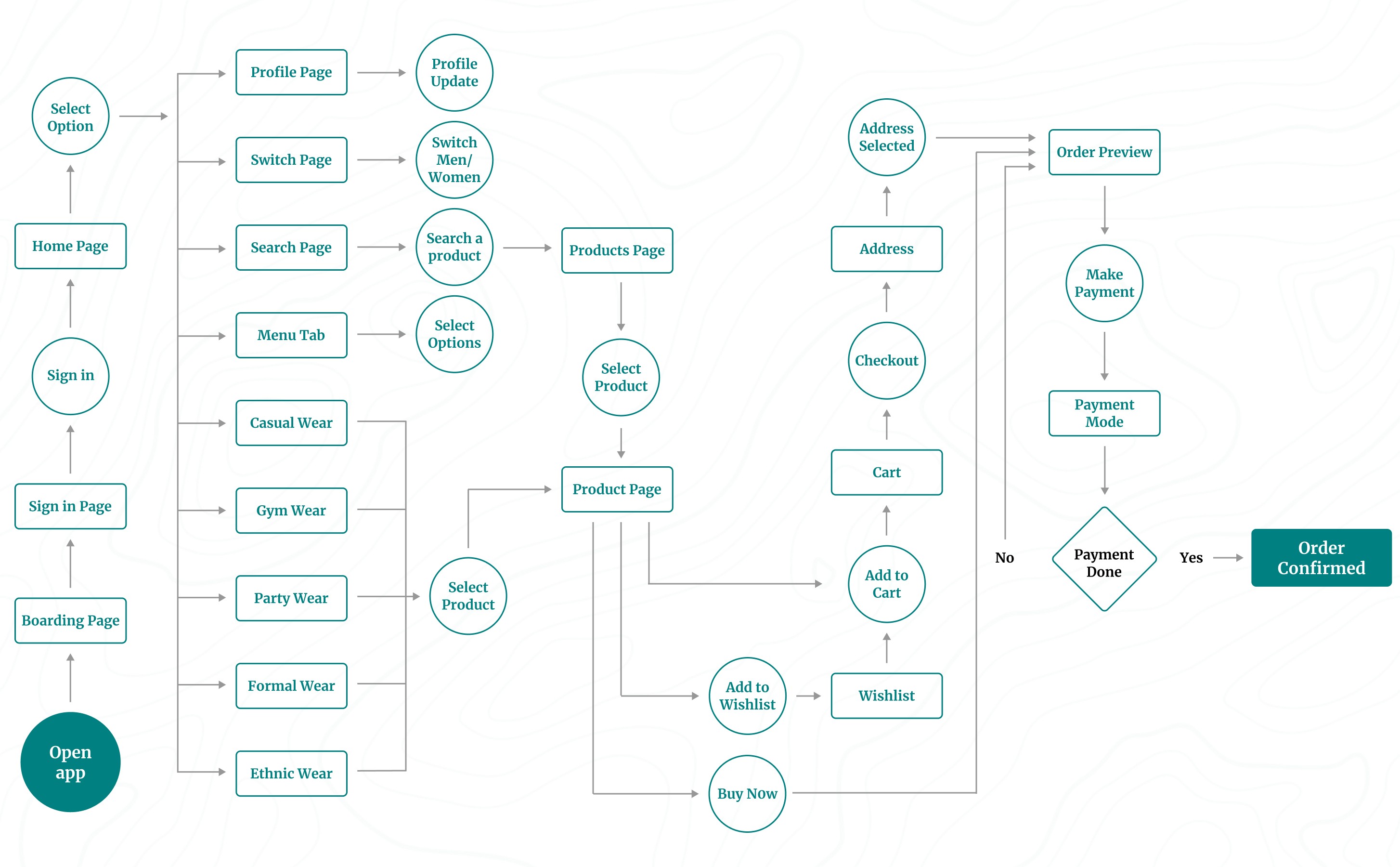
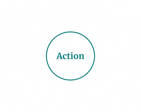
I used circles to represent the actions a user would take while moving through my design. They indicated tasks that needed to be completed or steps required to finish a task from start to finish.
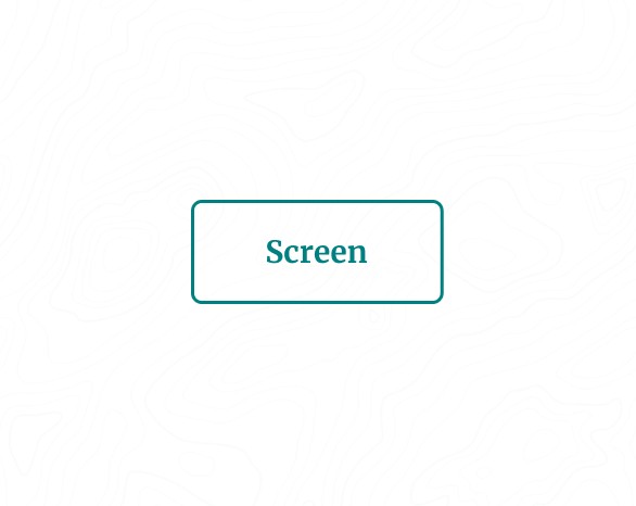
Rectangles describe screens of the app, such as a homepage or confirmation page, that users will experience while completing tasks.
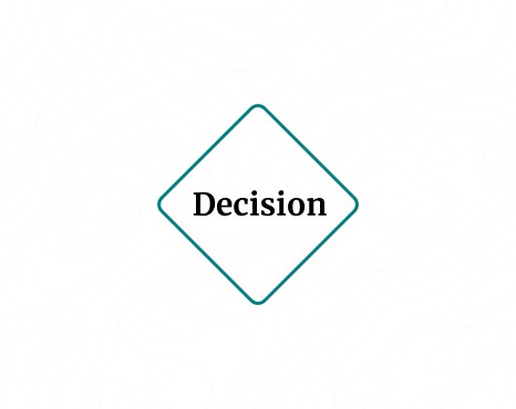
I used diamonds to ask questions where the user had to make a decision. The decision either moved them forward through the flow or sent them back to restart the process.
Lines with arrows tie everything together and display the flow of information.
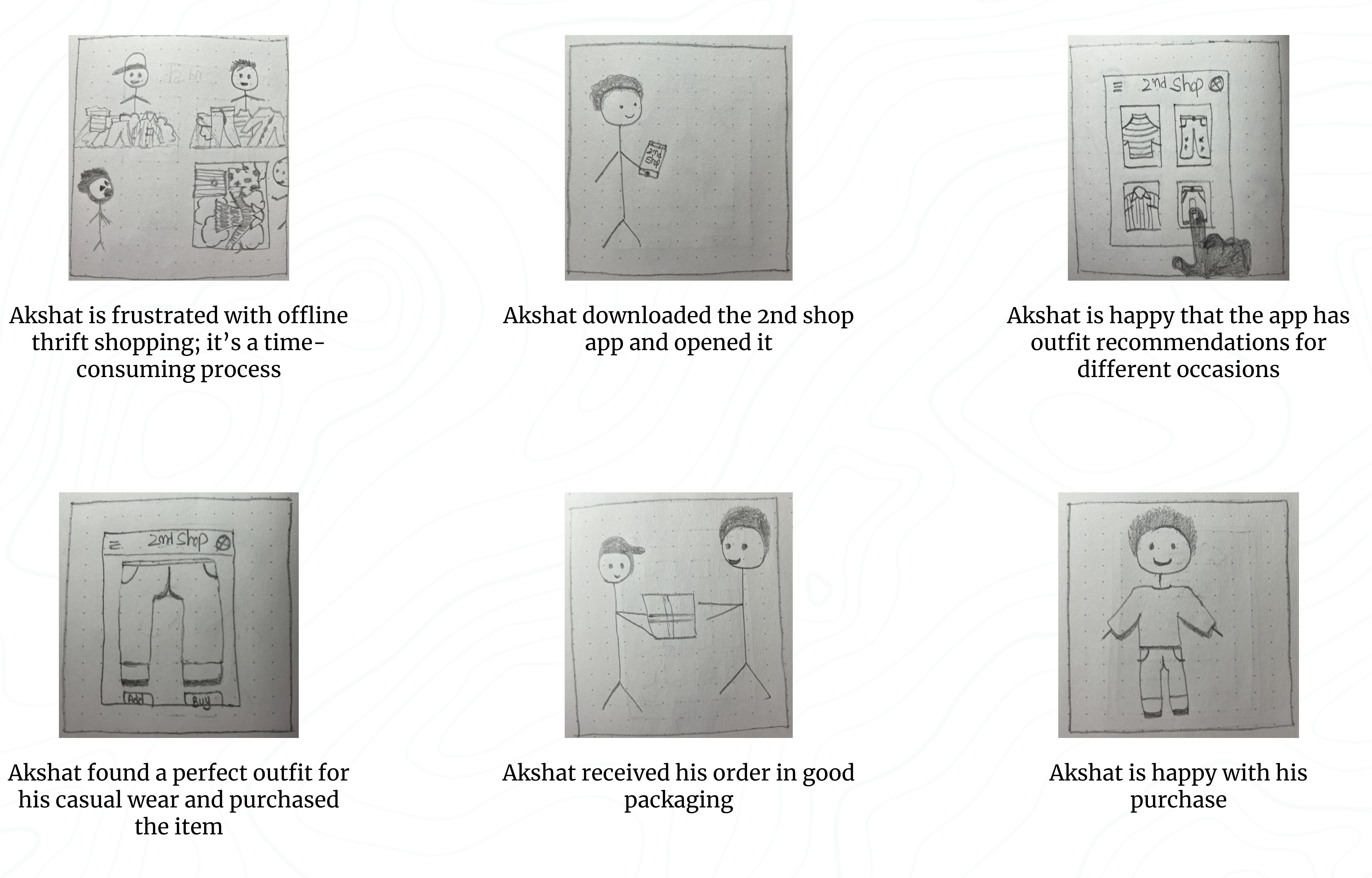
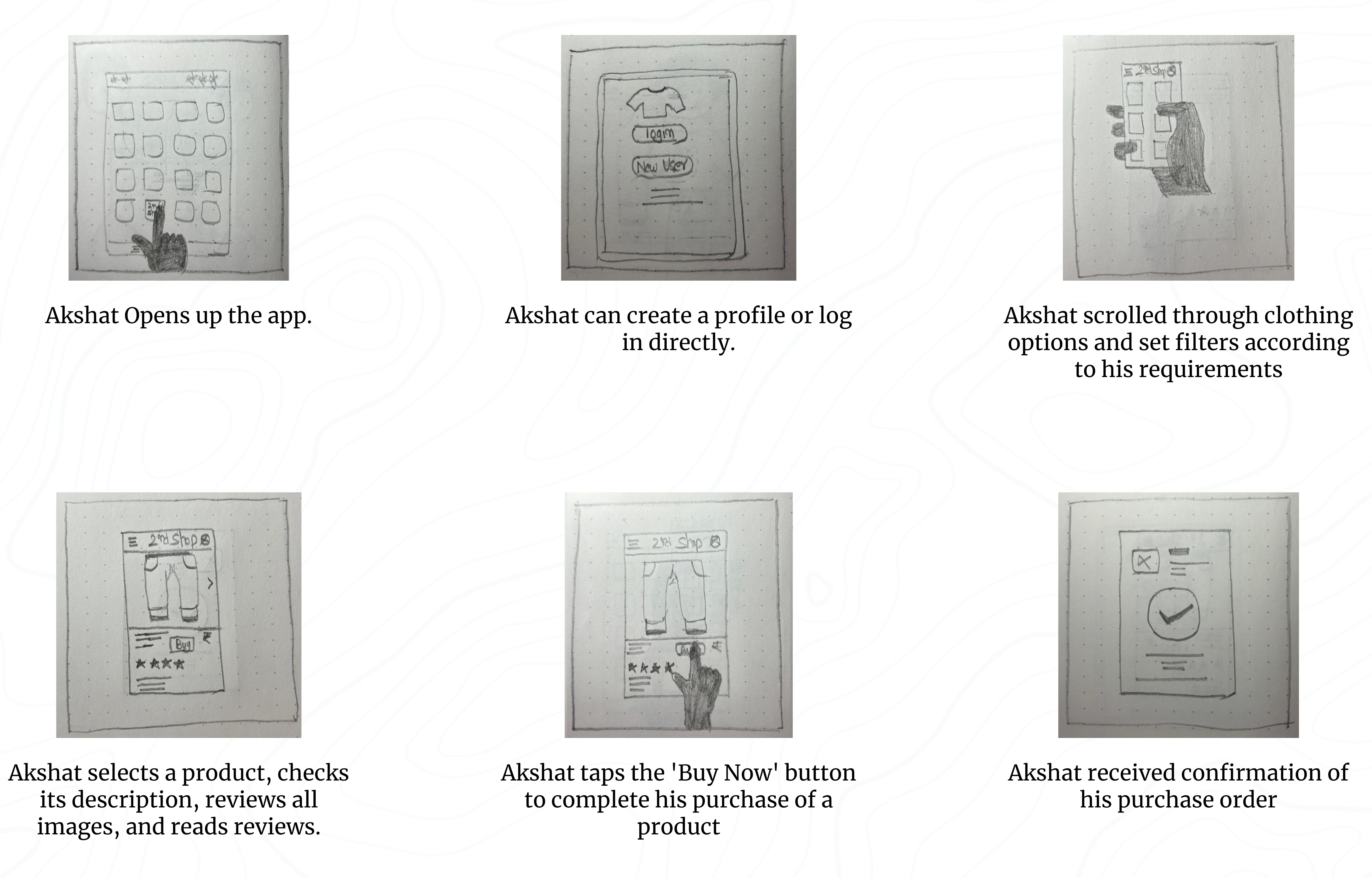
Storyboards:
Telling a story through visuals is often more effective than using words. In my UX design process, I created storyboards as a series of panels or frames that visually described and explored a user’s experience with the product.
I identified four key elements of a storyboard:
Character: This represented the user in the storyboard.
Scene: This provided a way to imagine the user’s environment.
Plot: This described the solution or benefit offered by the design.
Narrative: This outlined the problem the user faced and how the design would solve it.
I used two common types of storyboards in my UX design, both incorporating these four key elements:
Big-picture storyboards focused on what the user needed, their context, and why the product would be useful to them.
Close-up storyboards concentrated on the product and how it worked, which I found most effective in the middle to the end of the design process.
Before I show you my grand masterpiece of big-picture and up-close storyboards, let me just give you a little heads-up: please, please don't freak out over my drawing skills! I promise I won't quit my day job to become an artist anytime soon. But while I may not win any awards for my drawings, I'm pretty confident that I can create a good user experience. So, brace yourself for some laughably bad drawings, but trust me, the UX design is on point!
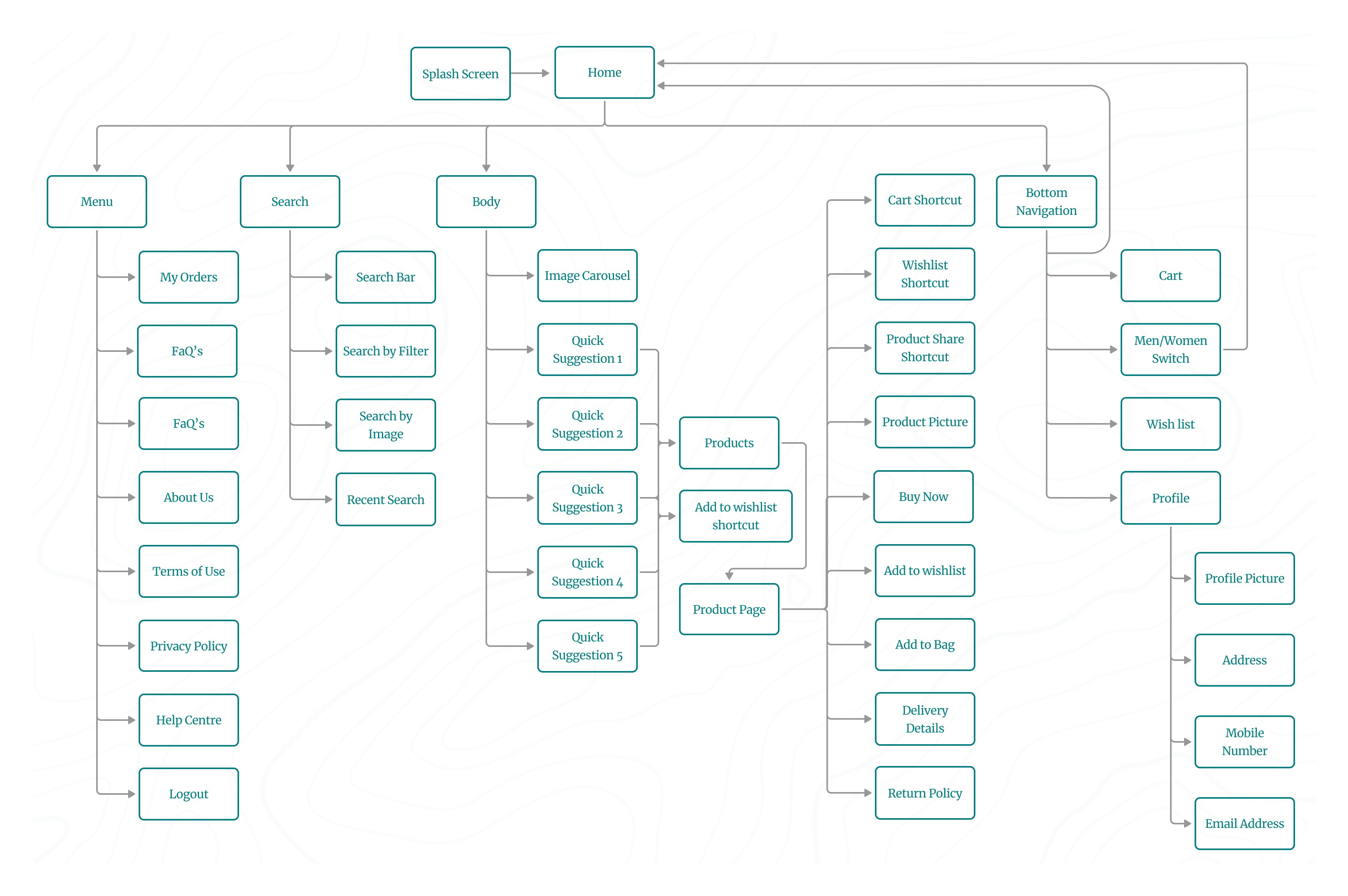
Information Arcthitecture (IA) & Sitemap :
Presenting information in a clear, organized way was crucial for my app. I wanted users to easily find their way around, so I ensured that the information was structured logically. It served as a roadmap for the product, guiding users smoothly from one point to another.
Here’s how I approached the information architecture for my app:
Organization: I focused on how different pieces of information connected and related to each other within the app. This helped me ensure a logical flow, making it easier for users to navigate.
Hierarchy: I created a "tree structure," placing broader categories at the top and more specific ones underneath. This structure helped users understand the relationships between different pieces of information, preventing them from feeling overwhelmed.
Sequence: I mapped out a clear path for users to follow, defining the steps they would take to achieve their goals within the app. This sequence guided users through the experience, ensuring they moved through the app in a logical order.
I applied information architecture principles to create a well-organized sitemap. This process involved mapping out content hierarchically and establishing clear parent/child relationships between different pages and sections.
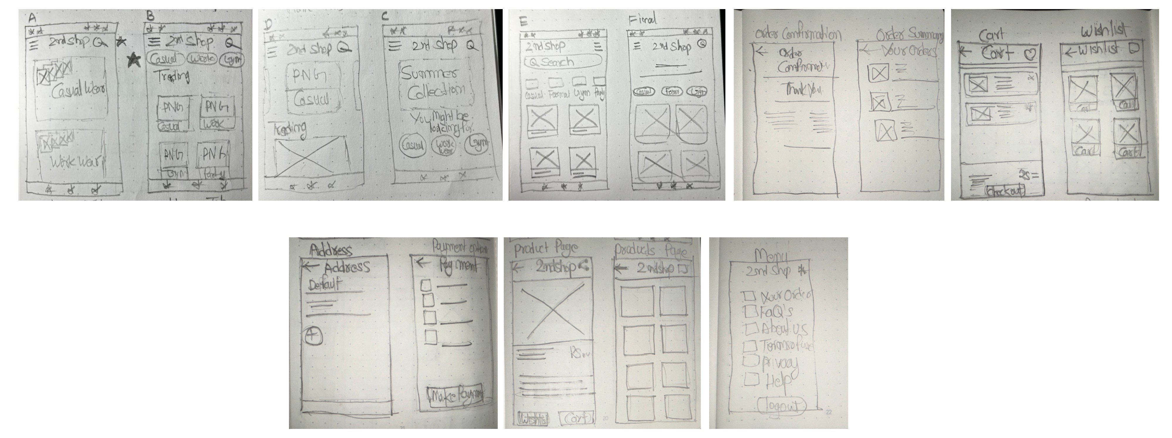
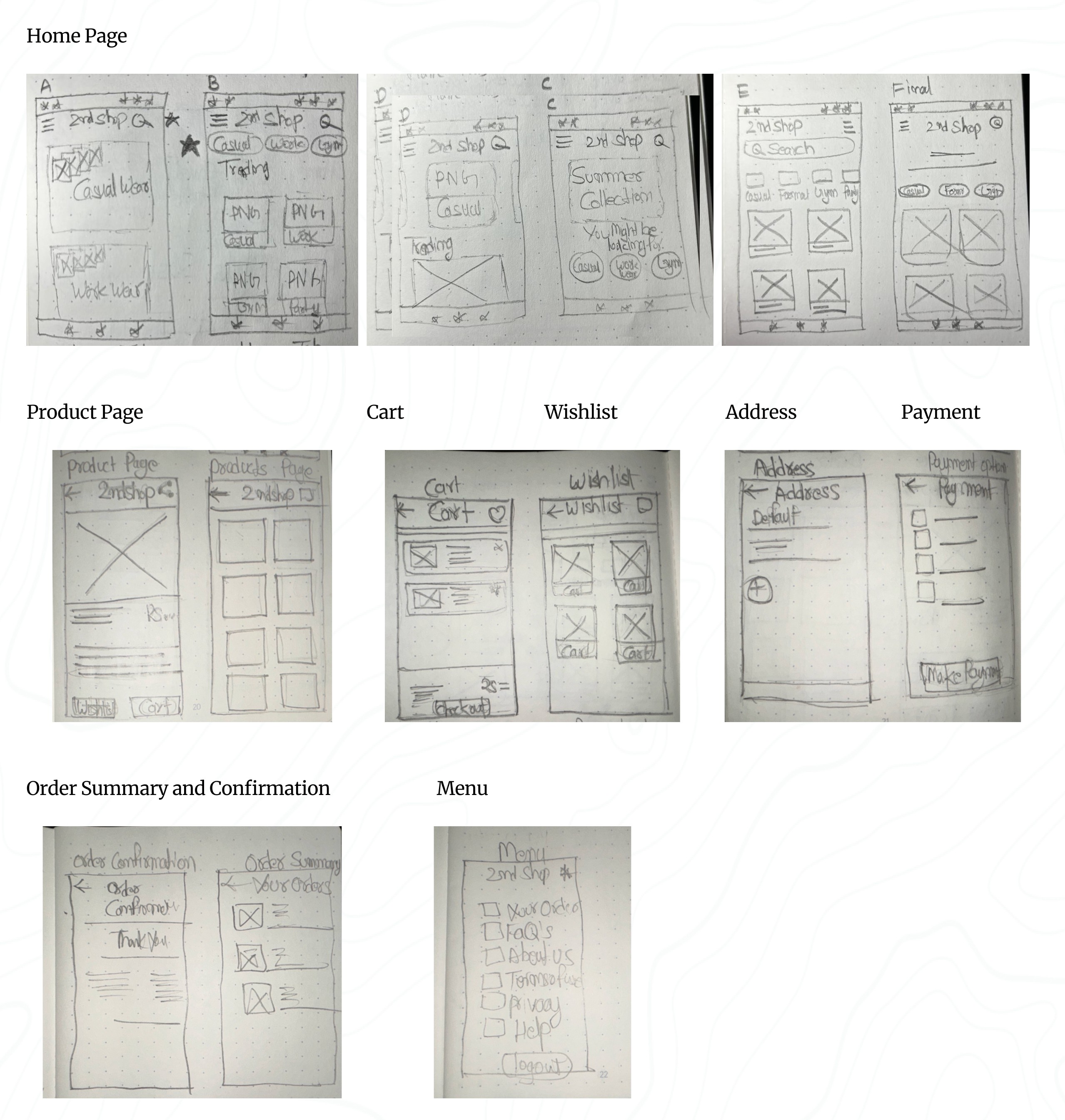
Paper wireframes :
To create a basic structure for the 2nd Shop app’s visual design, including its hierarchy, positioning, and overall layout, I started by drawing paper wireframes. Wireframes were a key step in my design process, helping me clarify and organize my initial ideas and concepts that might have otherwise been unclear or undefined.
I began with wireframes using simple pen and paper. This method allowed me to quickly sketch out different layouts and structures, focusing on the arrangement of elements without getting caught up in details or visual style. These rough sketches helped me visualize the app’s core functions and identify any potential problems or areas for improvement early in the design process.
I created four different homepage layouts before deciding on the final design for the paper wireframe. It was a good idea to create at least five different versions of how to structure information on a homepage. At this stage, my goal was to explore many ideas with wireframes. I viewed this as more focused brainstorming than before—still generating a lot of ideas, but now all centered around a single page.
If you look closely at the final design, you’ll see changes at every step of the design process, from paper wireframes to digital wireframes, then to low-fidelity prototypes, and finally to high-fidelity prototypes.
Using Gestalt Principles in Design
The Gestalt principles explain how humans group similar elements, recognize patterns, and simplify complex images. ]The Gestalt principles explained how I grouped similar elements, recognized patterns, and simplified complex images. They helped me understand how people perceived designs, whether it was a painting, a product, or a webpage. When I created wireframes, I used Gestalt Principles to ensure my content was well-organized, visually pleasing, and easy to navigate.
In my paper wireframes, I applied Gestalt Principles to make the design intuitive and user-friendly:
Similarity: I kept elements like buttons and product cards consistent in shape and size across the pages. This helped users quickly recognize that these elements had similar functions, such as selecting or navigating.
Proximity: I grouped related options closely together. This signaled to users that these options were part of the same process or category, making it easier for them to find what they needed.
Common Region: I enclosed items like the wishlist or cart within defined areas. This made it clear that these items belonged together, helping users easily identify and interact with grouped content.
Low-Fidelity(Lo-Fi) Prototype :
Lo-fi prototypes show how users will navigate through each screen of the app. This approach helped me troubleshoot and make necessary corrections. I began by designing all the digital wireframe screens needed for the app. Once I had those in place, I used connection nodes to map out the navigation. These nodes indicated where a connection began and where it should direct users next.
Low-Fidelity(Lo-Fi) Prototype :
Lo-fi prototypes show how users will navigate through each screen of the app. This helps troubleshoot and make necessary corrections. Let’s take a look at how I went about creating a lo-fi prototype from the completed user flow.
First, I designed all the digital wireframe screens needed for the app. Once I had those in place, I used connection nodes to map out the navigation. These nodes indicate where a connection begins and where it should direct users next.
E. Test Phase
Planning UX research studies:
Planning UX research studies was a Important part of my UX design process, essential to every phase from start to finish. When a product is ready to launch, or go live, that's not the end—it's just another beginning! It should still be iterated upon, and this involves doing some good old-fashioned research in the form of user testing. This step, known as acceptance testing, is where we get to see how real-life users interact with the product. Even at this late stage in the game, we’re still looking to make tweaks and adjustments based on what users tell us.
Ideally, at this point, I was only making minor refinements, as the major changes have already been addressed during the prototyping phase. The goal of this research and testing was to ensure I was providing end-users with the best possible experience with the final product.
Throughout the UX design process, I viewed research as an ongoing effort at every stage. Once I had a design ready to be turned into a prototype, I dove into user testing. Testing the prototype allowed me to refine my ideas and improve the design before finalizing the user interface.
By conducting research and testing while the product was still in its prototype form, I was able to make necessary changes early on, saving a lot of time and headaches later in development. Additionally, iterating the design based on user feedback ensured that when the product was finally launched, it would provide the best possible experience for the end user.
When creating a research plan, I included seven key elements: the project background, research goals, research questions, key performance indicators, methodology, participants, and the script or questions I would ask participants. These components helped ensure that my research was thorough, focused, and effective.
Project Background:
The project background is all about explaining why I conducted this research. No need for a lengthy history—just a few lines will do the trick.
"I am designing the 2nd Shop app to make thrift shopping more accessible and convenient for everyone. The goal is to provide users with an easy way to find their desired outfits, allowing them to save both time and money compared to traditional in-store thrift shopping."
Research Goals:
" To figure out if online thrift shopping through our app genuinely saves people time and money compared to offline shopping. "
Research Questions:
Actionable and Clearly Answerable by Research:
How much time do users spend on average searching for and purchasing items using the 2nd Shop app compared to traditional thrift shopping?
Specific to Ensure Meaningful Data:
What percentage of users find the quick suggestion options effective in narrowing down their search for desired outfits?
Analysis of the Research Questions:
Actionable and Clearly Answerable by Research:
The questions focus on specific, measurable aspects of the user experience, such as time spent, money saved, and user ratings. This ensures that the data collected can directly inform improvements to the app and validate the research goals.
Specific to Ensure Meaningful Data:
By narrowing the focus to specific metrics like time, money, and user ratings, the study can gather detailed insights that are directly relevant to the app's effectiveness in saving time and money for users.
Key Performance Indicators (KPIs):
Another crucial part of my research plan was the key performance indicators, or KPIs. These important indicators helped me measure progress toward my research goals. For my app, I needed to determine whether online thrift shopping was saving people time.
After analyzing the research questions, the next step was to prioritize the KPIs that would best measure the success of the 2nd Shop app. These KPIs would help me evaluate how effectively the app met user needs and achieved its goals. Here’s a breakdown of the most important KPIs I focused on:
Prioritization of KPIs for 2nd Shop:
Primary KPIs:
Time on Task: I measured how long it took users to complete tasks, such as finding and purchasing an outfit.
Conversion Rates: I tracked the percentage of users who successfully completed a purchase.
Drop-off Rates: Reducing drop-off rates was essential for ensuring users completed their desired actions, like making a purchase.
Secondary KPIs:
User Error Rates: I identified parts of the app where users made mistakes, which helped me pinpoint design issues that needed improvement. Lowering the error rate contributed to a smoother user experience.
System Usability Scale (SUS): I gathered overall usability feedback from users to understand how easy and intuitive the app was to use. A high SUS score indicated a well-designed user experience.
Net Promoter Score (NPS): I assessed user loyalty and the likelihood of users recommending my app to others, which provided insights into overall user satisfaction and potential for organic growth.
Methodology:
After planning my research study, I defined the methodology to determine how I would gather and analyze data. For the usability study, I chose the following approach:
Study Type: Unmoderated usability study (The participants test the prototypes without human guidance. Participants move through the study at their own pace and often in their own environment. Location: Remote, with participants based in Delhi (conducted from their own homes)
Date: 13-14 June 2024
Five participants were asked to complete a set of tasks independently while interacting with my prototype.
Each session, lasting 20 minutes, included an introduction and a series of tasks, allowing participants to share their experiences..
Participants:
Participants are frequent online shoppers with an interest in thrift shopping.
Users come from varying age groups to ensure diversity in perspectives.
Individuals have different levels of tech-savviness to ensure the app is user-friendly for all.
The group consists of:
3 males and 2 females
Ages 22–60 years old
Script:
Hello, and thank you for participating in my usability study! Before we begin, please note that this session will be recorded for research purposes. Your participation is voluntary, and you can exit the study at any time.
This usability study is not a test, and there are no right or wrong answers. We’re interested in understanding your experience and getting your honest feedback to help us improve our 2nd Shop thrift shopping app.
Before you start with the tasks, we’d like to know a little more about your background in thrift shopping and online shopping. Please take a moment to answer the following questions:
Can you share a bit about your experience with thrift shopping? How often do you visit thrift stores?
How frequently do you shop online, and what types of products do you typically purchase?
Once you’ve answered these questions, you can proceed with the tasks provided. Thank you for your valuable insights!
Promt 1: What details you can identify on the home screen of this app?
Prompt 1 follow-up: How easy is it for you to identify the details available on the screen? What was easy to identify, and what was difficult?
Promt 2: Let's add a product into your cart using filter of your desired type of outfit. Please describe each step you take.
Promt 2 follow-up: Was it easy for you to add a product to the cart? Did you encounter any difficulties at any step?
Promt 3: Please proceed to checkout with the item in your cart. What steps do you take? Can you find the shipping options? What about payment options?
Promt 3 follow-up: Did you find the checkout process easy? Did you encounter any difficulties? Were you able to find the shipping address section? Did you understand the payment gateway?
Promt 4: Can you find the details of your past orders of the app? How would you navigate to the Your order option from home page?
Promt 4 follow-up: Are you able to find details of your orders?
Promt 5: Would you use this online thrift shopping app?
Thank you so much for your time and valuable insights. Your feedback is crucial in helping us improve the 2nd Shop app.
Why unmoderated usability study? -
Why did I go with an unmoderated usability study for my app design? Well, I was juggling spreadsheets and crunching numbers as an accountant at the time, so arranging a moderated usability study felt like trying to balance a checkbook while skydiving—just a bit too adventurous!
Since my schedule was more packed than a tax season deadline, I opted for an unmoderated approach. This way, participants could dive into the app at their own pace.
Reduced Biasis
A new concept I learned while completing this project, which was really helpful for conducting the unmoderated usability study, is how to ensure accurate and unbiased feedback.
To achieve this, I implemented several key strategies:
Clear Instructions: I provided clear, neutral instructions to all participants to minimize the influence of personal biases or leading questions. This ensured that participants understood the tasks without being move by my expectations.
Neutral Language: I used neutral language in both the tasks and questions to avoid suggesting preferred answers or behaviors. This helped participants respond based on their true experiences rather than perceived expectations.
Diverse Participants: I selected a diverse group of participants with varying backgrounds and levels of tech-savviness. This diversity helped reduce the risk of bias that could arise from a homogenous participant pool.
Anonymous Feedback: By allowing participants to complete the study remotely and without direct interaction, I reduced the risk of social desirability bias, where participants might alter their responses based on perceived judgment.
Spreadsheet of Usability Study Data:
To start the review of the results from the usability study, I began my notetaking by adding the name of the participant into the blue box in Row 1, Column A of my spreadsheet. Then, I filled out the remainder of the spreadsheet based on what I observed about the participant in the voice recording.
I labeled the first five columns of the spreadsheet with the usability study topics that were most important for taking notes and assessing. Those categories included:
Tasks participants complete. Recorded in Column A.
The click path, or sequence of actions, a participant follows for each task. Recorded in Column B.
Observations about participant behaviors, feelings, and pain points as they interact with the product. Recorded in Column C.
Direct quotes from participants that highlight parts of their experience. Recorded in Column D.
How easy or difficult it was for the participant to complete each task. Recorded in Column E.
It’s time to dive into the usability test! Here’s how I approached the process:
I carefully observed each participant’s click paths, behaviors, pain points, and comments. I paid close attention to their tone of voice —whether they told confusion, frustration, or satisfaction.
As I observed the testing, I made sure to update the note-taking spreadsheet. Here’s what I recorded in the spreadsheet:
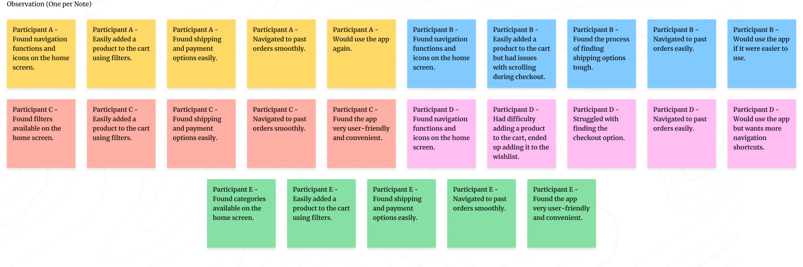
Affinity diagrams:
It's a great way to synthesize data by grouping it into categories based on these shared themes or relationships. While I could have done this activity on my own, I understood that in a real-world setting, it’s often done as a team to quickly and efficiently organize research data. Here’s how I approached the process step-by-step:
Sticky Notes:
First, I transferred all observations from my research participants onto individual sticky notes.
Each sticky note contained only one idea, observation, or direct quote to keep things clear and concise.
I included direct quotes from participants with quotation marks to indicate they were exact words.
Organize Sticky Notes into Groups:
Once all the sticky notes were ready, I grouped them by common themes or categories.
I started by identifying some obvious categories and created new ones as I reviewed the notes.
Categorize All Sticky Notes:
I categorized as many sticky notes as possible to ensure all participant feedback was represented in distinct groups.
I ended up with four groups to cover all observations.
Review and Refine Groups:
Affinity diagramming is flexible, so I reviewed my groups, moved sticky notes around where needed, and created new groups based on emerging patterns.
Affinity Diagram:
Creating the affinity diagram helped me sort through all the research data and identify patterns and themes. It made it easier to understand and define the problems in the UX.
This method also allowed me to think creatively about solving user problems by visually organizing the data in ways that might not have been obvious through just reading notes.
By using these steps, I was able to effectively synthesize and organize the feedback from my usability study, making it easier to identify key areas for improvement in my app design.
Identify the themes:
At this point, I had already identified several themes by creating an affinity diagram. Next, I had to consider two key questions:
What common patterns stand out in the data I collected?
What do these patterns tell me about my product design?
Here is a summary of the patterns extracted from the affinity diagram:
Navigation: Most participants found the icons and details on the home screen helpful, indicating that navigating the app was generally easy.
Checkout Process: Participants had no issues with adding products to the cart or proceeding to checkout. They found the process easy and clear, suggesting a smooth checkout experience.
User-Friendliness: Multiple participants considered the app to be user-friendly and convenient, highlighting a generally positive user interface.
Navigation Improvements: Some participants experienced difficulties with navigation and suggested improvements, indicating a need for enhanced navigation shortcuts.
Insight Identification from Affinity Diagram:
Ease of Navigation:
Insight: Clear and accessible navigation options enhance user satisfaction and task completion rates.
Smooth Checkout Process:
Insight: Minimizing steps and making key actions like checkout and adding to the cart more prominent can reduce user frustration and abandonment rates.
User-Friendly Interface:
Insight: Maintaining a clean, clear design with clear labels and icons contributes significantly to a positive user experience.
Presentation of Insights findings:
This presentation focused on the top three to five insights from a usability study to keep the viewers engaged and ensure they walked away with the most critical information. Presentations are particularly useful when sharing insights with a larger group, especially when viewers might not be familiar with the field of UX.
Key Considerations for Crafting an Effective Presentation:
Audience: Understand what my audience is interested in and tailor my presentation accordingly. This ensures engagement and helps me gain support for my project.
Overview: I have started with a table of contents so my audience knows what to expect.
Story: I have structured my presentation like a story, with a beginning, middle, and end. I used real user examples, quotes, and visuals to make my points more relatable and engaging.
Data: I have used visual elements to communicate my insights.
Less is More When It Comes to Text: I keep my slides concise with only high-level details. This ensures my audience listens to me rather than reading the slides.
Provide Recommendations for Next Steps: I conclude with a clear list of actionable steps based on my insights. This helps move the project forward.
Here is the Presentation Slides: Click on start button to go through the presentation.
Prioritizing Design Insights for Enhanced Usability:
I have identified key insights from my usability studie's presentation that are critical to improving the design. These insights have been categorized based on their urgency and impact on user experience.
Understanding Priorities (P0, P1, P2):
Priority 0 (P0): These are critical issues that must be addressed for the product to function properly. Any design flaw that prevents users from completing essential tasks falls into this category and must be fixed immediately.
Priority 1 (P1): These are important but non-critical issues. Addressing P1 insights improves the user experience but isn't essential for the basic functionality of the product.
Priority 2 (P2): These are lower-priority improvements that enhance the design but do not impact the core user experience. They can be addressed in future iterations if time and resources allow.
Key Prioritized Insights for 2nd Shop App:
Priority 0
Enhance Navigation: Introduce more navigation shortcuts to improve user flow.
Maintain User-Friendly Design: Ensure all labels and icons are clear and easy to understand, enhancing usability.
Priority 1
Optimize Checkout Process: Improve scrolling functionality to streamline the user’s checkout experience.
The next steps involve refining the designs based on these prioritized insights. Usability studies helped me identify pain points in prototypes, offered opportunities to enhance the design. By addressing Priority 0 issues first, I ensured the core user experience is smooth and accessible. Priority 1 insights, while important, are enhancements that will further improve the user experience.
The iterative design process will continue, with further modifications to wireframes and prototypes based on ongoing research and feedback. This approach allows me to prioritize and address the most critical user needs while refining and improving the design over time.
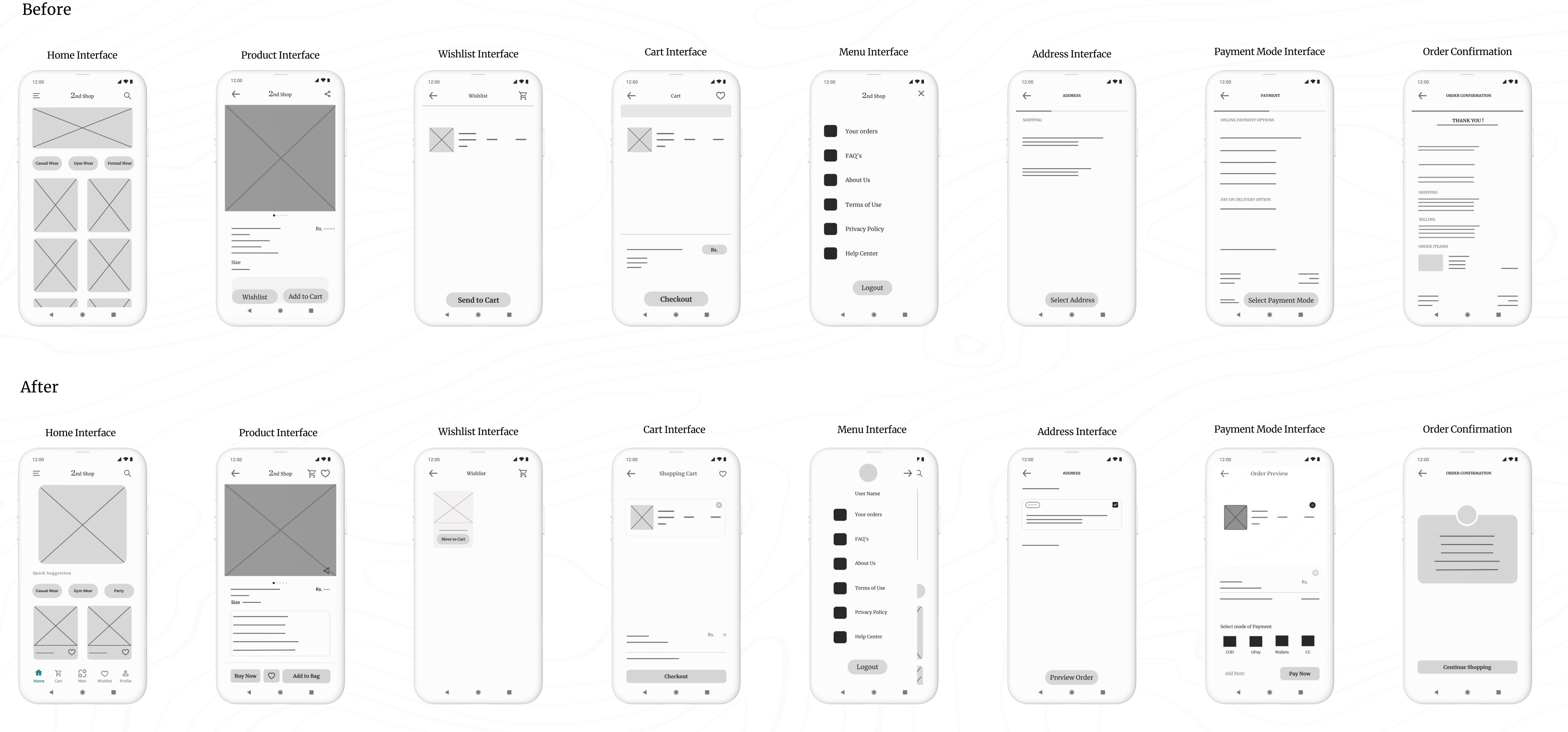
Iterating on Lo-fi Prototype Based on User Insights:
At this stage, I focused on modifying my low-fidelity prototype and identified the following priorities for my design improvements:
Enhanced Navigation: I introduced more navigation shortcuts to improve the user flow, making it easier for users to move through the app seamlessly.
Maintained User-Friendly Design: I ensured all labels and icons were clear and easy to understand, enhancing overall usability and preventing any confusion.
After these iterations, I had the updated low-fidelity prototype for the app.
Summary of Changes:
In the revised wireframes, the app’s usability has been significantly enhanced by adding more intuitive navigation shortcuts, improving label clarity, and optimizing the checkout process. The changes are designed to make the user experience smoother, more accessible, and more efficient, addressing key insights from the usability study.
(a). Before Prototype:
Navigation:
Limited navigation options at the bottom (only three tabs: Wishlist, Add to Cart, and Cart).
Fewer navigation shortcuts for quick access to different sections.
Design Elements:
Simple, minimal layout with standard icons and labels.
A straightforward checkout process with basic interaction elements.
Checkout Process:
No clear breakdown of steps in the checkout process.
Basic scrolling functionality without enhancements.
(b). After Prototype:
Enhanced Navigation:
Additional navigation shortcuts added at the bottom of the screen: Home, Cart, Men, Wishlist, and Profile for quicker access to different sections of the app.
Clear and distinct icons for each section, improving the overall user flow and accessibility.
User-Friendly Design:
Icons and labels are clearer and more intuitive, making it easier for users to understand each function.
The design now has more detailed elements like “Quick Suggestions” for easier product selection, enhancing the overall usability.
The Buy Now button is more prominent alongside “Add to Bag and buy now,” encouraging a more direct purchase action.
Optimized Checkout Process:
Introduced an Order Preview screen before final payment, providing users with a clear overview of their order before confirming.
Improved scrolling functionality within the checkout process, allowing for a more streamlined and user-friendly experience.
Clearer step-by-step process for address selection, payment, and confirmation, reducing confusion during checkout.
Refining My Design: A Presentation of Iteration Based on User Insights :
Here is the second set of presentation slides. Click the start button to go through the presentation.
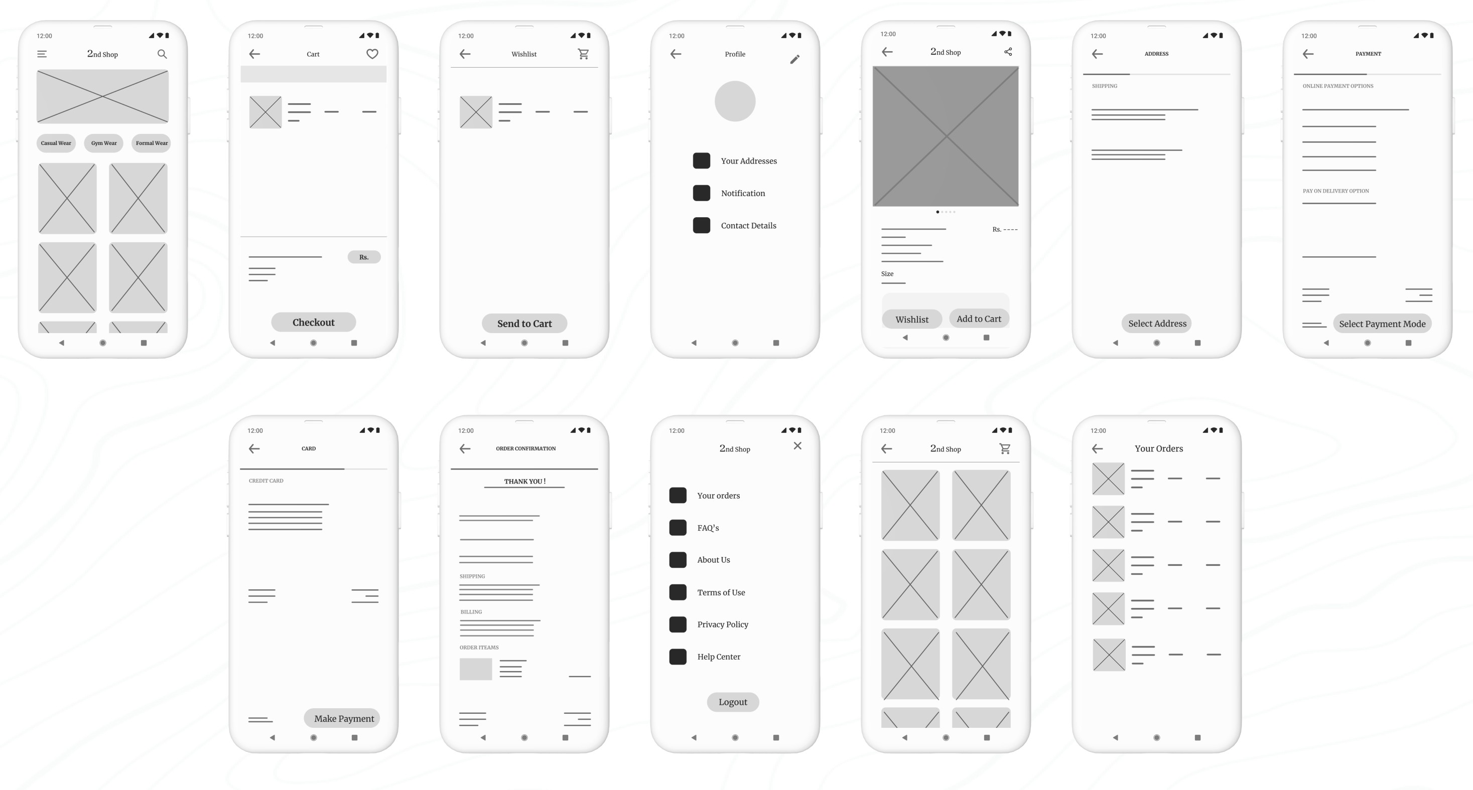
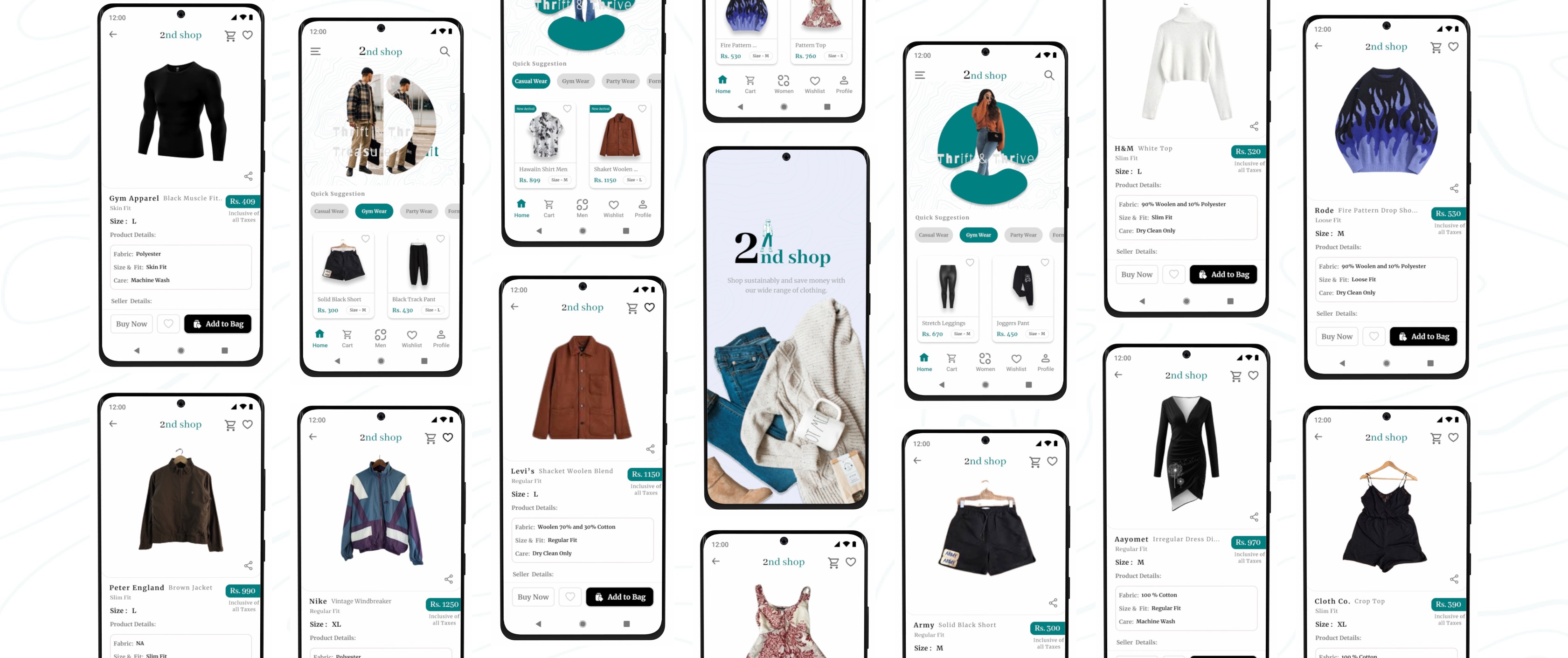
High-Fidelity Prototype:
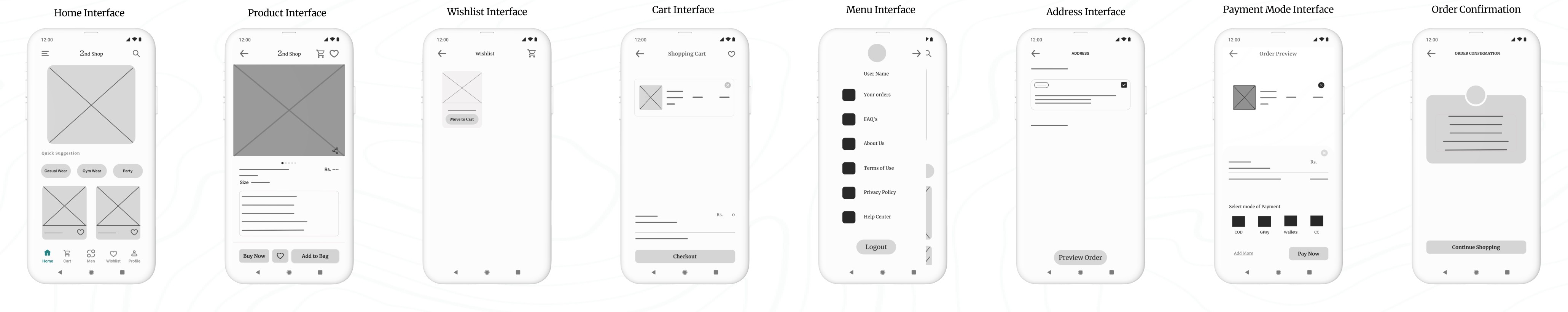
I successfully initiated the design of the high-fidelity prototype, which involved translating my low-fidelity concepts into a polished and interactive format. This phase allowed me to refine the visual aesthetics and functionality of the application, ensuring a more realistic user experience.

To view all the prototypes, visit here: Figma Prototypes
Component and Elements used in the design:
Interactive Components: Features dynamic elements like payment methods that update based on user interaction, providing a intuitive experience.
Iconography: Custom icons generated through the Iconify plugin, ensuring consistency and clarity across the app.
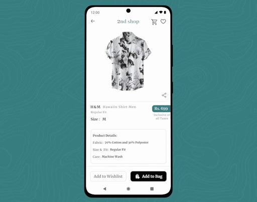
Navigation: A clean, user-friendly navigation bar providing easy access to key sections such as Home, Cart, Wishlist, Profile, and Men/Women section switching.
Buttons: Well-designed call-to-action buttons, optimized for both functionality and visual appeal, enhancing user interaction.
Animated Picture Carousel: I designed this animated carousel to be a focal point, capturing users' attention and encouraging them to explore the application further.
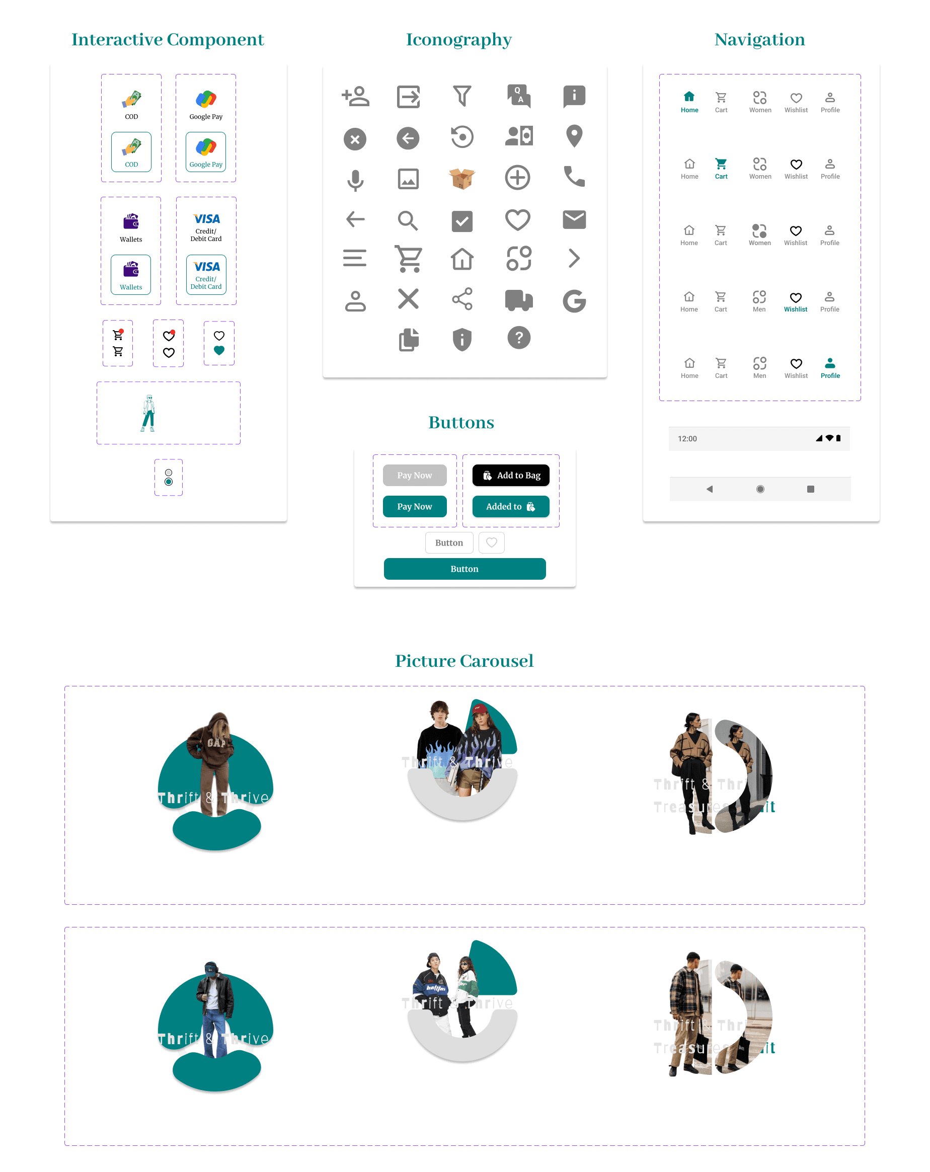
Animated Picture Carousel Made in Figma
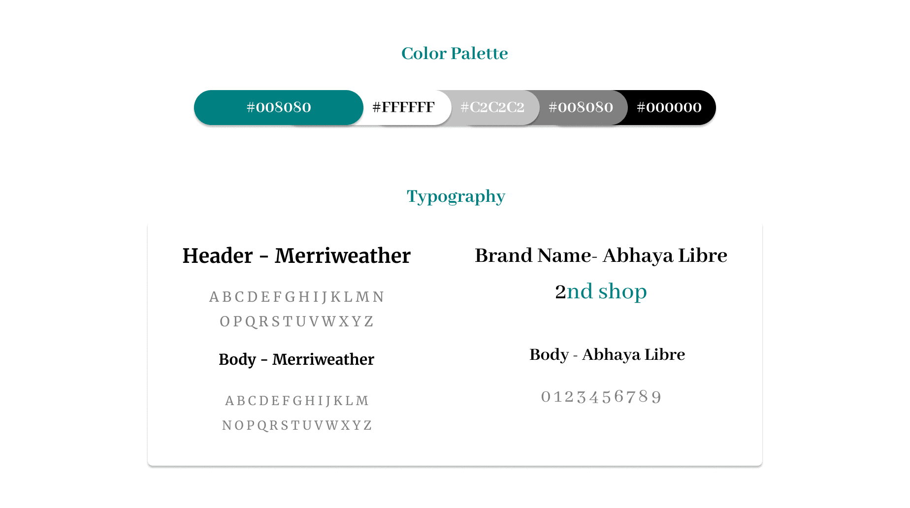
Color and Typography:
Color Palette: The chosen color palette combines green (#00S080), white, gray, and black for a modern and clean aesthetic. The green reflects sustainability and eco-friendliness, aligning with the core values of thrift shopping—promoting conscious consumption and environmental responsibility.
Typography: Merriweather is used for both headers and body text due to its readability, while Abhaya Libre is selected for brand elements and numerical data to give the app a distinctive, cohesive identity that balances both visual appeal and functionality.
Usability Study focused on High-Fidelity Prototype
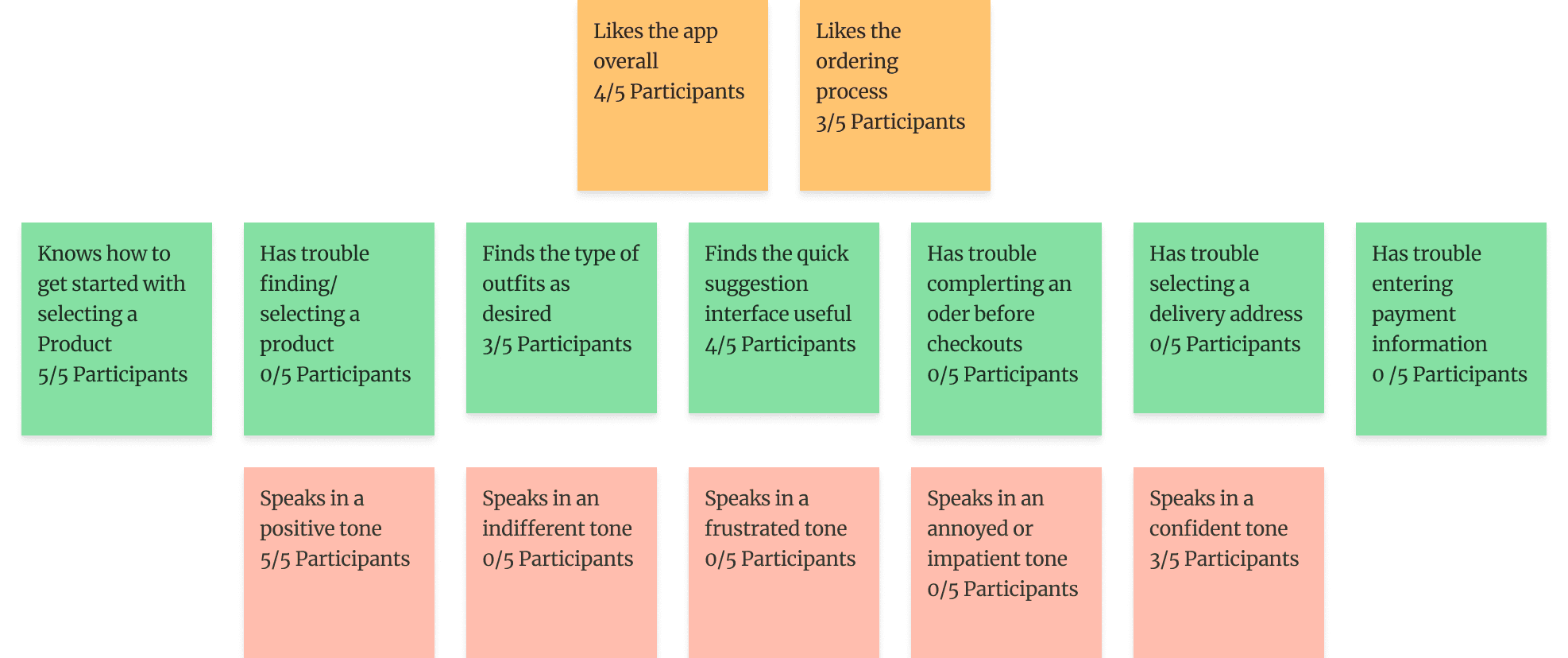
During this usability testing phase, which focused on my high-fidelity prototype, I observed participants interacting with key features of the 2nd Shop app. I gathered insights on the overall user experience, focusing on tasks such as selecting products, completing orders, and navigating the checkout process. I observed how easily they found items, completed their orders, and entered payment information. I also noted their overall attitude—whether positive, frustrated, or indifferent—to understand their emotional response. These insights guided future design improvements.
As I observed the testing, I made sure to update the note-taking spreadsheet. Here’s what I recorded in the spreadsheet:
Synthesize research findings with affinity mapping
After successfully applying the affinity diagram method to low-fidelity prototypes, I extended this approach to the high-fidelity prototype as well. This process involved categorizing and synthesizing user feedback and observations into coherent themes, which allowed me to visualize user interaction patterns and pain points more effectively. By doing so, I was able to identify deeper insights into user needs and preferences, directly informing iterative design improvements to enhance the overall user experience.
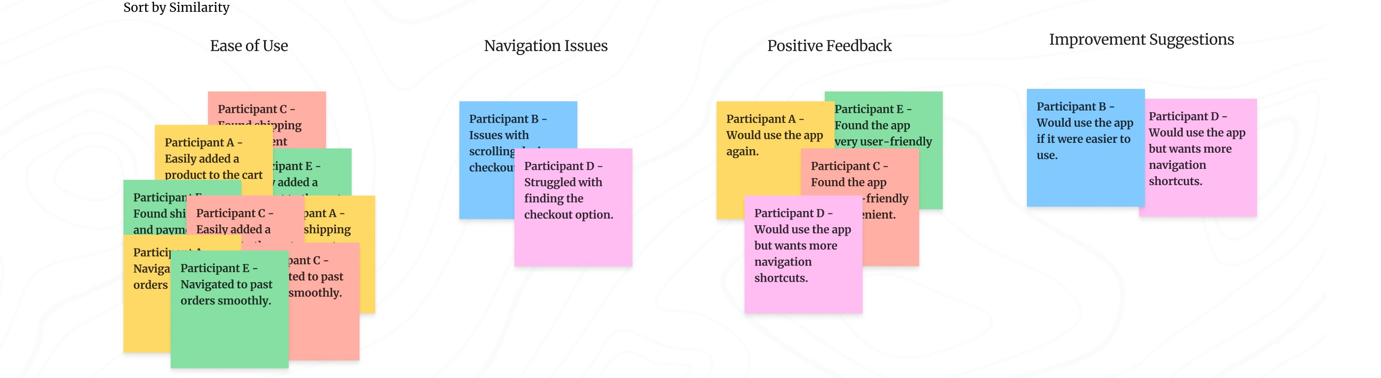
Sort sticky notes by similarity
I converted the findings into sticky notes, rearranged them, and grouped them into three categories, each with its own title and focus: Says, Does, and Feels.
I converted the findings into sticky notes, rearranged them, and grouped them into three categories, each with its own title and focus: Says, Does, and Feels.
The Says area includes all the notes about things users said during the study, such as "Speaks in a positive tone" (5/5 participants).
The Does area includes all the notes about actions users took during the study, such as "Knows how to get started with selecting a product" (5/5 participants).
The Feels area includes all the notes about how users felt during the study, such as "Likes the ordering process" (3/5 participants).
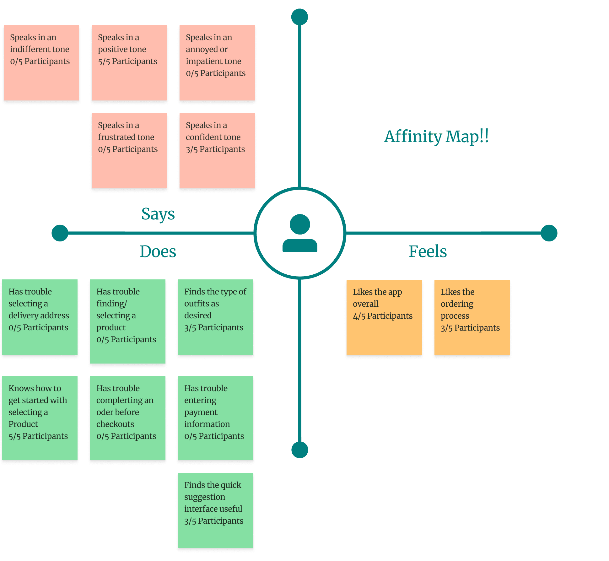
Identify themes in the data
The themes I identified from sorting the sticky notes are as follows:
It was observed that 5 out of 5 participants knew how to get started with selecting a product. This means that the app’s onboarding or product selection interface is intuitive and easy to use.
It was observed that 0 out of 5 participants had trouble completing an order before checkout. This suggests that the ordering process is seamless and straightforward for users.
It was observed that 3 out of 5 participants liked the ordering process. This indicates that the app’s ordering flow could be enhanced to improve overall satisfaction.
And it's a wrap. After identifying the themes in my usability study through affinity mapping, I concluded that the app meets its purpose and fulfills the user's needs for the time being. At this point, I decided not to proceed further beyond identifying the themes. Although there were some minor iterations, the app serves its purpose without requiring significant changes. However, since I had the time, I utilized it to make some adjustments based on feedback from user testing participants. The changes can be seen in the images below:
To view all the prototypes, visit here: Figma Prototypes
BTS of the Last usability Study
Here are some candid shots of my usability study participants, straight from the video recordings—don’t worry, no one was harmed in the making of these user experiences 😂 !
A big thank you to Mr. Sunny, Ms. Meera, Mr. Shourya, Mr. Rinku, Mr. Rajiv Shukla, Mr. Rohit Bhatt, Ms. Babita, Mr. Akshat Panthri, Mr. Rishab Jain, Mr. Rohit Sethi, Ms. Divya Gujral, Mr. Gaurav Nathani and Ms. Riya Kothari. You all truly helped a lot in my usability studies and user interview, and I was able to finish this case study with tons of learning and fun!
Takeaways
Through this case study, I learned the importance of understanding user motivations and pain points in the second-hand shopping experience. By focusing on ease of navigation, clear design, and trust-building features, I was able to create a product that resonates with users who value affordability, sustainability, and convenience. The usability study provided valuable insights, helping me refine the app to ensure a seamless and enjoyable experience for thrift shoppers. This project emphasized the need to continuously iterate based on real user feedback, making the app more user-centered and functional.
If you reached here thanks for going through my case study.
I am open to receiving feedback, reviews, questions, and your own insights about this case study.
I'll be glad to respond to all.
Ready to interact with the Application?
Fasten your seatbelts and get ready to explore the world of sustainable shopping with the 2nd Shop app. Dive in now to interact with the application.
Get Started
Case Study - 2nd Shop: Because shopping second-hand is the first rule of thrift.
2nd Shop app is the ultimate destination for fashion-forward folks who love a good bargain. Imagine a treasure trove of pre-loved clothes, all in one convenient place. No more digging through dusty thrift stores or scrolling endlessly online. So, get ready to unleash your inner thrift warrior and discover your new favorite outfit without breaking the bank!
The Design Evolution
The Design Evolution
Summary
This is my first case study after completing my course. It’s a bit lengthy, so grab a drink, settle in, and get ready to scroll! I’ve packed it with knowledge I have gained from the course, and I’m confident it’ll be worth your time.
When I started this project, I was staring at a blank screen, unsure of where to begin. Despite learning a lot in the course, my brain was in overdrive as I tried to organize my thoughts and make this case study as great as possible.
Once I prepared myself I thought about the design process, I was good to go. But here’s the kicker—I started working at night, so gathering primary research wasn’t an option. Instead, I hopped on Google and got to work with some solid secondary research.
I read some articles on Medium and wandered through various websites until my brain was sufficiently stuffed with information. After this late-night research journey, here’s what I discovered:
" There's a growing fashion craze among millennials and gen-z to middle-aged adults, leading to a surge in online fashion shopping. However, the second-hand shopping market hasn't quite caught on in India. Several factors contribute to this lag, but the gist is that online thrift stores need to get creative to lure in customers and keep them around. The main goal of my app is to help users buy pre-owned clothes. "
The read and research was worth spending my time on it. In conclusion, if at first you don’t succeed… do a bunch of reading and research. And all set !
Design Process : Design thinking UX framework
For this case study, I used the design thinking UX framework, which is a user-centered approach to problem-solving. The framework follows five key phases: empathize, define, ideate, prototype, and test. By working through each phase, I was able to better understand who my users are, what challenges they face, and how my design could address their needs. This process helped me dive deep into research, create prototypes, and test ideas to ensure the design was effective and user-focused.
A. Empethize Phase
Primary Research
After gathering details from secondary research, it was time to talk to real users. I asked them questions to learn more about:
Who they are
What problems they have
What they want from an app like mine
I used a list of questions I had prepared beforehand. These helped me understand:
What frustrates them
What they need
How they use similar apps
This information helped me design an app that truly works for them.
Interview Script
The interview script helped me maintain focus and ensured that key topics were addressed. It served as a roadmap for the interview.
Introduction
I started by introducing myself and explaining the purpose of the interview.
I asked, "Could you please share your full name and what your current role or occupation is?"
I asked, "How would your friends or family describe your personality?"
Background Questions
I inquired about their thoughts on the evolving fashion trends in India.
I asked how frequently they shopped at thrift stores.
I requested that they describe their experience with thrift shopping.
I asked what they enjoyed or disliked about thrift shopping.
I asked if they had ever used any online platforms for purchasing thrift clothing, and if so, to tell me about their experience with those platforms.
Platform-Specific Questions
I asked if they had a favorite online platform for thrift shopping and, if so, why they preferred it.
I asked what features or aspects they appreciated about their preferred platform.
I inquired how easy it was for them to find the items they were looking for on the platform.
I asked if the product descriptions and photos on the platform were clear and helpful.
I asked if there were any aspects of their preferred platform that they found lacking or wished were different.
I inquired what would encourage them to switch to a different platform.
I asked for their thoughts on an app that combines Instagram thrift stores and major offline thrift stores, offering e-commerce features like a shopping cart, wish list, payment options, and delivery tracking.
I asked what expectations they would have for such an app.
User Behavior Questions
I inquired how they usually searched for and browsed items when shopping for thrift clothes.
I asked what factors they took into account when making a purchase decision.
I asked if they tended to make purchases on impulse or carefully evaluated their options before buying.
I inquired how often they returned items bought online.
Wrap-up
I thanked the participant for their time and feedback.
I asked if there was anything else they would like to add.
I informed them how their feedback would be used and if there would be any follow-up.
Identifying the Target Users
To achieve a successful outcome, I knew it was important to clearly identify who the design was meant for. Understanding the needs of the users was key to making thoughtful, data-driven choices throughout the design process. By defining my users, I could focus my research more effectively and better pinpoint my target audience.
Basic Demographic Details Required for User Research:
Age: 16–30 years old
Gender Ratio: 60% Male, 40% Female
Location: Tier 1, 2, and 3 cities (urban population)
Occupation: Young working professionals and school/college students
Interview User Bio 1 - Rishab Jain
Interview User Bio 2 - Babita KC
Interview User Bio 3 - Akshat Panthri
User Pain Points -
From my primary research, I identified key pain points experienced by users while thrift shopping. These insights helped me understand the challenges users faced and informed my design decisions to address their needs more effectively. Through analyzing these pain points, I was able to develop a more user-centered solution tailored to improving the overall thrift shopping experience.
Access to Offline Thrift Stores:
Small thrift stores often lack an online presence, making it difficult for customers to browse and purchase items online.
Customers may have to physically visit multiple thrift stores to find desired products, which can be time-consuming and inconvenient.
Time-Consuming Browsing Experience:
Browsing through social media thrift stores can be a time-intensive process, requiring users to sift through numerous posts and pages.
Quality Concerns:
The quality of pre-owned products in online thrift shopping can be a significant issue, as customers cannot physically inspect the items before making a purchase.
Inaccurate or incomplete product descriptions, as well as misleading photographs, can lead to disappointed customers and potential returns or disputes.
Lack of Organization and Visibility:
Offline thrift shopping often suffers from disorganized displays and messy environments, making it challenging to locate specific items or sizes.
The lack of visibility and proper categorization can result in customers missing out on unique or desired products, leading to a frustrating shopping experience.
Overcrowding at Physical Stores:
Offline thrift shops can become overcrowded, especially during peak hours or sales events, creating an unpleasant and stressful shopping environment.
Overcrowding can also contribute to disorganization, making it more difficult to browse and locate desired items effectively.
Limited Inventory and Selection:
Offline thrift stores often have a limited inventory and selection, as they rely on donated or consigned items.
Accessibility Challenges:
Physical thrift stores may not be easily accessible for customers with mobility issues or those living in remote areas.
Lack of accessible options can exclude potential customers and limit the reach of thrift shopping opportunities.
Sustainability and Environmental Concerns:
Some customers may have concerns about the environmental impact of purchasing new items and may prefer the more sustainable option of thrift shopping.
However, the lack of organized and accessible thrift shopping experience can make it challenging to support these sustainable lifestyle.
3. User Personas
At that stage, I organized the data gathered during the interviews into an easily understandable format by creating personas that represented different groups of users.
4. User Stories
To better understand my users, I created user stories that reflect their experiences with my product. A user story is a concise, fictional statement from the perspective of a persona, designed to inspire and guide my design decisions. This method allowed me to creatively imagine the needs and goals of my users, ensuring that my designs effectively meet their expectations.
I crafted these user stories using a specific format to clearly define the user, their desired actions, and the benefits they seek:
As a type of user (WHO), I want to action (WHAT), so that benefit (WHY).

5. User Journey Mapping
I used user journey mapping to create seamless experiences by thoroughly understanding and addressing user needs. The primary advantage of a user journey map is that it helps prevent designer bias, ensuring that the design is centered around the user's needs rather than my own preferences. By meticulously documenting every interaction and experience from a user's perspective, I can empathize with specific personas and uncover pain points that might otherwise be overlooked.
B. Define Phase
5W's and H Framework
Once I pinpointed the user’s pain points, I used the 5 W's and H framework to address the who, what, when, where, why, and how of solving their problem. This approach helped me create clear and actionable problem statements that guided my design process.
Five W's and H framework I used for the problem statement:
Who - A busy working CA article (Akshat Panthri)
What - Akshat wants to thrift shop hassle-free.
Where - Akshat is likely using the app on the way to his office or gym, on the go.
When - Akshat gets frustrated shopping for thrift items offline.
Why - Akshat doesn't have much time for thrift shopping and has a tight budget.
How - Akshat wants to find his outfits for daily workwear and exercise with the least navigation of filters.
User Problem Statement
A problem statement summarizes who the user is, what they need from a design, and why.
User Name: Akshat Panthri
Short Description: Akshat has a busy lifestyle, working 8 hours a day as a CA article and studying after work.
User's Need: Akshat needs to buy clothes cheaply and spend less time searching for products.
Insight Behind the User's Need: Akshat wants to thrift shop easily without spending too much time or money, allowing him to save money and focus on other aspects of his busy lifestyle.
"Akshat Panthri is a busy CA article working 8 hours a day and studying after work who needs a quick and affordable way to thrift shop for clothes because he has limited time and a tight budget, making it difficult to shop for clothes offline."
3. Hypothesis statement
In my design process, hypothesis statements helped me transition from defining user problems to brainstorming potential solutions. When I created a hypothesis statement, I made an educated guess about what could be the most effective solution to the problem I identified in the problem statement. I followed a classic if/then method to structure my hypothesis:
"If Akshat Panthri could use the 2nd Shop thrift shopping app to quickly search for and purchase pre-owned clothing items with minimal effort, then he would save time and money, allowing him to focus on his work and other aspects of his busy lifestyle."
The features and benefits of a thrift shopping app:
Features:
User-friendly interface with easy navigation and search filters (category, size, brand, color, etc.)
Browse and purchase secondhand clothing items from multiple thrift stores in one place
Detailed product descriptions with high-quality images from multiple angles
Secure payment gateway integration for safe online transactions
Order tracking and delivery status updates
User profiles to save payment info, sizes, favorite brands/styles
Wishlist and notification alerts for newly listed items matching preferences
Ratings/reviews system for providing feedback on purchases
Social sharing options to share favorite finds on social media
Benefits:
Convenience of thrift shopping from home, saving time and effort
Access to a wide variety of secondhand clothing options across multiple stores
Eco-friendly and sustainable way of shopping by giving new life to used items
Cost savings compared to buying new clothing at regular retail prices
Ability to find unique, vintage, or rare pieces not available in mainstream stores
Streamlined discovery of desired styles/brands using filtering options
Transparency with detailed descriptions and images to judge condition
Social sharing caters to desire of finding unique pieces to build personal style
Builds community of like-minded thrift shoppers through reviews/sharing
Value of Product:
Cost-Friendly:
Thrift online shopping offers a cost-effective alternative to purchasing new items at regular retail prices.
By providing access to gently used or pre-owned items, customers can save significant amounts of money while still obtaining quality products.
Accessible:
An online thrift shopping platform makes secondhand shopping accessible to a wider audience, regardless of their geographical location.
Customers can conveniently browse and purchase items from the comfort of their homes, without the need to physically visit multiple thrift stores.
Quality Check:
The online platform can implement rigorous quality checks and detailed product descriptions, ensuring transparency about the condition of each item.
This helps manage customer expectations and builds trust in the products being offered.
Unique and Exclusive Finds:
Thrift stores often offer unique, vintage, or limited-edition items that may not be readily available in mainstream retail stores.
An online thrift platform can provide access to a diverse range of one-of-a-kind pieces, catering to customers seeking individuality and exclusivity.
Connection of features and benefits of app with the needs of users -
Akshat Panthri - 1. Budget Friendly 2. Fashionable Cloths 3. Outfits versatility.
Babita KC - Easy-to-use app interface.
Rishab Jain - Notification alert for new arrivals.
Goal Statements:
This App (Product (what)) will let user place their order conveniently and allowing them to shop a wide variety of products within their budget (Perform Specific actions (what)) which will benefit users with limited budgets and little time for clothes shopping (Who the action will affect (who)) by browsing and purchasing items from the comfort of their homes, users can save time and effort compared to physically visiting multiple thrift stores (How the action will positively affect users (why)).
I measured effectiveness by including a navigation feature that allowed users to place their orders and track them live, anytime, anywhere. (Impact)
Competitive Audit:
I considered how much effort both direct and indirect competitors had put into designing and marketing their products. They had already made an impact on the industry my product was entering. By studying these companies, analyzing their designs, and paying attention to user feedback, I gathered valuable insights that helped me make the 2nd Shop app both unique and user-centric
A detailed overview of the competitors is available in the Google Sheet linked below.
C. Ideate Phase
How Might We Questions:
When brainstorming solutions to design problems, I found it to be a great opportunity to get creative and have fun. One of the most effective methods I used was the “How might we” (HMW) exercise.
The HMW exercise helped me turn problems into design opportunities. By asking questions that started with “How might we,” I was able to approach the problem from different angles and generate a variety of potential solutions. It was a valuable way to spark creativity and explore innovative ideas.
To create effective "How might we" questions, I first revisited clear and well-defined problem statements. I then reframed these problems into questions that would inspire new ideas and solutions. This approach allowed me to think creatively and explore various ways to address the user's needs.
After reviewing the problem statements, these were the questions that came to my mind:
HMW create a personalized recommendation system that quickly suggests used/secondhand items based on the average preferences and needs?
HMW add a one-click purchase feature to minimize the time spent on completing transactions?
HMW design a mobile app interface that allows the person to shop for used/secondhand items during short breaks or while commuting?
HMW provide a filtering system that requires minimal input but delivers highly relevant search results?
HMW implement a notification system to alert the person about new arrivals or deals that match their preferences without overwhelming them?
D. Prototype Phase
User Flows:
User flows were essential in my UX design process as they mapped out the path a user took to complete a task within the app. By visualizing these paths, I ensured the product was intuitive, efficient, and met user needs. Designing user flows helped me predict user actions and decisions, which reduced obstacles and enhanced the overall user experience. This approach allowed me to predict potential user needs and simplify their journey, ultimately leading to higher user satisfaction and engagement.
The user flow map I created for my 2nd Shop app outlined the step-by-step journey a user took, from opening the app to completing a purchase. I designed it to provide a seamless and intuitive experience, guiding users efficiently through the app's features and functions.
I used circles to represent the actions a user would take while moving through my design. They indicated tasks that needed to be completed or steps required to finish a task from start to finish.
Rectangles describe screens of the app, such as a homepage or confirmation page, that users will experience while completing tasks.
I used diamonds to ask questions where the user had to make a decision. The decision either moved them forward through the flow or sent them back to restart the process.
Lines with arrows tie everything together and display the flow of information.
Storyboards:
Telling a story through visuals is often more effective than using words. In my UX design process, I created storyboards as a series of panels or frames that visually described and explored a user’s experience with the product.
I identified four key elements of a storyboard:
Character: This represented the user in the storyboard.
Scene: This provided a way to imagine the user’s environment.
Plot: This described the solution or benefit offered by the design.
Narrative: This outlined the problem the user faced and how the design would solve it.
I used two common types of storyboards in my UX design, both incorporating these four key elements:
Big-picture storyboards focused on what the user needed, their context, and why the product would be useful to them.
Close-up storyboards concentrated on the product and how it worked, which I found most effective in the middle to the end of the design process.
Before I show you my grand masterpiece of big-picture and up-close storyboards, let me just give you a little heads-up: please, please don't freak out over my drawing skills! I promise I won't quit my day job to become an artist anytime soon. But while I may not win any awards for my doodles, I'm pretty confident that I can create a killer user experience. So, brace yourself for some laughably bad drawings, but trust me, the UX design is on point!
2nd Shop Big-Picture Storyboard
Scenario: Use the 2nd shop app to quickly and easily shop thrift cloths - Big Picture Storyboard
2nd Shop Close-up Storyboard
Scenario: Use the 2nd shop app to quickly and easily shop thrift cloths - Close-up Storyboard
Information Arcthitecture (IA) & Sitemap :
Presenting information in a clear, organized way was crucial for my app. I wanted users to easily find their way around, so I ensured that the information was structured logically. It served as a roadmap for the product, guiding users smoothly from one point to another.
Here’s how I approached the information architecture for my app:
Organization: I focused on how different pieces of information connected and related to each other within the app. This helped me ensure a logical flow, making it easier for users to navigate.
Hierarchy: I created a "tree structure," placing broader categories at the top and more specific ones underneath. This structure helped users understand the relationships between different pieces of information, preventing them from feeling overwhelmed.
Sequence: I mapped out a clear path for users to follow, defining the steps they would take to achieve their goals within the app. This sequence guided users through the experience, ensuring they moved through the app in a logical order.
I applied information architecture principles to create a well-organized sitemap. This process involved mapping out content hierarchically and establishing clear parent/child relationships between different pages and sections.
Paper wireframes :
To create a basic structure for the 2nd Shop app’s visual design, including its hierarchy, positioning, and overall layout, I started by drawing paper wireframes. Wireframes were a key step in my design process, helping me clarify and organize my initial ideas and concepts that might have otherwise been unclear or undefined.
I began with wireframes using simple pen and paper. This method allowed me to quickly sketch out different layouts and structures, focusing on the arrangement of elements without getting caught up in details or visual style. These rough sketches helped me visualize the app’s core functions and identify any potential problems or areas for improvement early in the design process.
I created four different homepage layouts before deciding on the final design for the paper wireframe. It was a good idea to create at least five different versions of how to structure information on a homepage. At this stage, my goal was to explore many ideas with wireframes. I viewed this as more focused brainstorming than before—still generating a lot of ideas, but now all centered around a single page.
If you look closely at the final design, you’ll see changes at every step of the design process, from paper wireframes to digital wireframes, then to low-fidelity prototypes, and finally to high-fidelity prototypes.
Using Gestalt Principles in Design
The Gestalt principles explain how humans group similar elements, recognize patterns, and simplify complex images. They help us understand how people perceive designs, whether it’s a painting, a product, or a webpage. When I create wireframes, I used Gestalt Principles to made sure my content is well-organized, visually pleasing, and easy for users to understand.
In my paper wireframes, I used Gestalt Principles to ensure the design was intuitive and user-friendly:
Similarity: I kept elements like buttons and product cards consistent in shape and size across the pages. This helps users quickly recognize that these elements have similar functions, such as selecting or navigating.
Proximity: On pages like the login and menu screens, I grouped related options closely together. This signals to users that these options are part of the same process or category, making it easier for them to find what they need.
Common Region: I enclosed items like the wishlist or cart within defined areas. This makes it clear that these items belong together, helping users easily identify and interact with grouped content.
Low-Fidelity(Lo-Fi) Prototype :
Lo-fi prototypes show how users will navigate through each screen of the app. This approach helped me troubleshoot and make necessary corrections. I began by designing all the digital wireframe screens needed for the app. Once I had those in place, I used connection nodes to map out the navigation. These nodes indicated where a connection began and where it should direct users next.
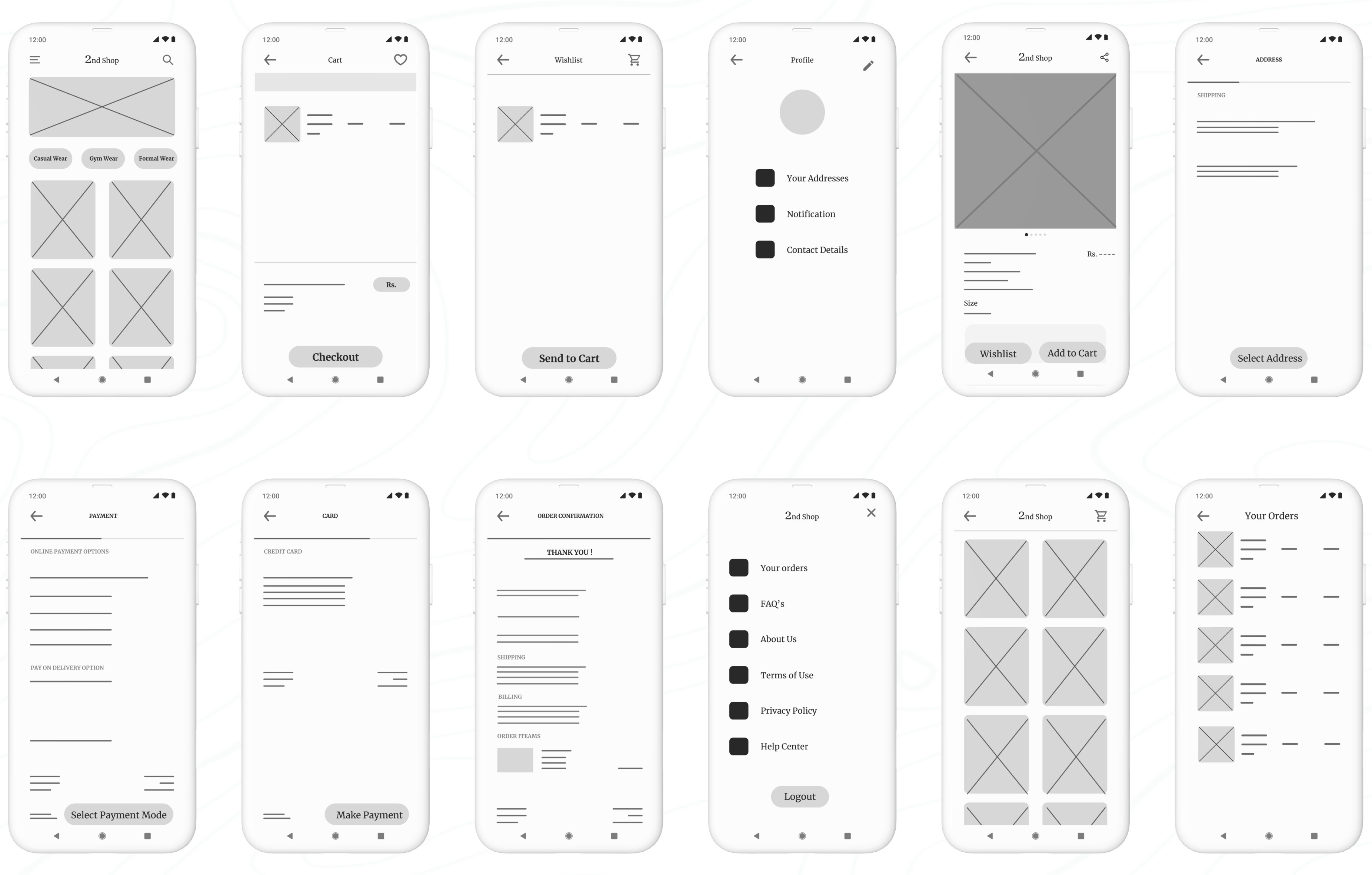
E. Test
Planning UX research studies:
Planning UX research studies was a Important part of my UX design process, essential to every phase from start to finish. When a product is ready to launch, or go live, that's not the end—it's just another beginning! It should still be iterated upon, and this involves doing some good old-fashioned research in the form of user testing. This step, known as acceptance testing, is where we get to see how real-life users interact with the product. Even at this late stage in the game, we’re still looking to make tweaks and adjustments based on what users tell us.
Ideally, at this point, I was only making minor refinements, as the major changes have already been addressed during the prototyping phase. The goal of this research and testing was to ensure I was providing end-users with the best possible experience with the final product.
Throughout the UX design process, I viewed research as an ongoing effort at every stage. Once I had a design ready to be turned into a prototype, I dove into user testing. Testing the prototype allowed me to refine my ideas and improve the design before finalizing the user interface.
By conducting research and testing while the product was still in its prototype form, I was able to make necessary changes early on, saving a lot of time and headaches later in development. Additionally, iterating the design based on user feedback ensured that when the product was finally launched, it would provide the best possible experience for the end user.
When creating a research plan, I included seven key elements: the project background, research goals, research questions, key performance indicators, methodology, participants, and the script or questions I would ask participants. These components helped ensure that my research was thorough, focused, and effective.
Project Background:
The project background is all about explaining why I conducted this research. No need for a lengthy history—just a few lines will do the trick.
"I am designing the 2nd Shop app to make thrift shopping more accessible and convenient for everyone. The goal is to provide users with an easy way to find their desired outfits, allowing them to save both time and money compared to traditional in-store thrift shopping."
Research Goals:
"To figure out if online thrift shopping through our app genuinely saves people time and money compared to offline shopping."
Research Questions:
Actionable and Clearly Answerable by Research:
How much time do users spend on average searching for and purchasing items using the 2nd Shop app compared to traditional thrift shopping?
Specific to Ensure Meaningful Data:
What percentage of users find the filtering options effective in narrowing down their search for desired outfits?
Analysis of the Research Questions:
Actionable and Clearly Answerable by Research:
The questions focus on specific, measurable aspects of the user experience, such as time spent, money saved, and user ratings. This ensures that the data collected can directly inform improvements to the app and validate the research goals.
Specific to Ensure Meaningful Data:
By narrowing the focus to specific metrics like time, money, and user ratings, the study can gather detailed insights that are directly relevant to the app's effectiveness in saving time and money for users.
Key Performance Indicators (KPIs):
Another crucial part of my research plan was the key performance indicators, or KPIs. These important indicators helped me measure progress toward my research goals. For my app, I needed to determine whether online thrift shopping was saving people time.
After analyzing the research questions, the next step was to prioritize the KPIs that would best measure the success of the 2nd Shop app. These KPIs would help me evaluate how effectively the app met user needs and achieved its goals. Here’s a breakdown of the most important KPIs I focused on:
Prioritization of KPIs for 2nd Shop:
Primary KPIs:
Time on Task: I measured how long it took users to complete tasks, such as finding and purchasing an outfit.
Conversion Rates: I tracked the percentage of users who successfully completed a purchase.
Drop-off Rates: Reducing drop-off rates was essential for ensuring users completed their desired actions, like making a purchase.
Secondary KPIs:
User Error Rates: I identified parts of the app where users made mistakes, which helped me pinpoint design issues that needed improvement. Lowering the error rate contributed to a smoother user experience.
System Usability Scale (SUS): I gathered overall usability feedback from users to understand how easy and intuitive the app was to use. A high SUS score indicated a well-designed user experience.
Net Promoter Score (NPS): I assessed user loyalty and the likelihood of users recommending my app to others, which provided insights into overall user satisfaction and potential for organic growth.
Methodology:
After planning my research study, I defined the methodology to determine how I would gather and analyze data. For the usability study, I chose the following approach:
Study Type: Unmoderated usability study (The participants test the prototypes without human guidance. Participants move through the study at their own pace and often in their own environment. Location: Remote, with participants based in Delhi (conducted from their own homes)
Date: 13-14 June 2024
Five participants were asked to complete a set of tasks independently while interacting with my prototype.
Each session, lasting 20 minutes, included an introduction and a series of tasks, allowing participants to share their experiences..
Participants:
Participants are frequent online shoppers with an interest in thrift shopping.
Users come from varying age groups to ensure diversity in perspectives.
Individuals have different levels of tech-savviness to ensure the app is user-friendly for all.
The group consists of:
3 males and 2 females
Ages 24–60 years old
Script:
Hello, and thank you for participating in my usability study! Before we begin, please note that this session will be recorded for research purposes. Your participation is voluntary, and you can exit the study at any time.
This usability study is not a test, and there are no right or wrong answers. We’re interested in understanding your experience and getting your honest feedback to help us improve our 2nd Shop thrift shopping app.
Before you start with the tasks, we’d like to know a little more about your background in thrift shopping and online shopping. Please take a moment to answer the following questions:
Can you share a bit about your experience with thrift shopping? How often do you visit thrift stores?
How frequently do you shop online, and what types of products do you typically purchase?
Once you’ve answered these questions, you can proceed with the tasks provided. Thank you for your valuable insights!
Promt 1: What details you can identify on the home screen of this app?
Prompt 1 follow-up: How easy is it for you to identify the details available on the screen? What was easy to identify, and what was difficult?
Promt 2: Let's add a product into your cart using filter of your desired type of outfit. Please describe each step you take.
Promt 2 follow-up: Was it easy for you to add a product to the cart? Did you encounter any difficulties at any step?
Promt 3: Please proceed to checkout with the item in your cart. What steps do you take? Can you find the shipping options? What about payment options?
Promt 3 follow-up: Did you find the checkout process easy? Did you encounter any difficulties? Were you able to find the shipping address section? Did you understand the payment gateway?
Promt 4: Can you find the details of your past orders of the app? How would you navigate to the Your order option from home page?
Promt 4 follow-up: Are you able to find details of your orders?
Promt 5: Would you use this online thrift shopping app?
Thank you so much for your time and valuable insights. Your feedback is crucial in helping us improve the 2nd Shop app.
Why unmoderated usability study? -
Why did I go with an unmoderated usability study for my app design? Well, I was juggling spreadsheets and crunching numbers as an accountant at the time, so arranging a moderated usability study felt like trying to balance a checkbook while skydiving—just a bit too adventurous!
Since my schedule was more packed than a tax season deadline, I opted for an unmoderated approach. This way, participants could dive into the app at their own pace.
Reduced Biasis
A new concept I learned while completing this project, which was really helpful for conducting the unmoderated usability study, is how to ensure accurate and unbiased feedback.
To achieve this, I implemented several key strategies:
Clear Instructions: I provided clear, neutral instructions to all participants to minimize the influence of personal biases or leading questions. This ensured that participants understood the tasks without being move by my expectations.
Neutral Language: I used neutral language in both the tasks and questions to avoid suggesting preferred answers or behaviors. This helped participants respond based on their true experiences rather than perceived expectations.
Diverse Participants: I selected a diverse group of participants with varying backgrounds and levels of tech-savviness. This diversity helped reduce the risk of bias that could arise from a homogenous participant pool.
Anonymous Feedback: By allowing participants to complete the study remotely and without direct interaction, I reduced the risk of social desirability bias, where participants might alter their responses based on perceived judgment.
Spreadsheet of Usability Study Data:
To start the review of the results from the usability study, I began my notetaking by adding the name of the participant into the blue box in Row 1, Column A of my spreadsheet. Then, I filled out the remainder of the spreadsheet based on what I observed about the participant in the voice recording.
I labeled the first five columns of the spreadsheet with the usability study topics that were most important for taking notes and assessing. Those categories included:
Tasks participants complete. Recorded in Column A.
The click path, or sequence of actions, a participant follows for each task. Recorded in Column B.
Observations about participant behaviors, feelings, and pain points as they interact with the product. Recorded in Column C.
Direct quotes from participants that highlight parts of their experience. Recorded in Column D.
How easy or difficult it was for the participant to complete each task. Recorded in Column E.
It was time to dive into the usability test! Here’s how I approached the process:I carefully observed each participant’s click paths, behaviors, pain points, and comments. I paid close attention to their tone of voice —whether they told confusion, frustration, or satisfaction.
As I observed the testing, I made sure to update the note-taking spreadsheet. Here’s what I recorded in the spreadsheet:
Affinity diagrams:
It's a great way to synthesize data by grouping it into categories based on these shared themes or relationships. While I could have done this activity on my own, I understood that in a real-world setting, it’s often done as a team to quickly and efficiently organize research data. Here’s how I approached the process step-by-step:
Sticky Notes:
First, I transferred all observations from my research participants onto individual sticky notes.
Each sticky note contained only one idea, observation, or direct quote to keep things clear and concise.
I included direct quotes from participants with quotation marks to indicate they were exact words.
Organize Sticky Notes into Groups:
Once all the sticky notes were ready, I grouped them by common themes or categories.
I started by identifying some obvious categories and created new ones as I reviewed the notes.
Categorize All Sticky Notes:
I categorized as many sticky notes as possible to ensure all participant feedback was represented in distinct groups.
I ended up with four groups to cover all observations.
Review and Refine Groups:
Affinity diagramming is flexible, so I reviewed my groups, moved sticky notes around if needed, and created new groups based on emerging patterns.
Affinity Diagram:
Creating the affinity diagram helped me sort through all the research data and identify patterns and themes. It made it easier to understand and define the problems in the UX.
This method also allowed me to think creatively about solving user problems by visually organizing the data in ways that might not have been obvious through just reading notes.
By using these steps, I was able to effectively synthesize and organize the feedback from my usability study, making it easier to identify key areas for improvement in my app design.
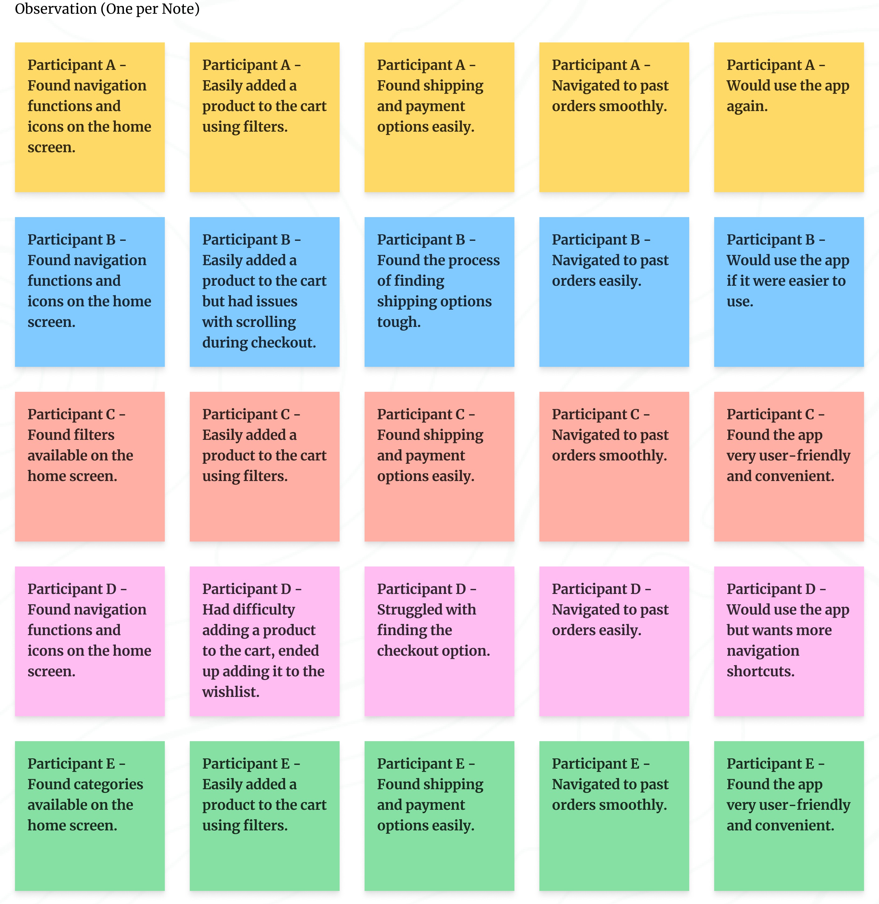
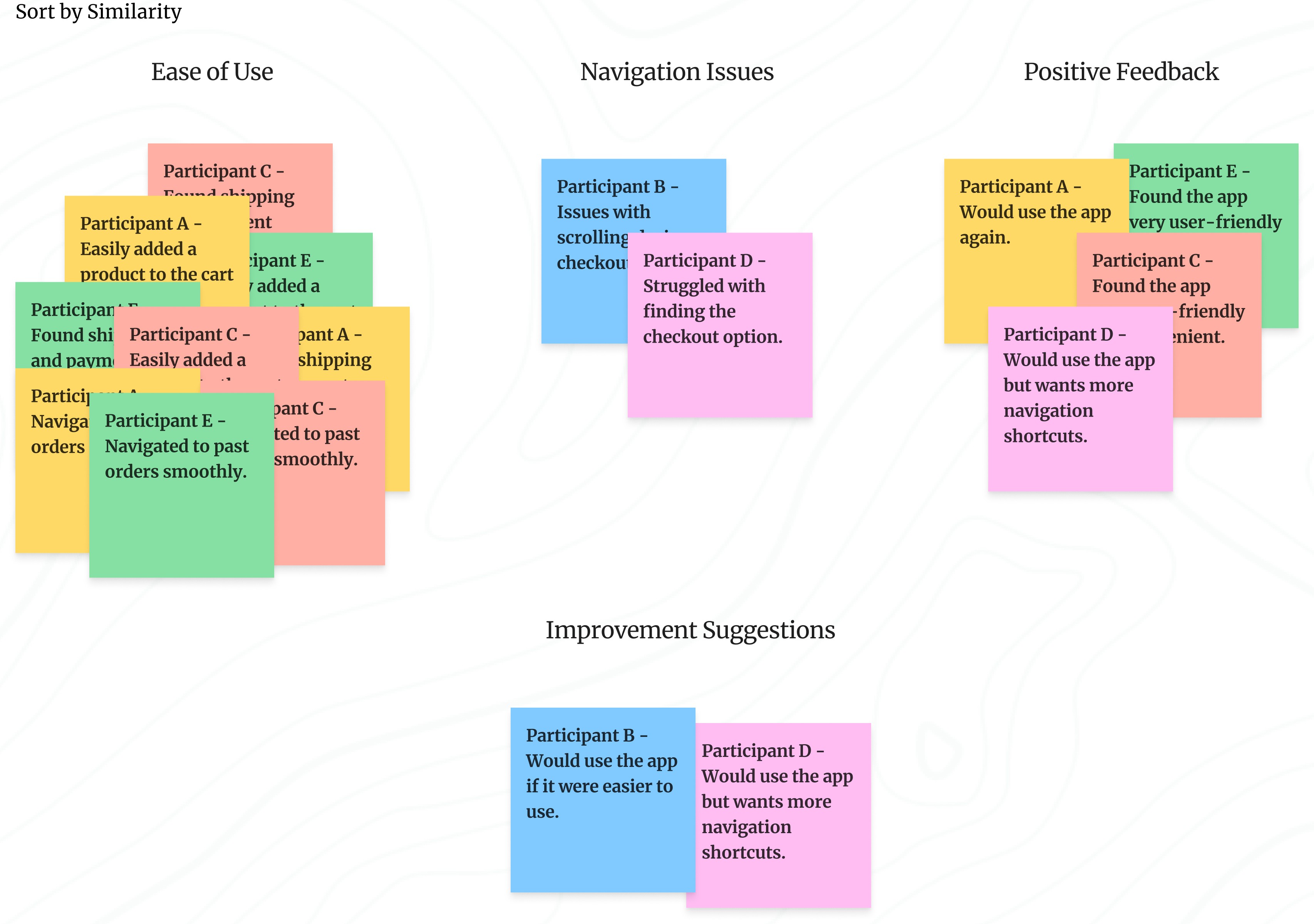
Identify the themes:
At this point, I had already identified several themes by creating an affinity diagram. Next, I had to consider two key questions:
What common patterns stand out in the data I collected?
What do these patterns tell me about my product design?
Here is a summary of the patterns extracted from the affinity diagram:
Navigation: Most participants found the navigation functions and icons on the home screen helpful, indicating that navigating the app was generally easy.
Checkout Process: Participants had no issues with adding products to the cart or proceeding to checkout. They found the process easy and intuitive, suggesting a smooth checkout experience.
User-Friendliness: Multiple participants considered the app to be user-friendly and convenient, highlighting a generally positive user interface.
Navigation Improvements: Some participants experienced difficulties with navigation and suggested improvements, indicating a need for enhanced navigation shortcuts.
Insight Identification from Affinity Diagram:
Ease of Navigation:
Insight: Clear and accessible navigation options enhance user satisfaction and task completion rates.
Smooth Checkout Process:
Insight: Minimizing steps and making key actions like checkout and adding to the cart more prominent can reduce user frustration and abandonment rates.
User-Friendly Interface:
Insight: Maintaining a clean, intuitive design with clear labels and icons contributes significantly to a positive user experience.
Presentation of Insights findings:
This presentation focused on the top three to five insights from a usability study to keep the viewers engaged and ensure they walked away with the most critical information. Presentations are particularly useful when sharing insights with a larger group, especially when viewers might not be familiar with the field of UX.
Key Considerations for Crafting an Effective Presentation:
Audience: Understand what my audience is interested in and tailor my presentation accordingly. This ensures engagement and helps me gain support for my project.
Overview: I have started with a table of contents so my audience knows what to expect.
Story: I have structured my presentation like a story, with a beginning, middle, and end. I used real user examples, quotes, and visuals to make my points more relatable and engaging.
Data: I have used visual elements to communicate my insights.
Less is More When It Comes to Text: I keep my slides concise with only high-level details. This ensures my audience listens to me rather than reading the slides.
Provide Recommendations for Next Steps: I conclude with a clear list of actionable steps based on my insights. This helps move the project forward.
Here is the Presentation Slides: Click on start button to go through the presentation.
Prioritizing Design Insights for Enhanced Usability:
I have identified key insights from my usability studie's presentation that are critical to improving the design. These insights have been categorized based on their urgency and impact on user experience.
Understanding Priorities (P0, P1, P2):
Priority 0 (P0): These are critical issues that must be addressed for the product to function properly. Any design flaw that prevents users from completing essential tasks falls into this category and must be fixed immediately.
Priority 1 (P1): These are important but non-critical issues. Addressing P1 insights improves the user experience but isn't essential for the basic functionality of the product.
Priority 2 (P2): These are lower-priority improvements that enhance the design but do not impact the core user experience. They can be addressed in future iterations if time and resources allow.
Key Prioritized Insights for 2nd Shop App:
Priority 0
Enhance Navigation: Introduce more navigation shortcuts to improve user flow.
Maintain User-Friendly Design: Ensure all labels and icons are clear and easy to understand, enhancing usability.
Priority 1
Optimize Checkout Process: Improve scrolling functionality to streamline the user’s checkout experience.
The next steps involve refining the designs based on these prioritized insights. Usability studies helped me identify pain points in prototypes, offered opportunities to enhance the design. By addressing Priority 0 issues first, I ensured the core user experience is smooth and accessible. Priority 1 insights, while important, are enhancements that will further improve the user experience.
The iterative design process will continue, with further modifications to wireframes and prototypes based on ongoing research and feedback. This approach allows me to prioritize and address the most critical user needs while refining and improving the design over time.
Iterating on Lo-fi Prototype Based on User Insights:
At this stage, I focused on modifying my low-fidelity prototype and identified the following priorities for my design improvements:
Enhance Navigation: I introduced more navigation shortcuts to improve the user flow, making it easier for users to move through the app seamlessly.
Maintain User-Friendly Design: I ensured all labels and icons were clear and easy to understand, enhancing overall usability and preventing any confusion.
After these iterations, here are the updated lo-fi prototype for the app.
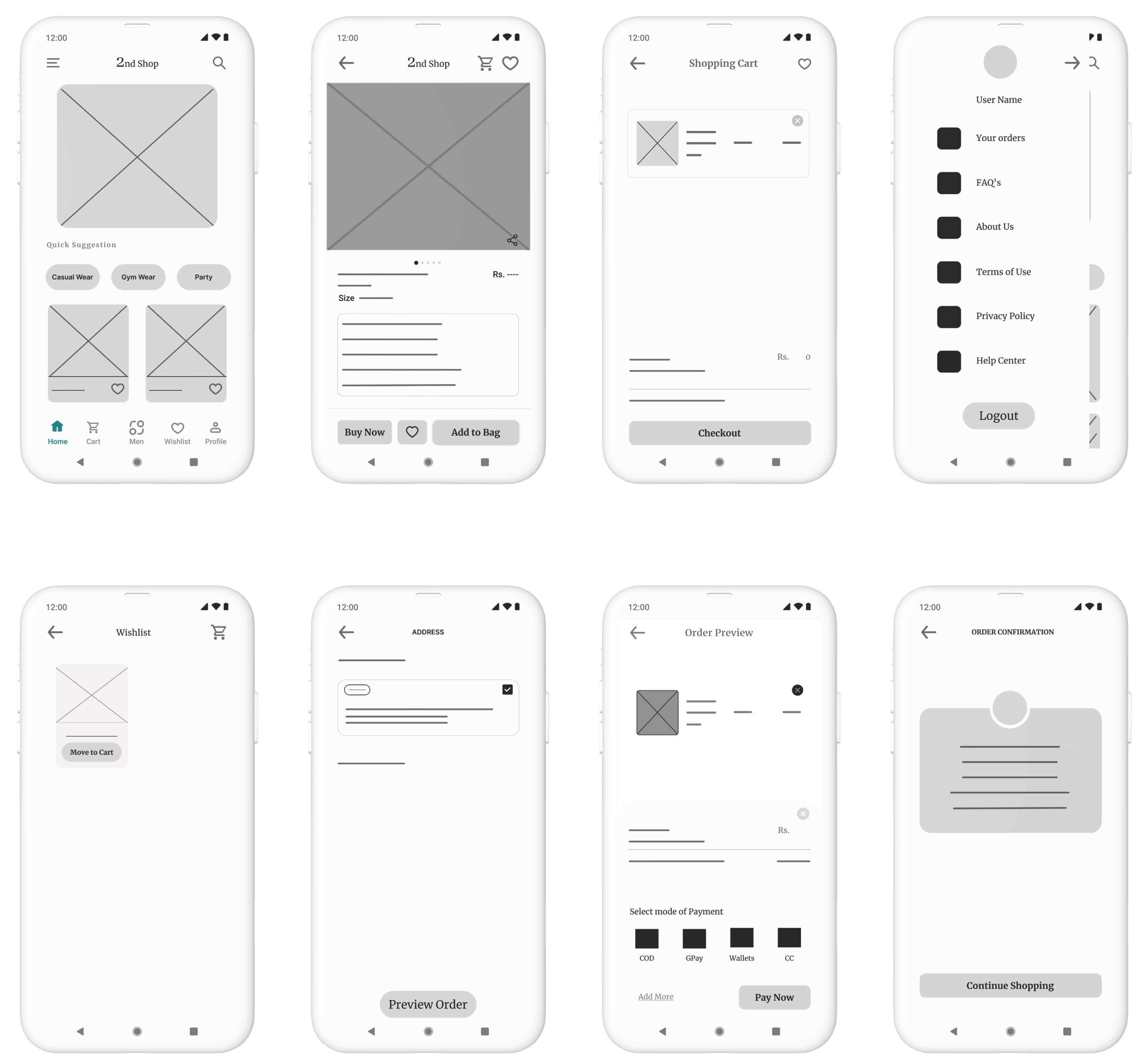
Summary of Changes:
In the revised wireframes, the app’s usability has been significantly enhanced by adding more intuitive navigation shortcuts, improving label clarity, and optimizing the checkout process. The changes are designed to make the user experience smoother, more accessible, and more efficient, addressing key insights from the usability study.
(a). Before Prototype:
Navigation:
Limited navigation options at the bottom (only three tabs: Wishlist, Add to Cart, and Cart).
Fewer navigation shortcuts for quick access to different sections.
Design Elements:
Simple, minimal layout with standard icons and labels.
A straightforward checkout process with basic interaction elements.
Checkout Process:
No clear breakdown of steps in the checkout process.
Basic scrolling functionality without enhancements.
(b). After Prototype:
Enhanced Navigation:
Additional navigation shortcuts added at the bottom of the screen: Home, Cart, Men, Wishlist, and Profile for quicker access to different sections of the app.
Clear and distinct icons for each section, improving the overall user flow and accessibility.
User-Friendly Design:
Icons and labels are clearer and more intuitive, making it easier for users to understand each function.
The design now has more detailed elements like “Quick Suggestions” for easier product selection, enhancing the overall usability.
The Buy Now button is more prominent alongside “Add to Bag,” encouraging a more direct purchase action.
Optimized Checkout Process:
Introduced an Order Preview screen before final payment, providing users with a clear overview of their order before confirming.
Improved scrolling functionality within the checkout process, allowing for a more streamlined and user-friendly experience.
Clearer step-by-step process for address selection, payment, and confirmation, reducing confusion during checkout.
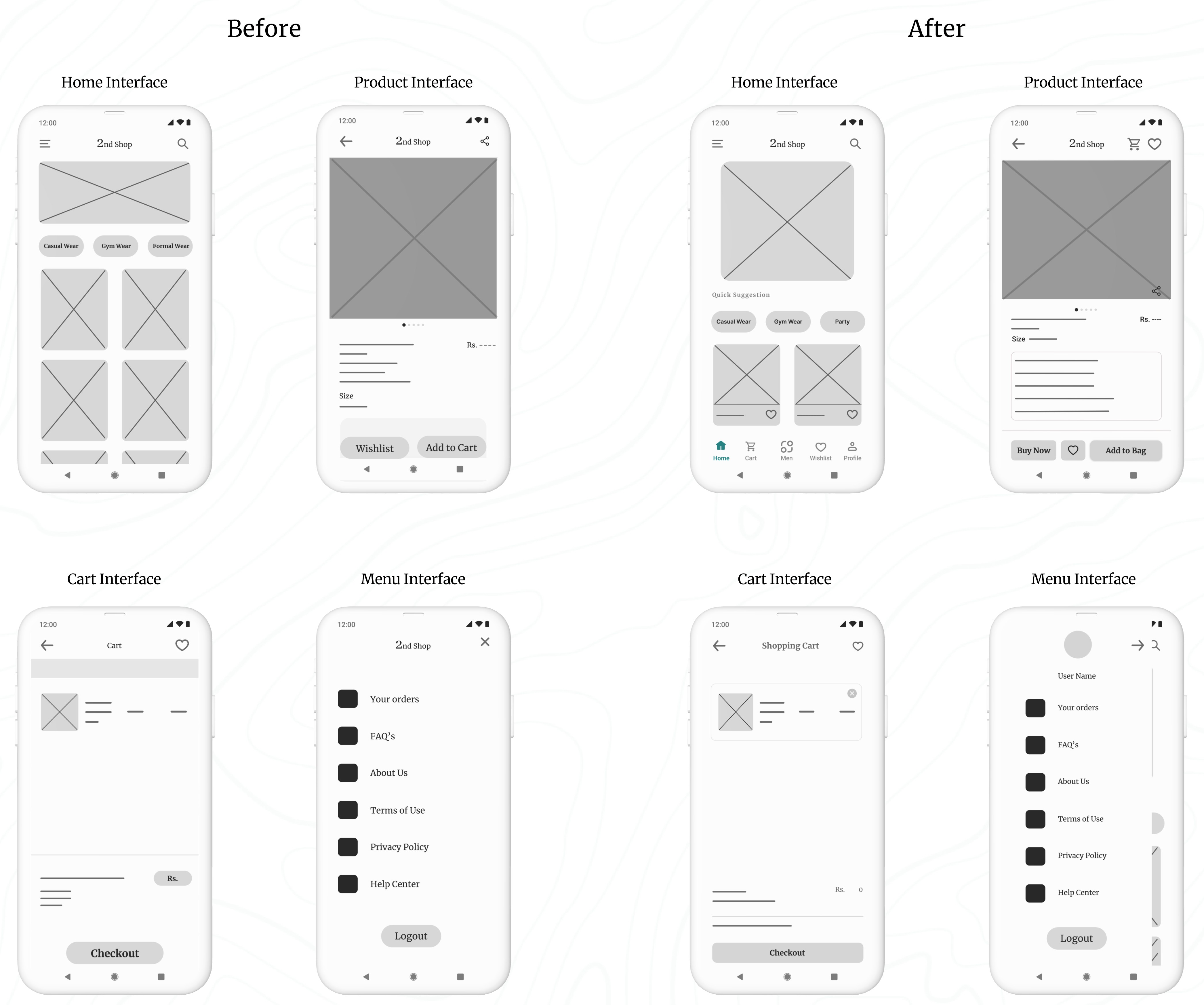
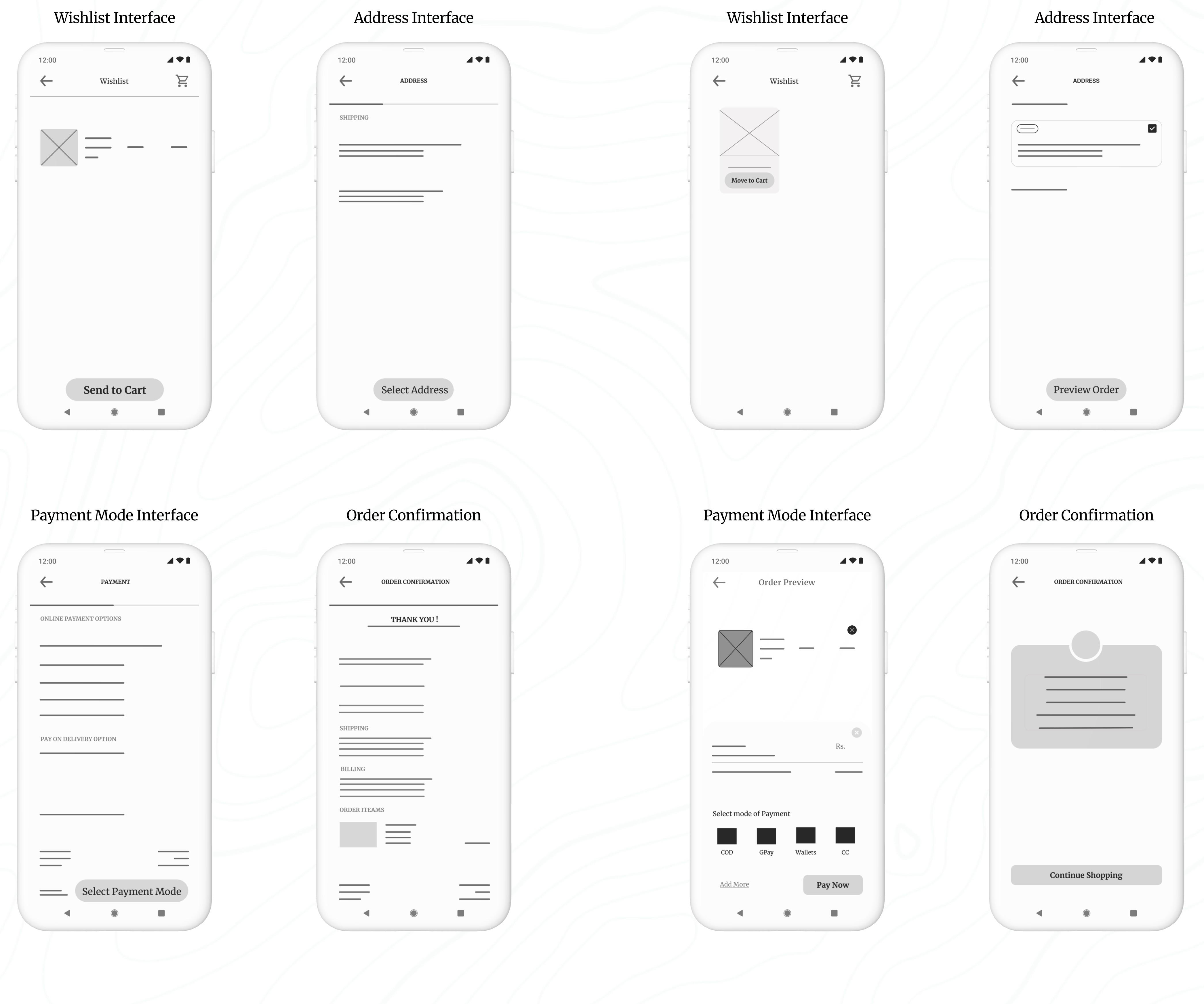
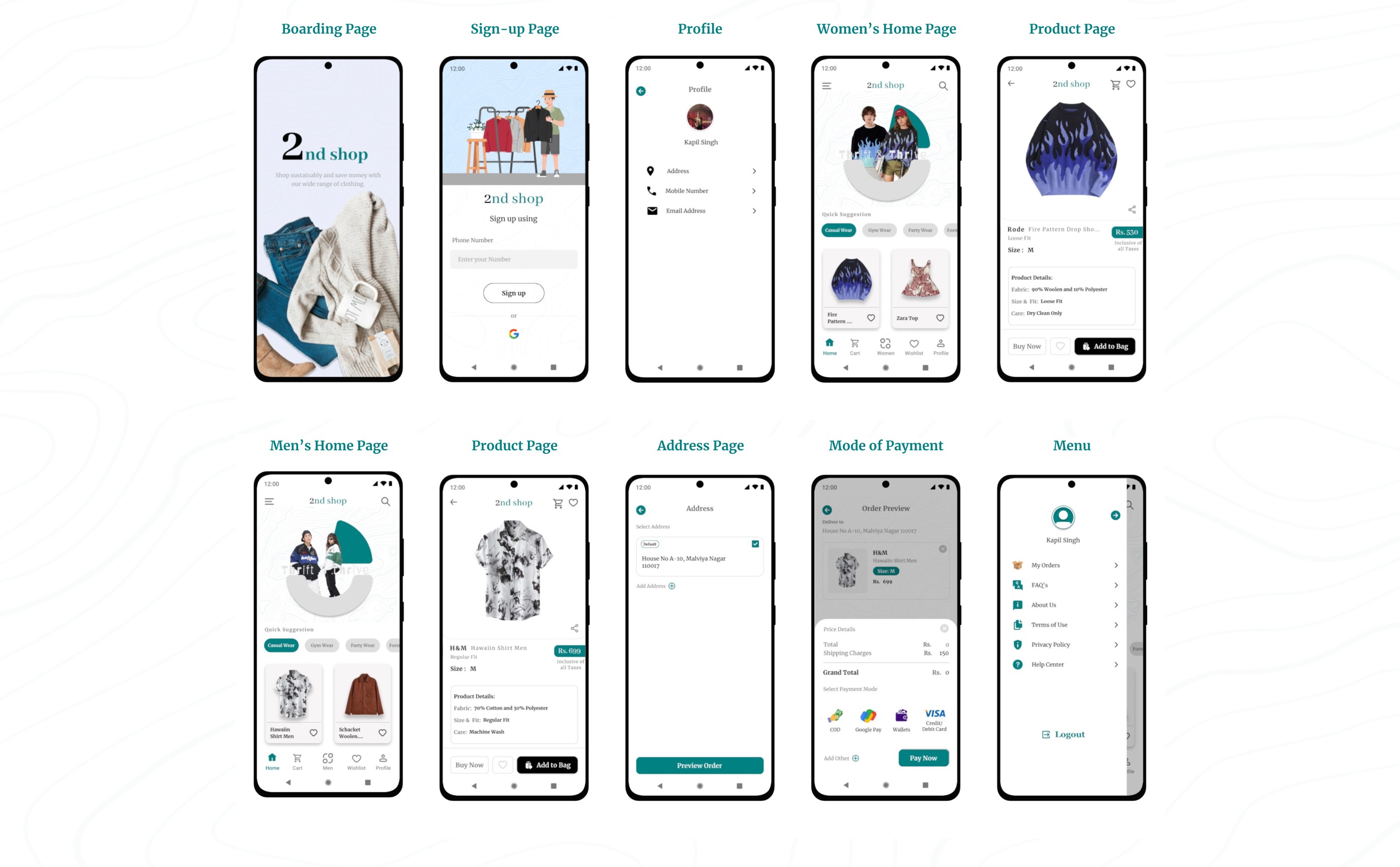
Refining My Design: A Presentation of Iteration Based on User Insights :
Here is the second set of presentation slides. Click the start button to go through the presentation.
To view all the prototypes, visit here: Figma Prototypes

To view all the prototypes, visit here: Figma Prototypes
High-Fidelity Prototype:
I successfully initiated the design of the high-fidelity prototype, which involved translating my low-fidelity concepts into a polished and interactive format. This phase allowed me to refine the visual aesthetics and functionality of the application, ensuring a more realistic user experience.
Color and Typography:
Color Palette: The chosen color palette combines green (#00S080), white, gray, and black for a modern and clean aesthetic. The green reflects sustainability and eco-friendliness, aligning with the core values of thrift shopping—promoting conscious consumption and environmental responsibility.
Typography: Merriweather is used for both headers and body text due to its readability, while Abhaya Libre is selected for brand elements and numerical data to give the app a distinctive, cohesive identity that balances both visual appeal and functionality.
Animated Picture Carousel Made in Figma
Component and Elements used in the design:
Interactive Components: Features dynamic elements like payment methods that update based on user interaction, providing a responsive and intuitive experience.
Iconography: Custom icons generated through the Iconify plugin, ensuring consistency and clarity across the app.
Navigation: A clean, user-friendly navigation bar providing easy access to key sections such as Home, Cart, Wishlist, Profile, and Men/Women section switching.
Buttons: Well-designed call-to-action buttons, optimized for both functionality and visual appeal, enhancing user interaction.
Animated Picture Carousel: I have designed this animated carousel so that it will be a center of attraction and attract users and make them explore the application more.
During this usability testing phase, which focused on my high-fidelity prototype, I observed participants interacting with key features of the 2nd Shop app. I gathered insights on the overall user experience, focusing on tasks such as selecting products, completing orders, and navigating the checkout process. I observed how easily they found items, completed their orders, and entered payment information. I also noted their overall attitude—whether positive, frustrated, or indifferent—to understand their emotional response. These insights guided future design improvements.
As I observed the testing, I made sure to update the note-taking spreadsheet. Here’s what I recorded in the spreadsheet:
Usability Study focused on High-Fidelity Prototype
Synthesize research findings with affinity mapping
Sort sticky notes by similarity
I converted the findings into sticky notes, rearranged them, and grouped them into three categories, each with its own title and focus: Says, Does, and Feels.
Identify themes in the data
The themes I identified from sorting the sticky notes are as follows:
After successfully applying the affinity diagram method to my low-fidelity prototypes, I extended this approach to the high-fidelity prototype as well. I categorized and synthesized user feedback and observations into organised themes, which helped me visualize user interaction patterns and pain points more effectively. This allowed me to uncover deeper insights into user needs and preferences, directly informing iterative design improvements to enhance the overall user experience.
BTS of the Last usability Study
Here are some candid shots of my usability study participants, straight from the video recordings—don’t worry, no one was harmed in the making of these user experiences 😂 !
A big thank you to Mr. Sunny, Ms. Meera, Mr. Shourya, Mr. Rinku, Mr. Rajiv Shukla, Mr. Rohit Bhatt, Ms. Babita, Mr. Rishab Jain, Mr. Akshat Panthri, Mr. Rohit Sethi, Ms. Divya Gujral, Mr. Gaurav Nathani and Ms. Riya Kothari. You all truly helped a lot in my usability studies and user interview, and I was able to finish this case study with tons of learning and fun!
The Says area includes all the notes about things users said during the study, such as "Speaks in a positive tone" (5/5 participants).
The Does area includes all the notes about actions users took during the study, such as "Knows how to get started with selecting a product" (5/5 participants).
The Feels area includes all the notes about how users felt during the study, such as "Likes the ordering process" (3/5 participants).
It was observed that 5 out of 5 participants knew how to get started with selecting a product. This means that the app’s onboarding or product selection interface is intuitive and easy to use.
It was observed that 0 out of 5 participants had trouble completing an order before checkout. This suggests that the ordering process is seamless and straightforward for users.
It was observed that 3 out of 5 participants liked the ordering process. This indicates that the app’s ordering flow could be enhanced to improve overall satisfaction.
Takeaways
Through the 2nd Shop case study, I learned the importance of understanding user motivations and pain points in the second-hand shopping experience. By focusing on ease of navigation, intuitive design, and trust-building features, I was able to create a product that resonates with users who value affordability, sustainability, and convenience. The usability study provided valuable insights, helping me refine the app to ensure a seamless and enjoyable experience for thrift shoppers. This project emphasized the need to continuously iterate based on real user feedback, making the app more user-centered and functional.
I's a wrap. After identifying the themes in my usability study through affinity mapping, I concluded that the app meets its purpose and fulfills the user's needs for the time being. At this point, I decided not to proceed further beyond identifying the themes. Although there were some minor iterations, the app serves its purpose without requiring significant changes. However, since I had the time, I utilized it to make some adjustments based on feedback from user testing participants. The changes can be seen in the images below:
If you reached here thanks for going through my case study.
I am open to receiving feedback, reviews, questions, and your own insights about this case study.
I'll be glad to respond to all.
Ready to interact with the Application?
Fasten your seatbelts and get ready to explore the world of sustainable shopping with the 2nd Shop app. Dive in now to interact with the application.
Get Started